Case study · Academic Opportunity of Arizona
Academic Opportunity of Arizona
A branded, illustrated presentation for Academic Opportunity of Arizona that tells one student's story, then shows the scholarship program's impact and growth.
01 — Context
Non-profit pitch deck design for Arizona scholarships
Academic Opportunity of Arizona (AOA) is a scholarship organisation that helps Arizona students, including many with learning disabilities, attend schools that suit their needs. Its work depends on donors, and its presentations need to explain both the need and the difference a gift makes. That makes non-profit pitch deck design central to how AOA raises support.
AOA asked us for a distinctive PowerPoint deck that would set out its mission and show the results it has achieved so far. The deck had to be warm enough to connect with families and donors, and clear enough to present hard numbers credibly.
We designed the deck as a branded presentation with a title slide template, a story section and a data section, all built around AOA's apple-shaped logo and a colourful, friendly illustration style.
The hard part was balance. A deck about children with learning disabilities can easily become either too sad or too corporate. We wanted donors to feel the weight of the problem, then leave with a clear sense of hope and a concrete way to help. That meant deciding the order of slides before designing any of them: person first, then the need, then the program, then the proof, then the ask.
02 — Story
Leading with one student, not a statistic
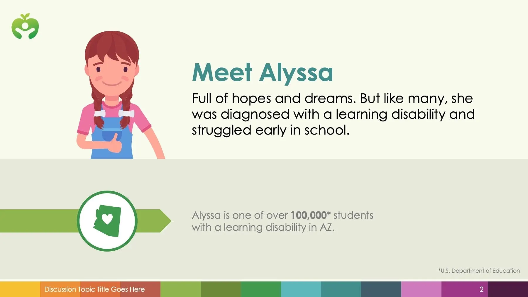
Donors respond to people before percentages, so the deck opens with a story. "Meet Alyssa" introduces an illustrated student who was diagnosed with a learning disability and struggled early in school. Underneath, a green banner with an Arizona state icon puts her in context: she is one of more than 100,000 students with a learning disability in the state, as cited from the U.S. Department of Education.
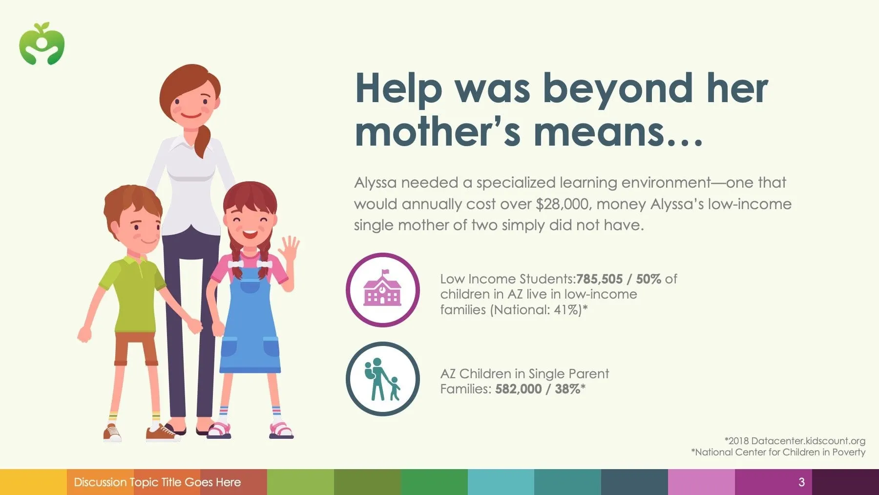
The next slide raises the stakes. Alyssa needed a specialised learning environment costing over $28,000 a year, beyond what her low-income single mother could afford. Two round icons set out the state figures on low-income families and single-parent households, with sources noted at the bottom.
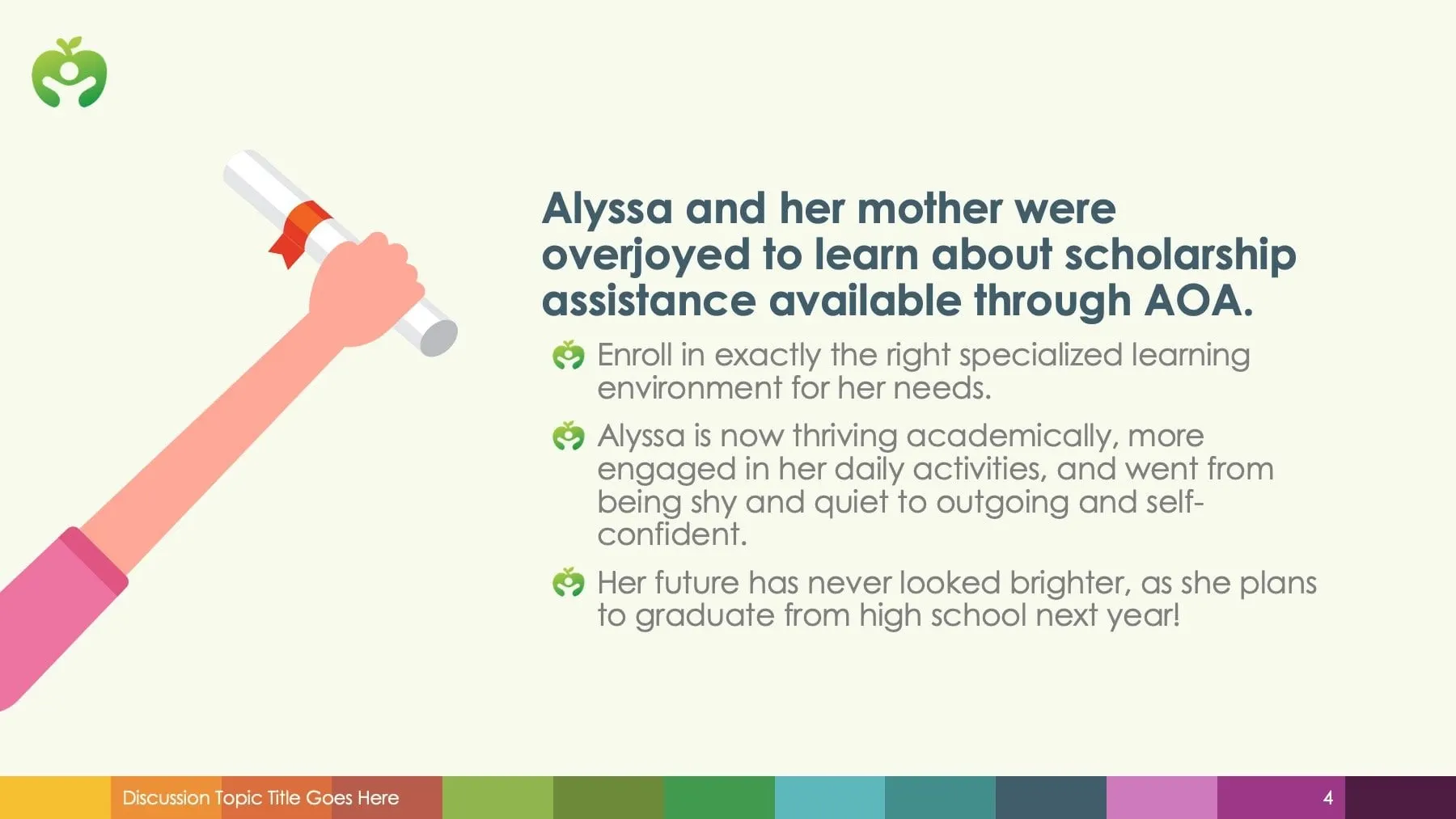
The turning point follows: Alyssa and her mother learn about scholarship assistance through AOA, and the slide lists what changed for her. An illustrated hand holding a diploma does the emotional work, leaving the copy free to stay short.
We used friendly, flat illustrations of children and parents throughout. They help protect student privacy, keep the tone hopeful, and give the deck a look that is clearly AOA's own.
03 — Impact
Showing results donors can trust
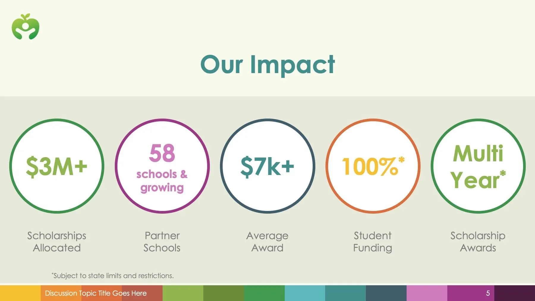
Once the story has done its work, the deck turns to evidence. The "Our Impact" slide sets five of AOA's headline figures in large coloured rings: scholarships allocated, partner schools, average award, student funding and multi-year awards. Each ring takes a colour from the brand stripe, and a footnote keeps the funding claim accurate.
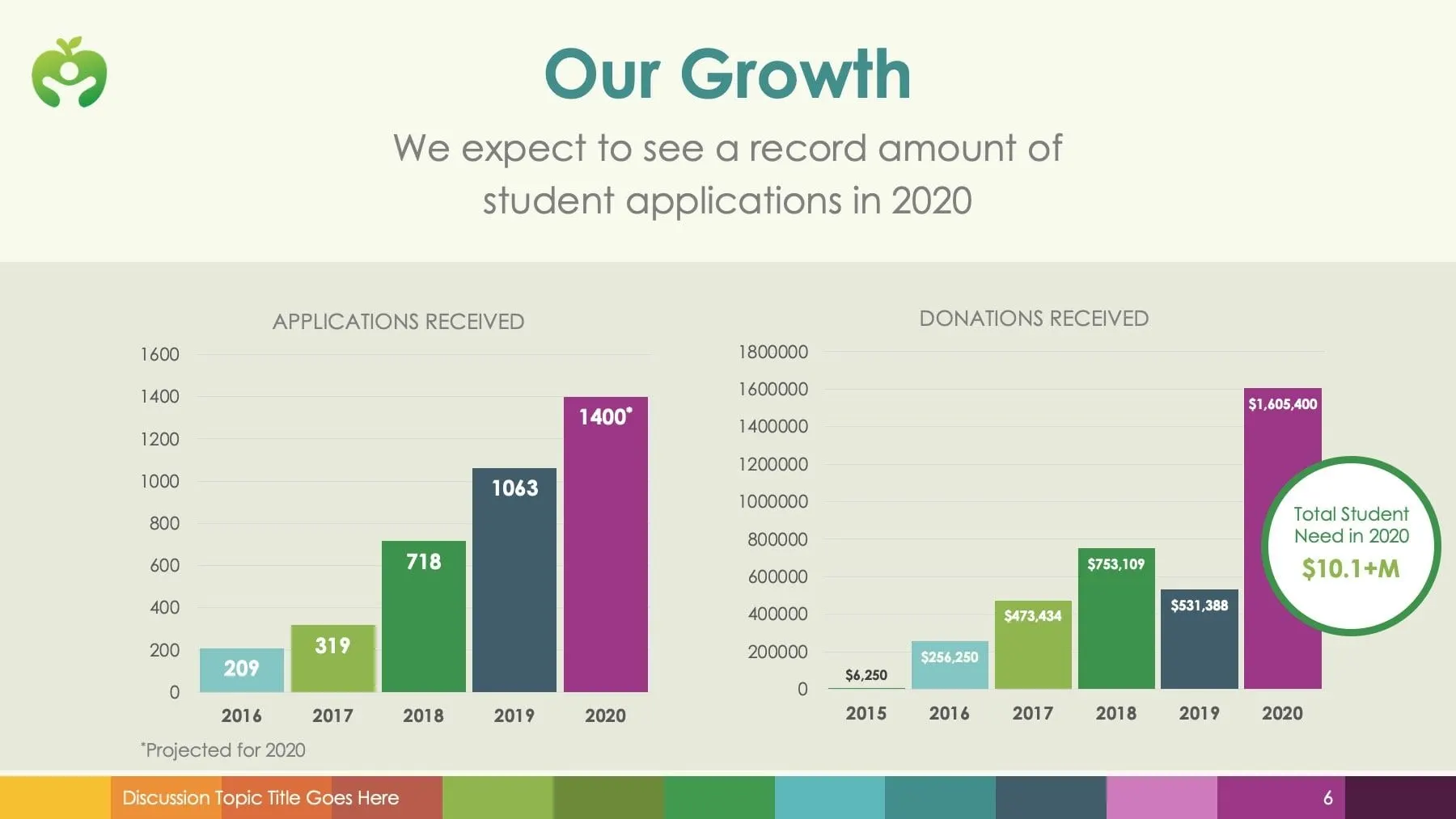
"Our Growth" uses two bar charts, one for applications received and one for donations received, with each year in a different brand colour and projected figures clearly marked. A circular callout highlights the total student need for 2020, which turns the chart into a request.
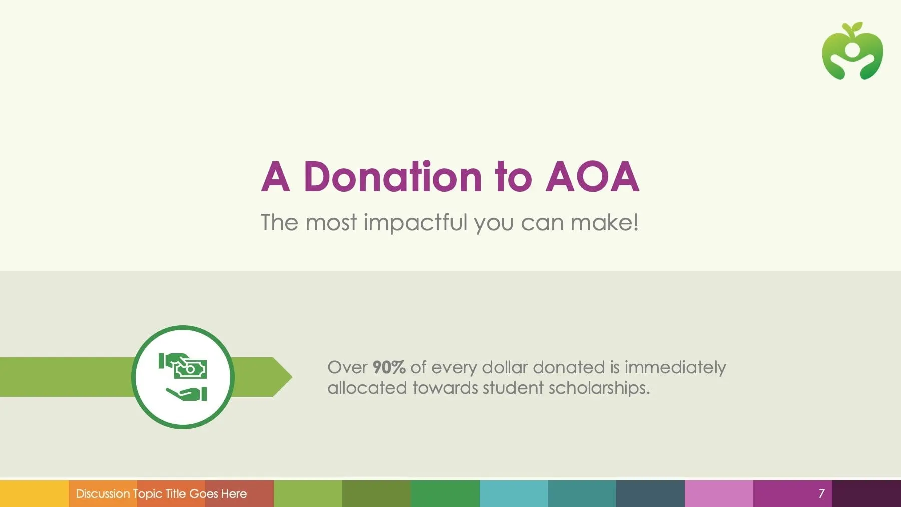
The section closes with a simple ask, "A Donation to AOA", and one fact about how donations are allocated to scholarships. Clear infographic design matters here: every number is AOA's own, presented so a donor can take it in within seconds.
04 — System
A deck AOA can keep using
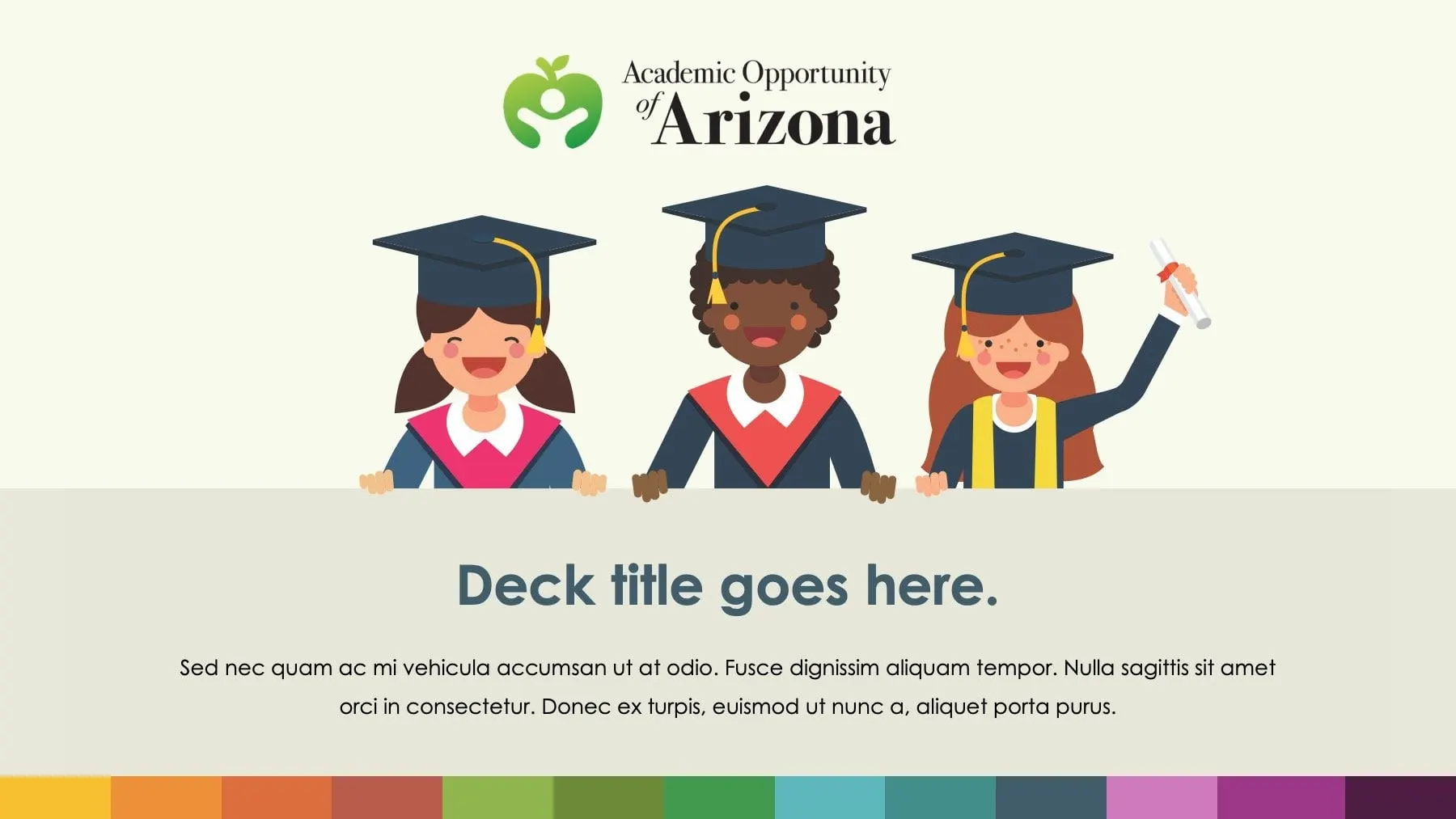
Every slide shares the same frame: AOA's logo in a corner, a cream background with a soft grey-green band, and a multicolour stripe along the bottom that carries the topic title and page number. The title slide includes placeholder text so the team can create new decks for different audiences without starting again.
The colour stripe does double duty. It makes the deck feel joyful and youthful, which suits an organisation working with children, and it supplies a ready-made palette for charts and icons.
For organisations in education, we often recommend this approach: one story, then the proof. It is a theme we explore in designing for your audience, not yourself. See also our report for the water non-profit Imagine H2O and our work for Further Learning Group.
What we delivered
A branded, illustrated presentation and reusable template.