UX/UI Design
If it’s hard to use, it doesn’t matter how it looks.
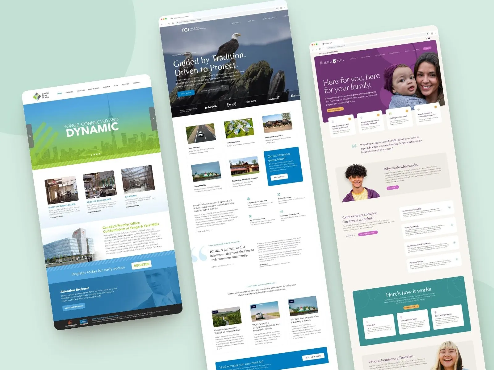
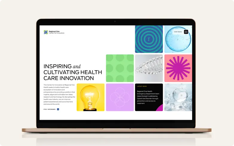
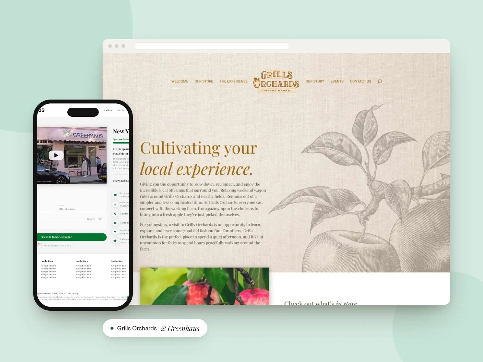
We design websites, apps and interfaces that feel obvious to the people using them. Clear paths, fewer clicks and screens that look as good as they work.
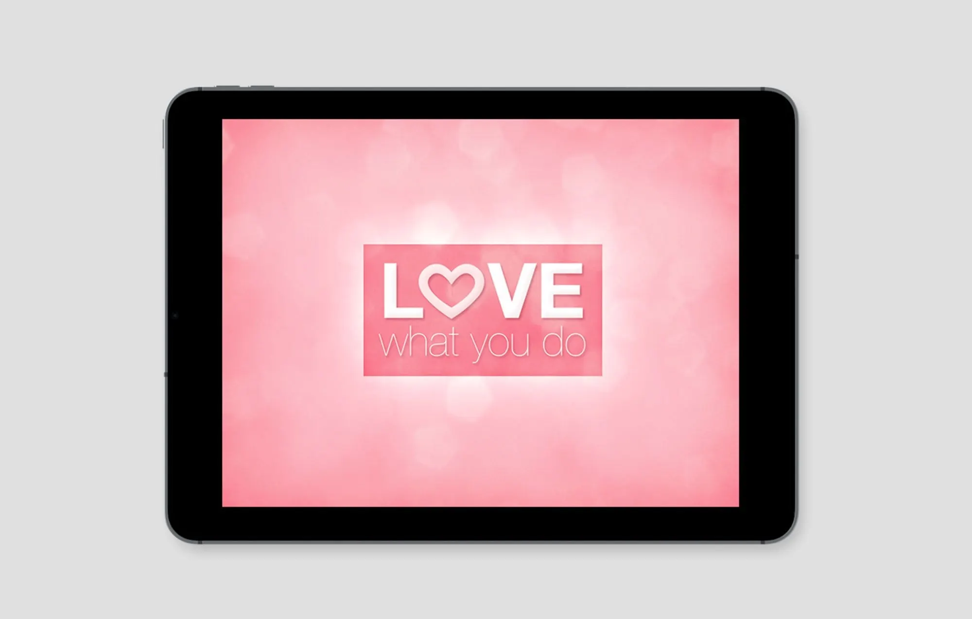
Good UX is invisible. Nobody notices the menu that made sense or the form that took ten seconds. They just get what they came for, trust you a little more and come back. That’s the experience we design for.
What is UX/UI design?
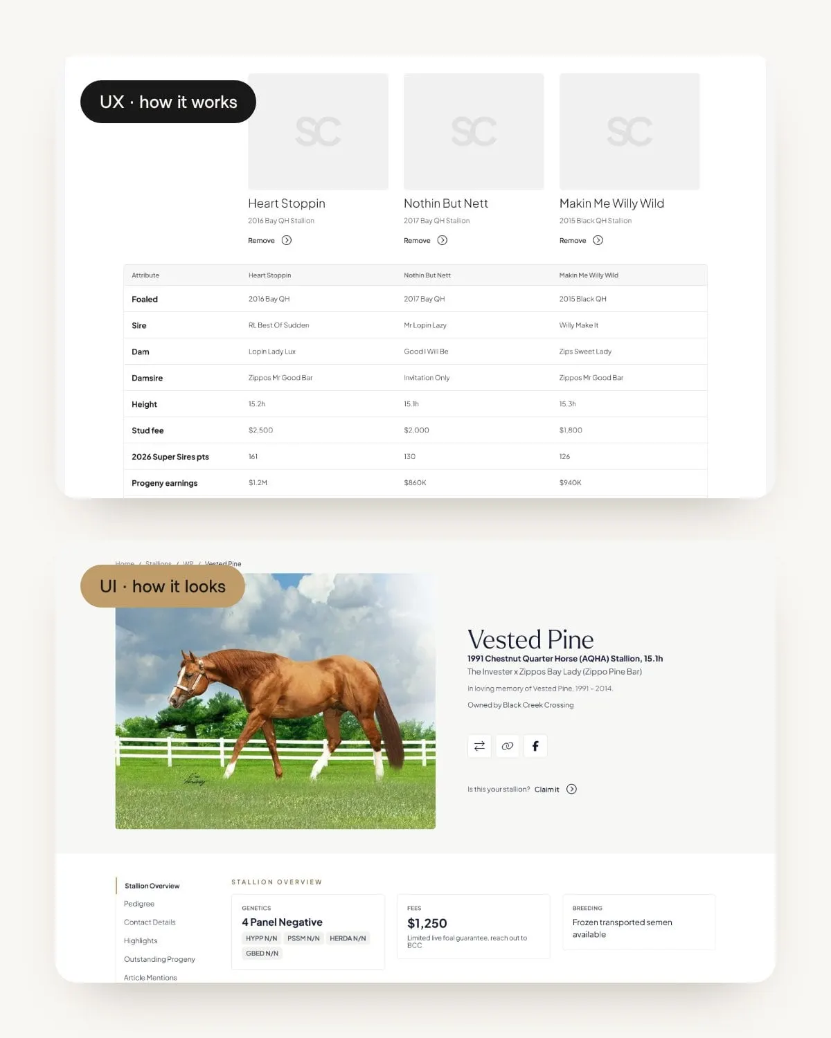
How it works, and how it looks.
UX (user experience) design is how a product works: the structure, the flow, how many steps it takes to get something done. UI (user interface) design is how it looks and feels: layout, type, colour, buttons and the small interactions that make a product feel polished.
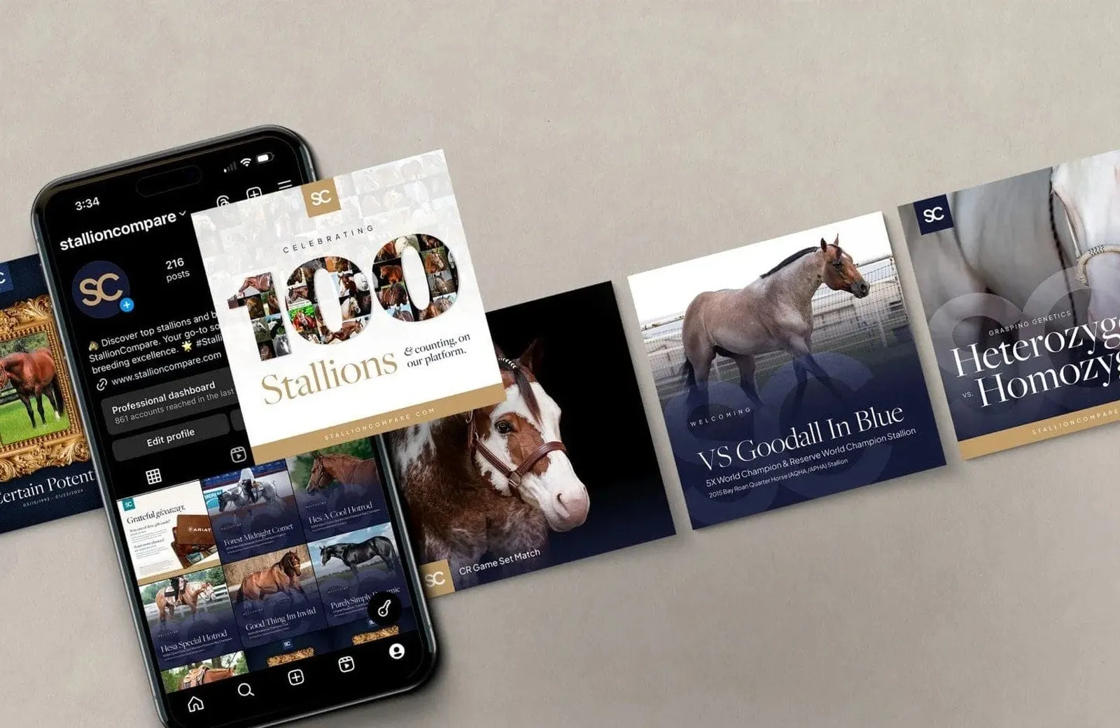
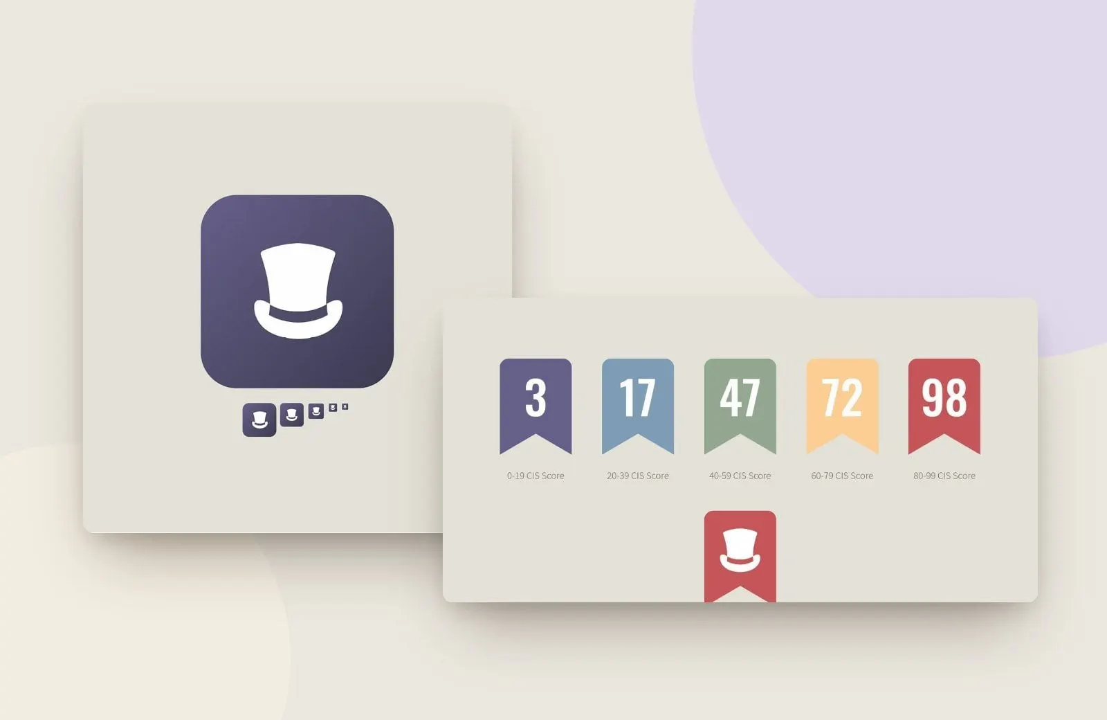
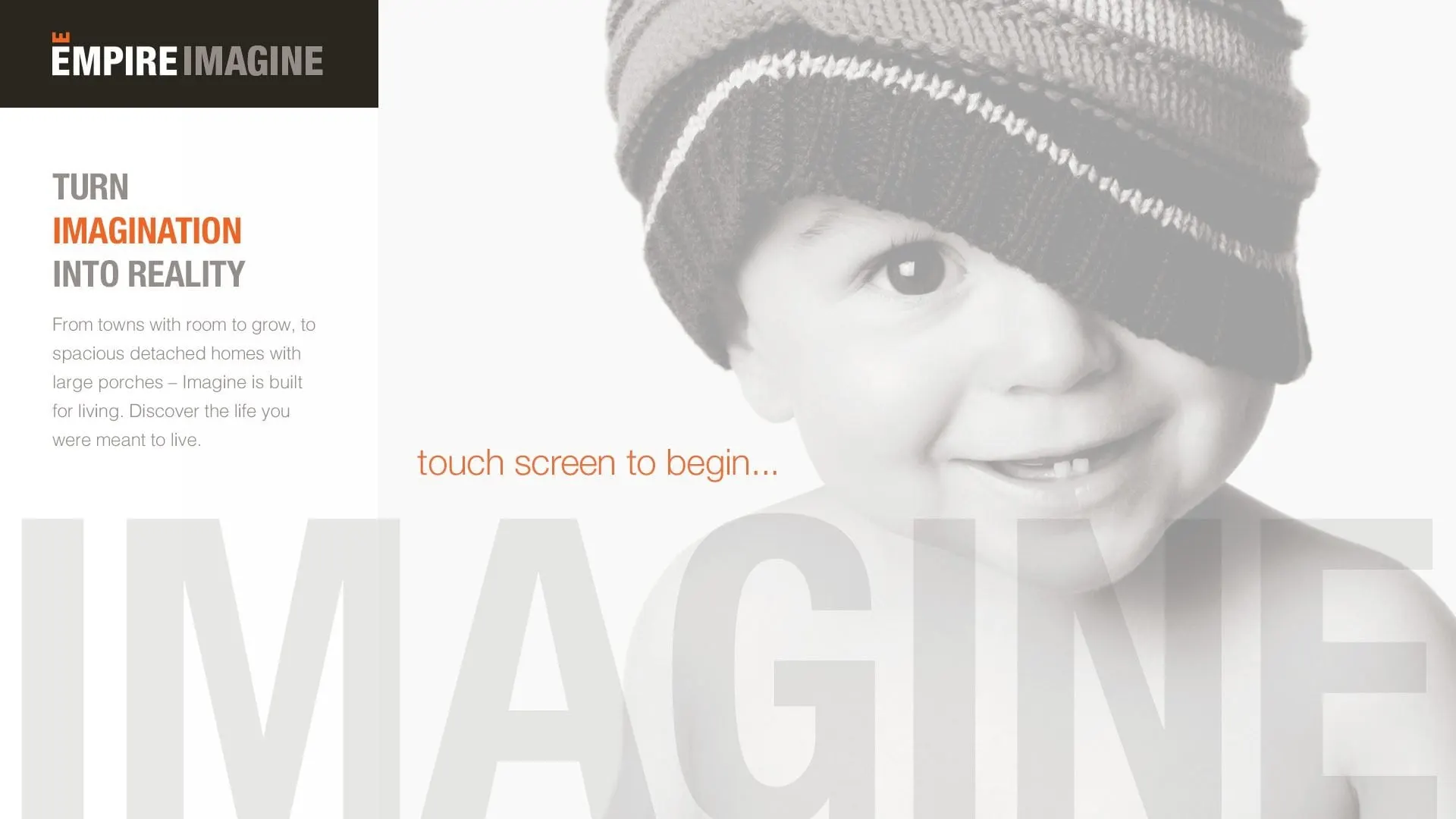
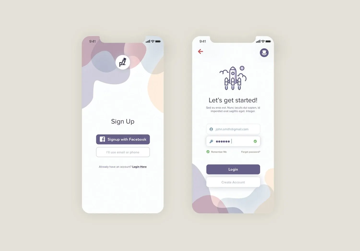
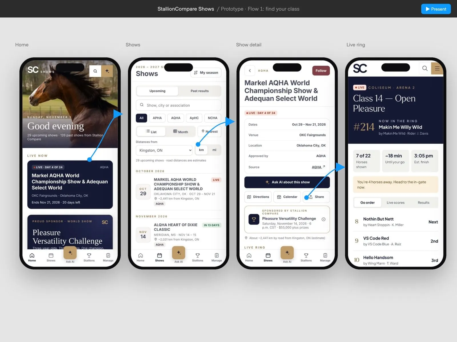
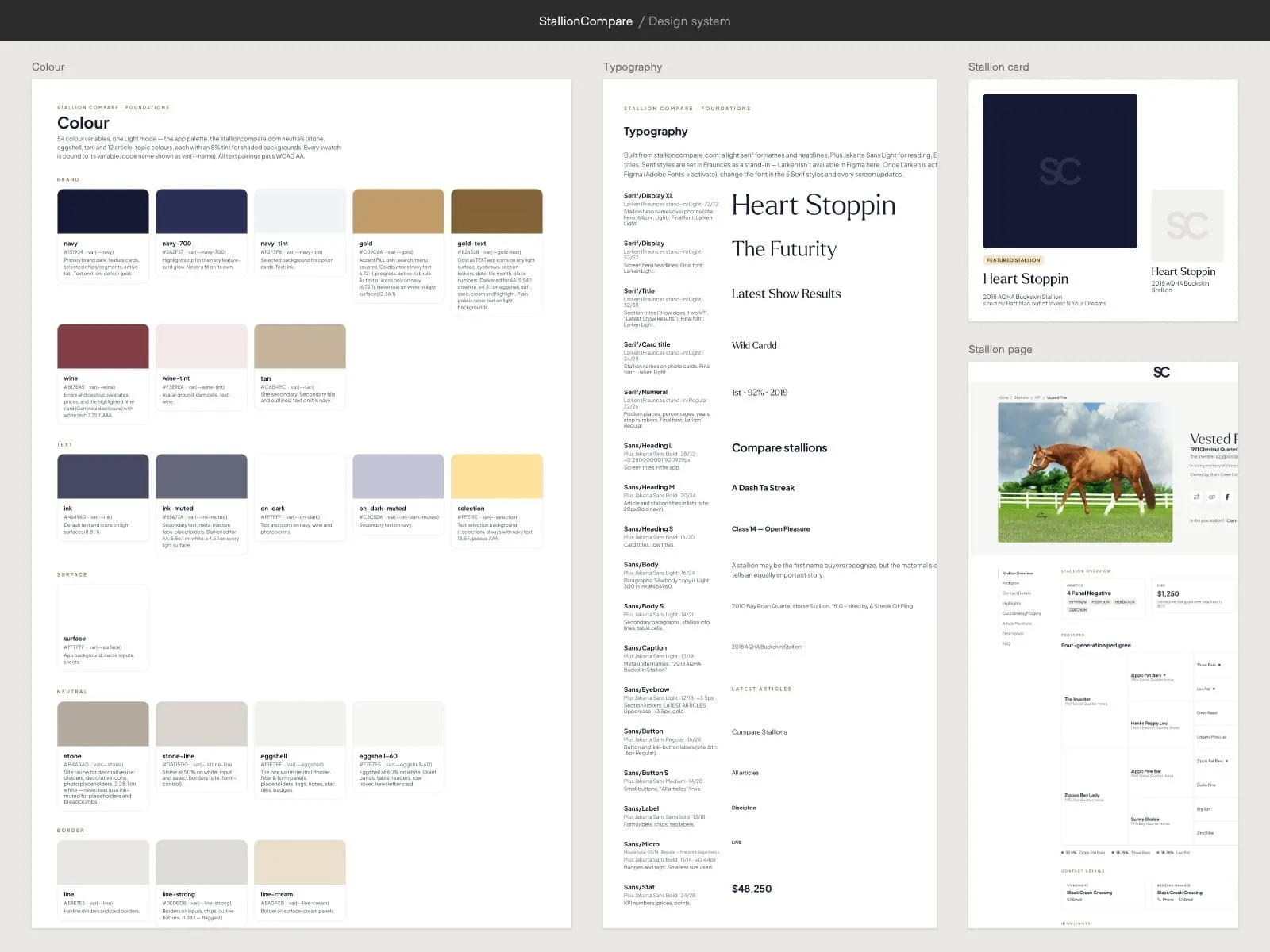
We do both, for websites, web apps, mobile apps and touchscreens. For StallionCompare we designed a platform for comparing stallions and breeding data; for Props2 we designed an entire social app, down to its icons and score badges.
Every interface we design starts with the brand behind it. It’s why our UX work sits so naturally beside our branding and website design.
What we design.
From a single landing page to a full product.
Let’s make it easy to use.
How we design experiences.
We test thinking before we polish pixels.
-
01Discover
Research
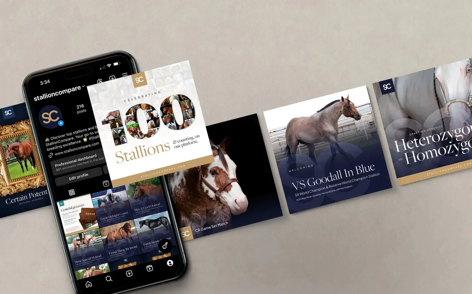
We learn your users, their goals and where they get stuck today. Depending on the project, that can mean digging into analytics, talking with customers or watching how people move through your current website or app.
The result is a clear picture of what’s working, what’s frustrating people and what matters most to fix. It’s the foundation of good UX design, and it gives us a solid brief for mapping user flows and wireframes in the next step.
-
02Structure
Flows & Wireframes
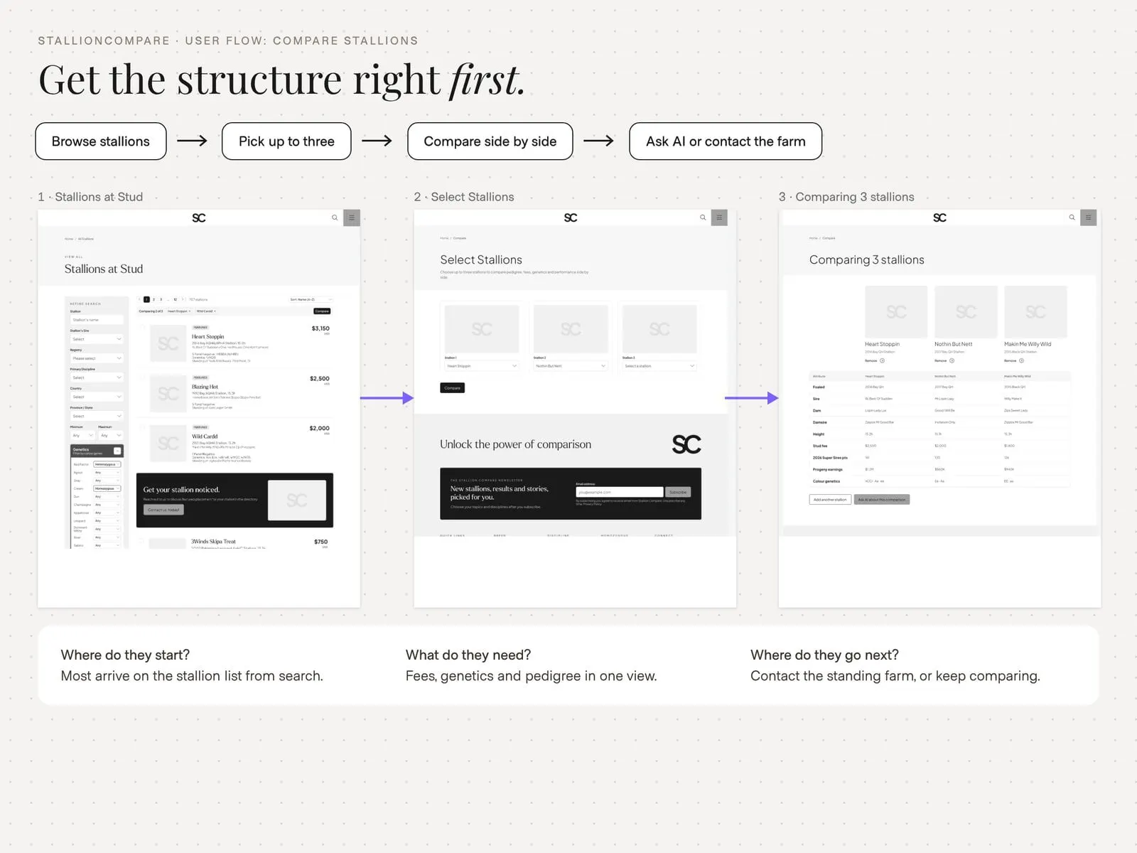
We map the user journeys and wireframe key screens so the structure is right first. Where does someone start, what do they need to see, and how many taps does it take to get where they’re going?
Working in plain wireframes keeps the conversation on usability rather than colours and fonts. Once the flows make sense and the key screens are agreed, we have a sturdy skeleton for the interface design to build on.
-
03Design
Interface Design
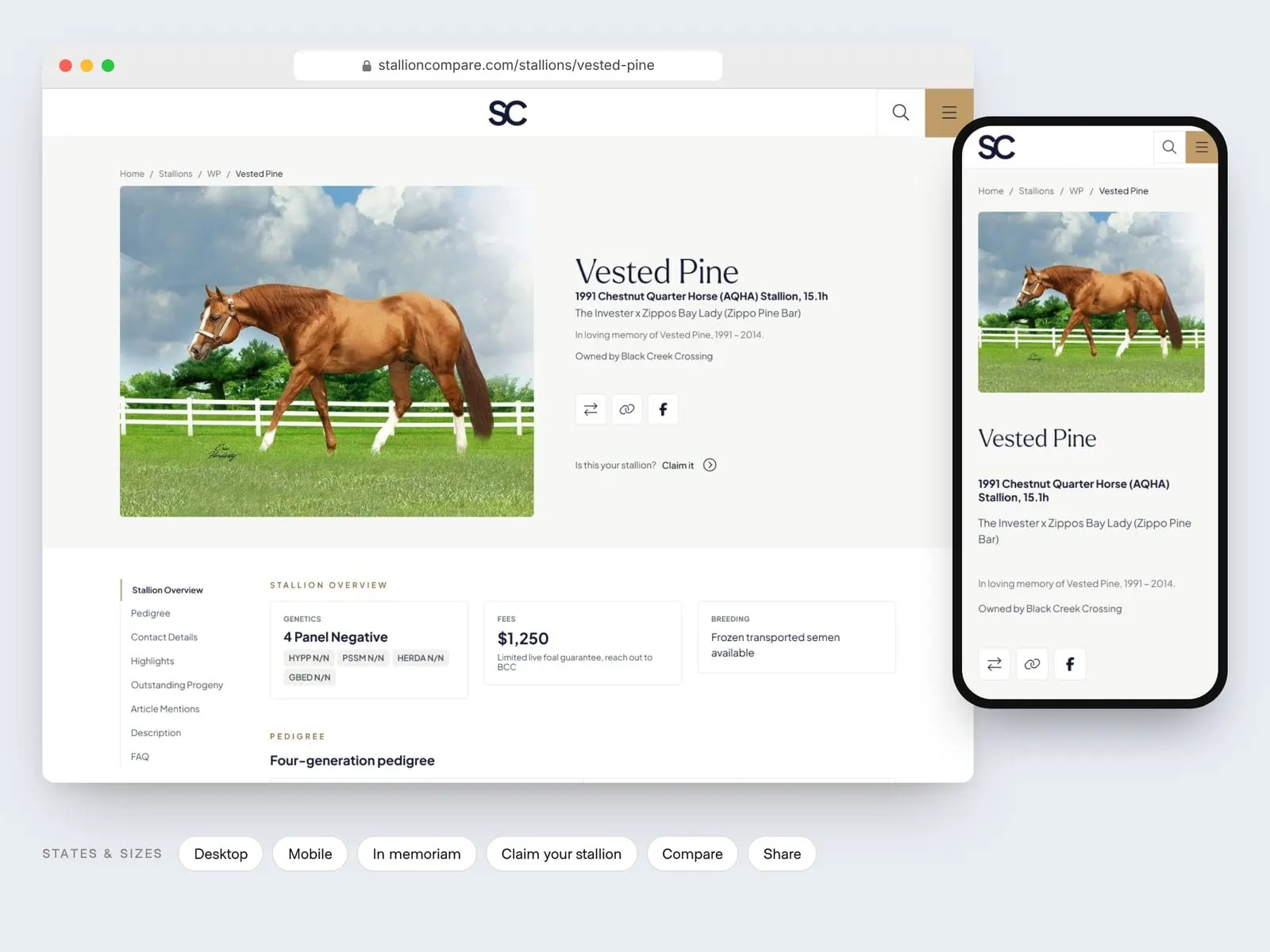
We design the look and feel in Figma, with every state and screen size covered. That means more than the happy path: empty states, error messages, loading screens and how each layout adapts from phone to desktop.
This is where your UI design comes together, clear, on-brand and easy to use. Because the structure was settled in wireframes, the visual work can focus on clarity and polish. Next, we put it in people’s hands.
-
04Test
Prototype & Test
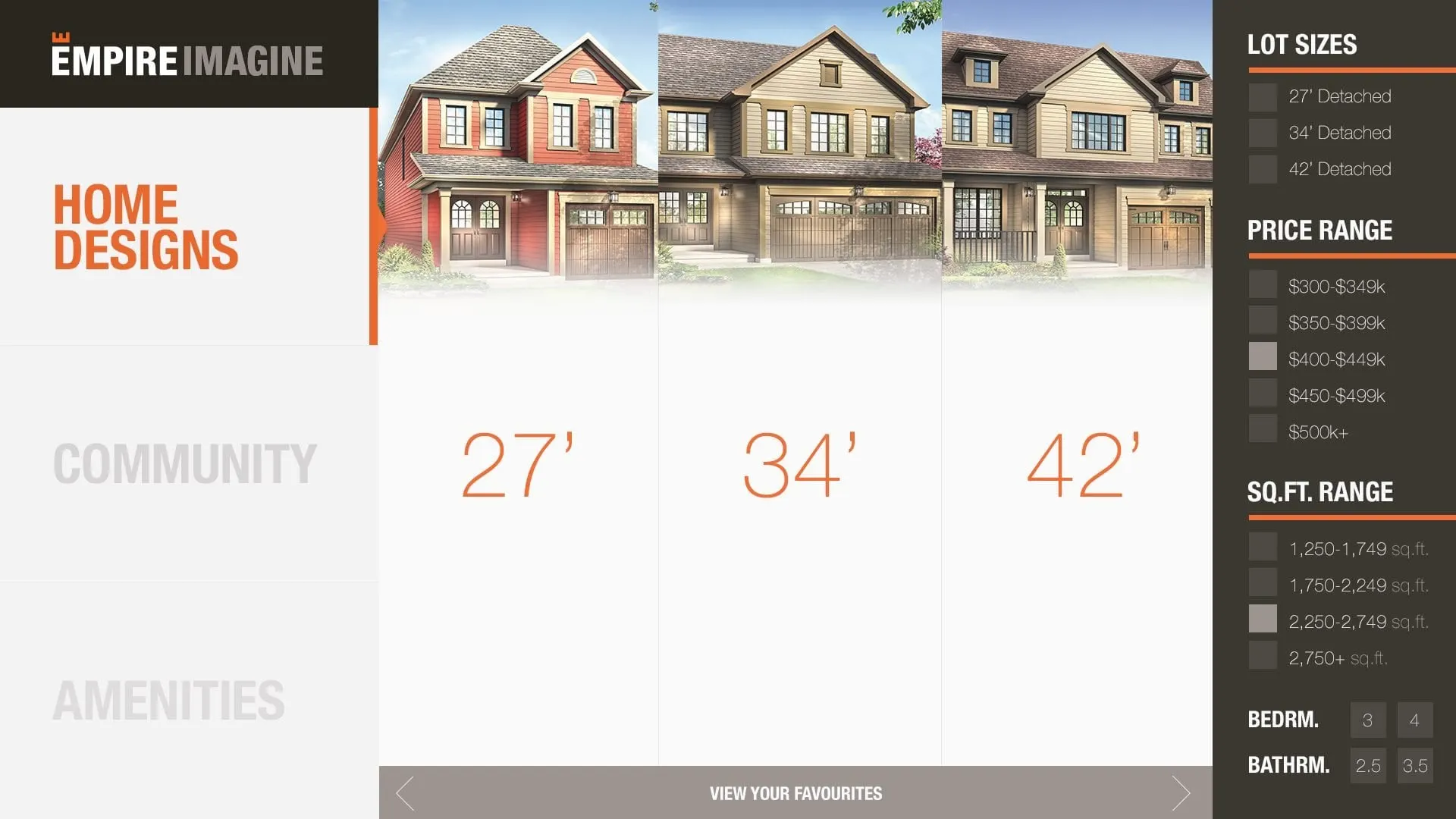
Clickable prototypes let you and your users try the experience before development. Tapping through something realistic exposes confusing labels, missing steps and awkward flows far faster than a static mockup ever could.
We gather feedback, fix what isn’t working and test again where it matters. You get confidence that the design works for real people, and your developers avoid rebuilding things after launch. Then it’s time to package everything up for handoff.
-
05Handoff
Design System
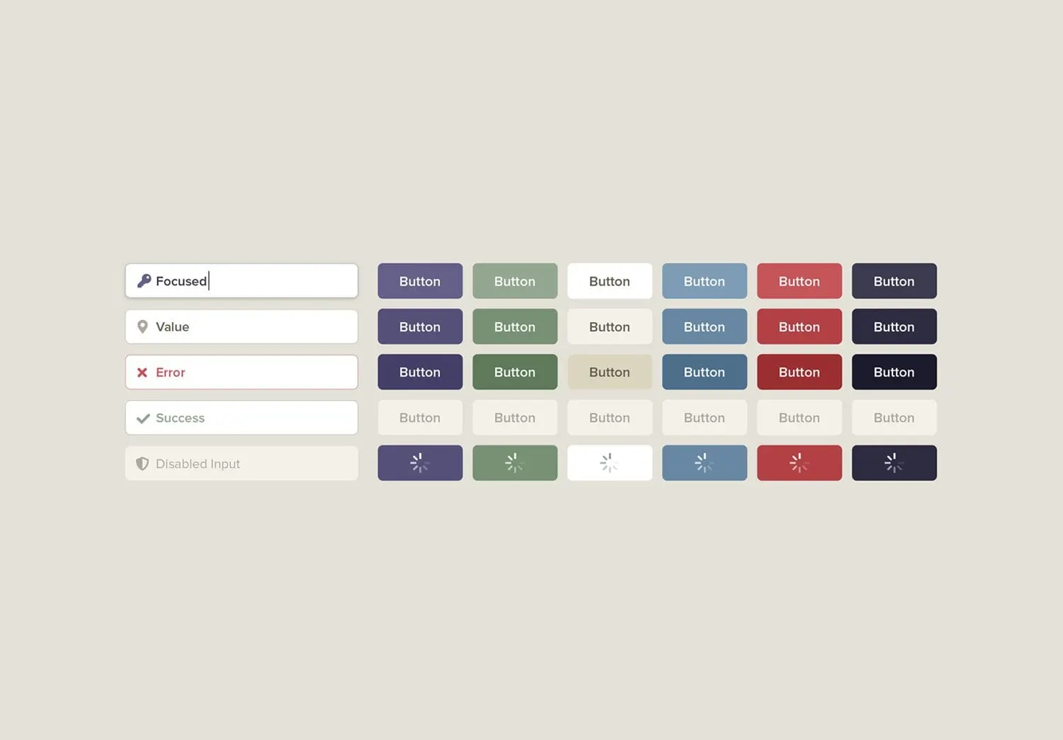
You get a documented UI kit so developers build exactly what was designed. Colours, type, spacing, buttons, form fields and components are all defined, along with how each one behaves in every state.
A good design system keeps paying off long after this project wraps. New screens and features can be designed and built faster, and your product stays consistent as it grows. Think of it as the handshake between UX/UI design and development.
Why teams choose us for UX/UI.
Brand designers who think like product designers. We start with how people actually use your website, app or portal, then shape screens that feel obvious and look unmistakably like your brand. The result is an interface people pick up quickly and files your developers can build from with confidence.
User-first
Decisions come from how people actually use your product, not from guesswork. We map the key tasks, test flows with real users where it helps and cut the steps that slow people down.
Brand-led
Interfaces look and sound like your brand, not a template. Colour, type, icons and microcopy carry your identity into every screen, so the product feels like it comes from the same company as your marketing.
Built to build
You get developer-ready files with components, states and spacing all defined. Hover, error, empty and loading states are designed up front, so nobody is left guessing and the finished product matches the design.
Proven across platforms
We’ve designed websites, apps, portals and touchscreens. Each comes with its own constraints and expectations, and what we learn on one makes the others easier to use.
We’ve earned some good company. Recognize anyone?










They were really good at explaining why they did what they did. Michael and Natashya were amazing partners in building our site.

Beyond their technical expertise, what truly stood out was how personally invested the team was in our success. They took the time to understand our business priorities and consistently aligned their work to meet those objectives.

We had an incredibly short and aggressive timeline that Envy Design Co. met, delivering an incredible website. After the websites were launched, leads continued to come in.

Ready to build something worth envying?
Tell us a bit about your goals and we’ll be in touch as soon as we’re able to explore how we can help bring your vision to life.
Frequently asked questions.
What’s the difference between UX and UI design?
UX design is how a product works: structure, flow and ease of use. UI design is how it looks: layout, colour, type and interaction details. We design both together so they support each other.
Think of UX as the plan and UI as the finish. UX design involves understanding users, mapping journeys, organizing content and wireframing screens so tasks feel natural. UI design brings that structure to life with visual hierarchy, buttons, icons, typography and the small interactions that make a website or app feel polished. When UX and UI are handled separately, products can end up beautiful but confusing, or clear but bland. Designing both together gives you an interface that's easy to use and good to look at.
Do you design mobile apps?
Yes. We have designed iOS and Android apps, including Props2 and the Mary Kay recruitment app, from flows and wireframes through to final interfaces and UI kits.
Mobile app design starts with understanding what people need to do and making the most common tasks quick and obvious. We map user flows, sketch wireframes, test the structure in clickable prototypes and then design the final screens, following platform conventions so the app feels at home on both iOS and Android. We finish with a UI kit and developer-ready files, so your development team has everything they need to build it accurately. If you're planning an app, we can start with a conversation about your users and goals.
Can you improve the UX of our existing website?
Yes. We start with a review of how people use your current site, then redesign the structure and key pages where they will make the biggest difference.
A UX review might look at analytics, navigation, forms, mobile usability and the paths people take toward contacting you or buying. We look for friction: confusing menus, buried information, long forms or pages that don't answer obvious questions. From there we prioritize changes by impact, which might mean a few focused page redesigns or a broader rethink of your site structure. Not every UX improvement requires a full rebuild, and we'll be honest about which approach makes sense for your website.
Do you build what you design?
For websites, yes: our developers build every site we design. For apps, we hand off developer-ready files and a UI kit and can work alongside your development team.
Having UX/UI designers and web developers on the same team means fewer surprises during the build. Designs are created with development in mind, and questions get answered quickly. For mobile apps, we usually partner with your in-house developers or development agency. We provide organized design files, components, spacing and type specifications, and we stay involved during the build to answer questions and review how the interface is coming together. That way the finished app still matches the design you approved.
What tools do you use?
We design and prototype in Figma, which makes it easy for your team and developers to review, comment and inspect every detail.
Figma works in the browser, so you don't need special software to see our UX/UI design work. You can leave comments directly on screens, click through interactive prototypes and see how flows work before anything is built. Developers can inspect spacing, colours and typography and export assets, which cuts down on guesswork. We organize files with reusable components and clear naming, so they stay useful long after the project wraps. If your team already works in Figma, we can collaborate in your workspace.
Related
Often paired with
UX/UI is at the heart of our website design and website development. If you are launching something new, start with branding. Further reading: visual hierarchy in web design and what makes a great homepage.
Resources & articles
View all articles