Case study · Advanced Gerontological Education Inc.
AGE Inc.
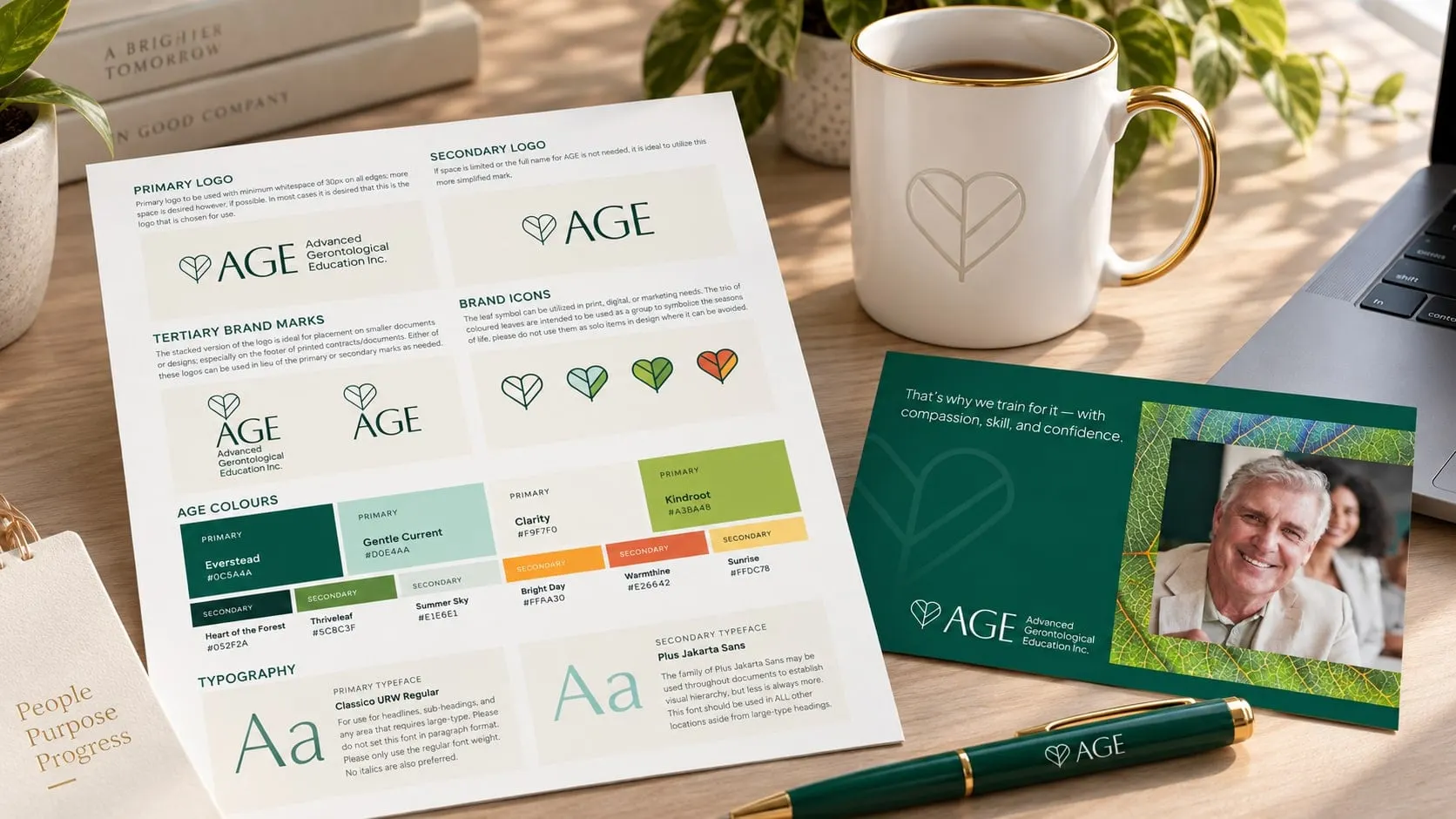
A rebrand and new website for AGE Inc., the Canadian organization behind GPA dementia care education, with a leaf-heart identity and a site built around training and certification.
01 — Context
25 years of dementia care education, ready for a fresh face
AGE Inc. (Advanced Gerontological Education) has spent more than 25 years advancing dementia care in Canada. Its Gentle Persuasive Approaches (GPA) program trains long-term care staff, clinicians, students and families in person-centred care, and is delivered by certified coaches across the country.
The work is compassionate and evidence-based, and AGE wanted its brand and website to say so. We led the rebrand and designed and built a new website around how people actually find, register for and deliver GPA training.
02 — Identity
A leaf and a heart, in one line
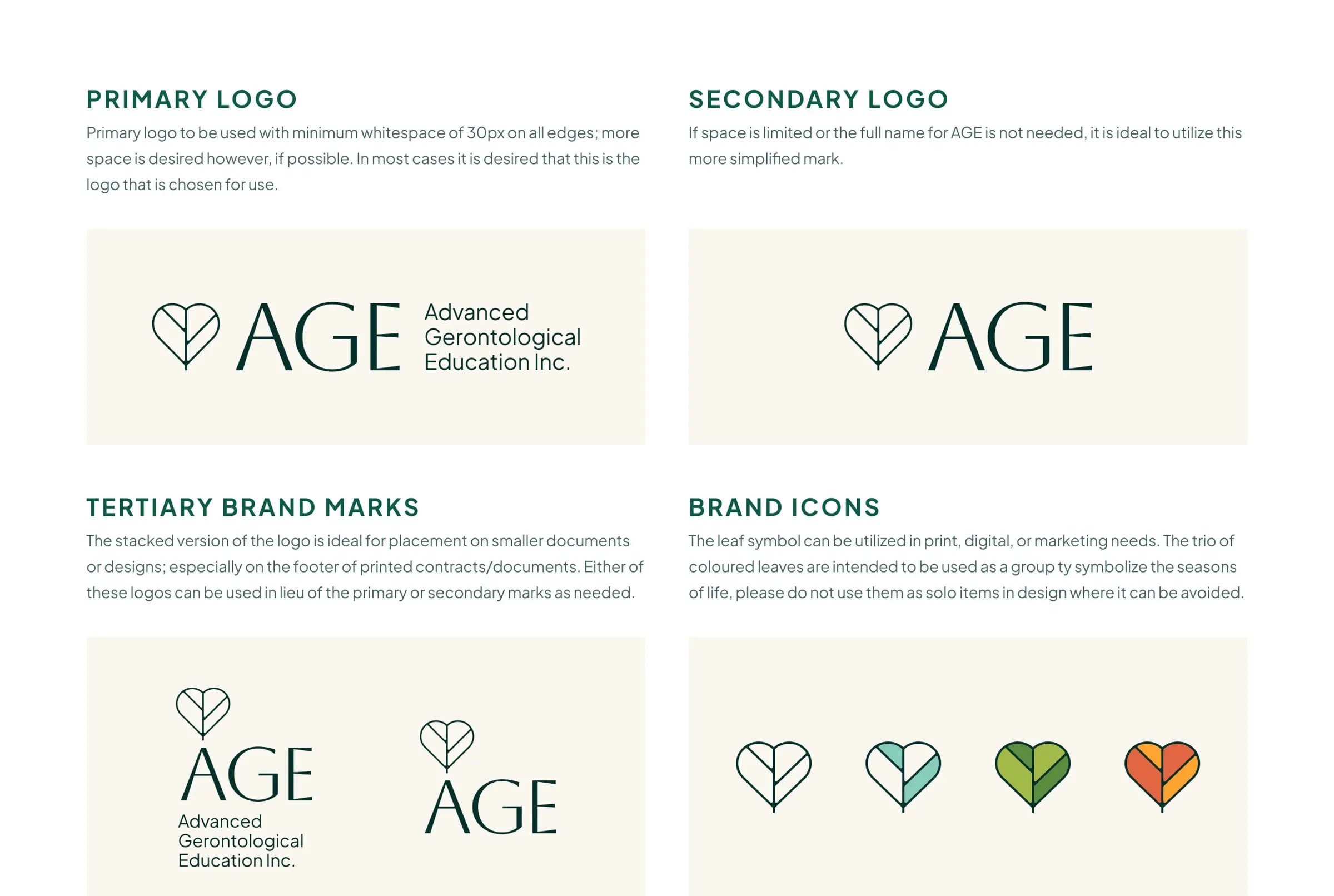
The new mark draws a heart and a leaf as a single continuous line. It speaks to compassion and to growth, and it pairs with a calm, classic wordmark. A full lockup spells out Advanced Gerontological Education Inc.; a shorter AGE version and stacked versions cover smaller spaces.
The leaf also becomes a family of brand icons. Filled in different colours, the trio of leaves stands for the seasons of life, a gentle way to talk about ageing without clichés.

03 — Colour & type
Warm greens that feel caring, not clinical
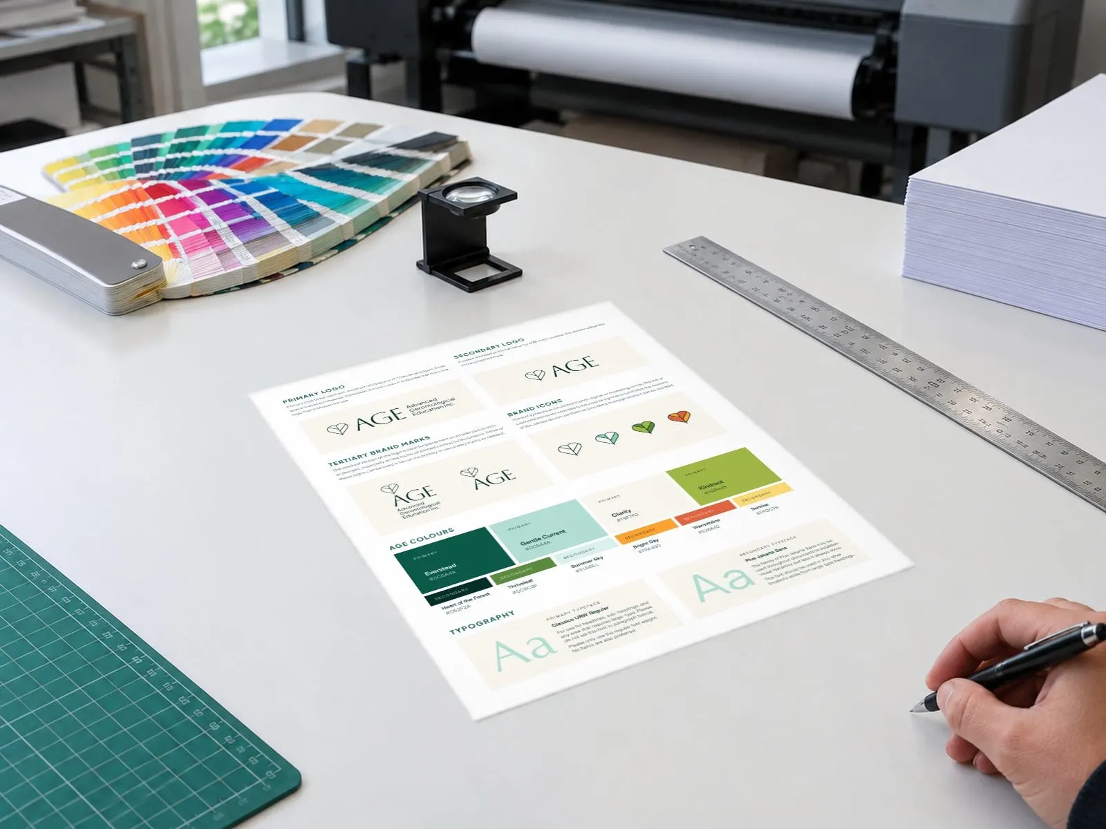
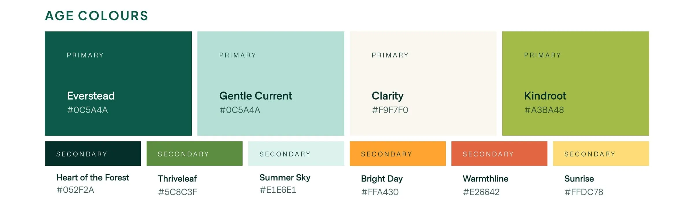
The palette leads with Everstead, a deep forest green, alongside Gentle Current, Clarity and Kindroot. Secondary colours like Heart of the Forest, Thriveleaf, Summer Sky, Bright Day, Warmthline and Sunrise add warmth for events and highlights. Classico URW handles headlines and Plus Jakarta Sans keeps body text clear and accessible.
Healthcare and education brands are judged on trust first. We share more on that in our healthcare branding and education and learning pages.
04 — Website
A website built around training and certification
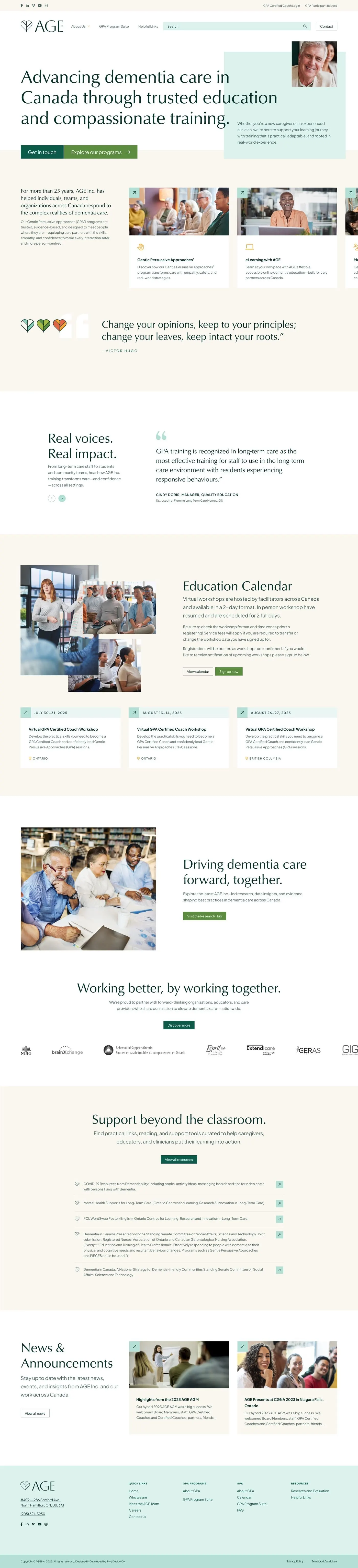
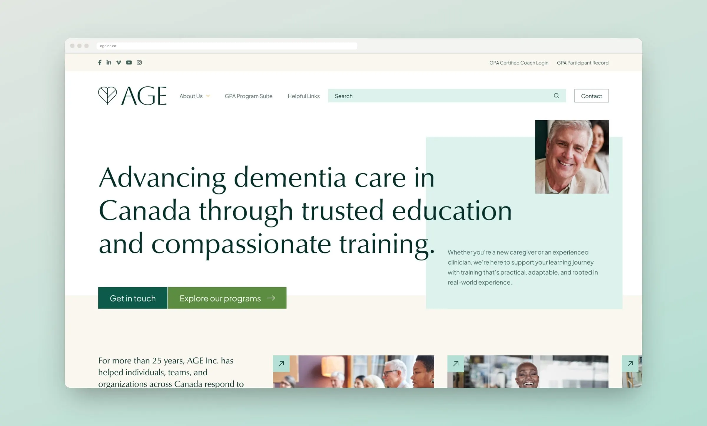
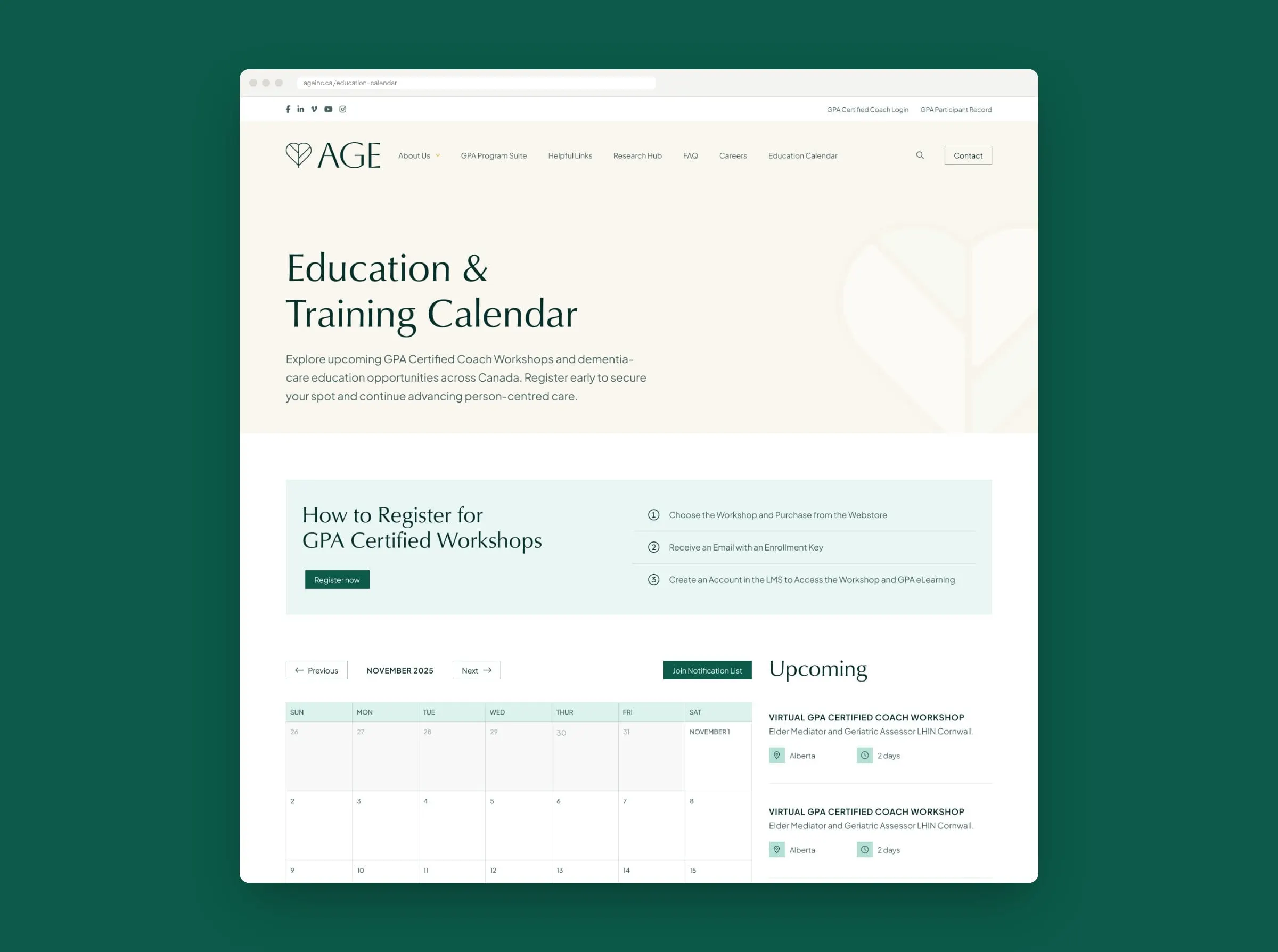
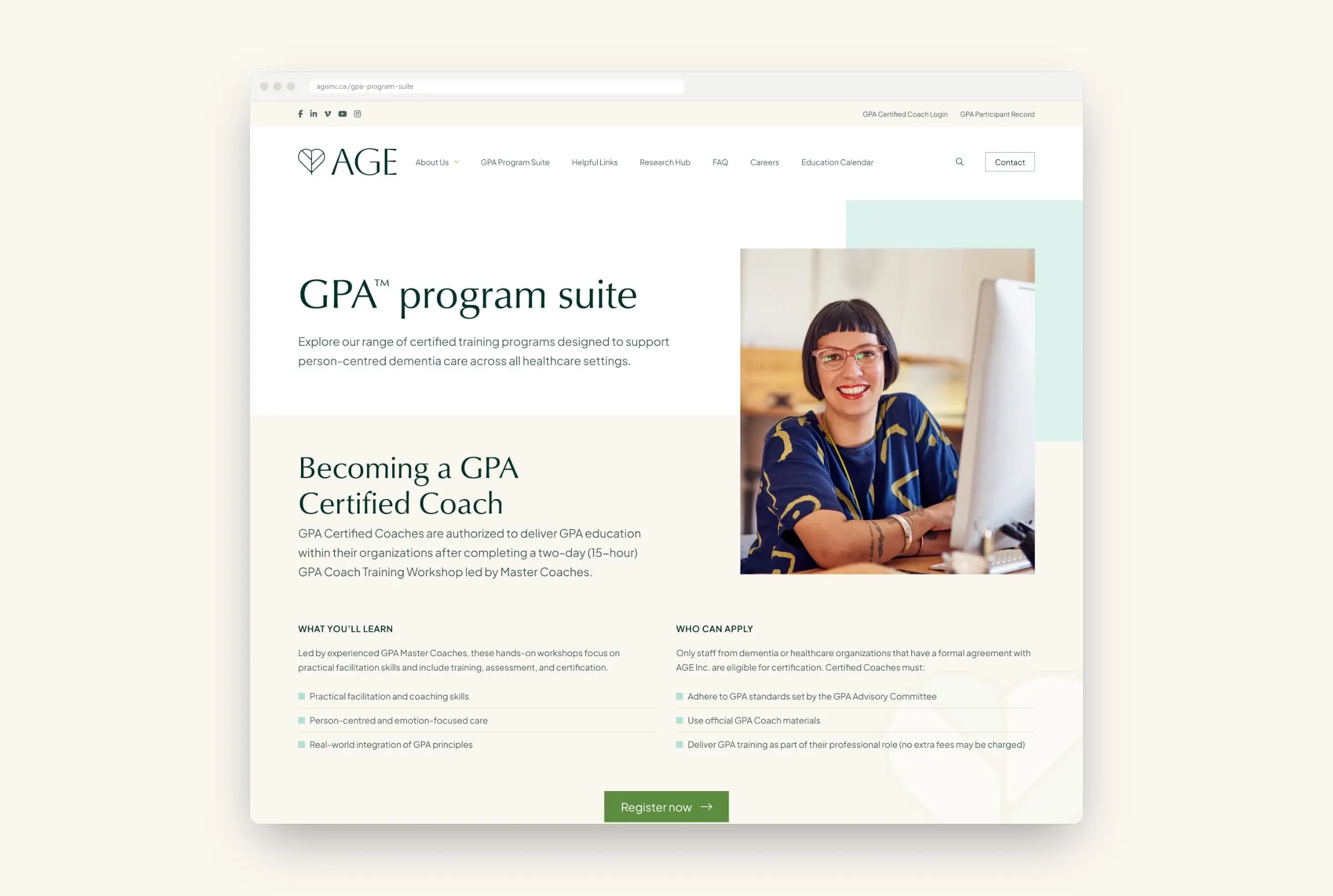
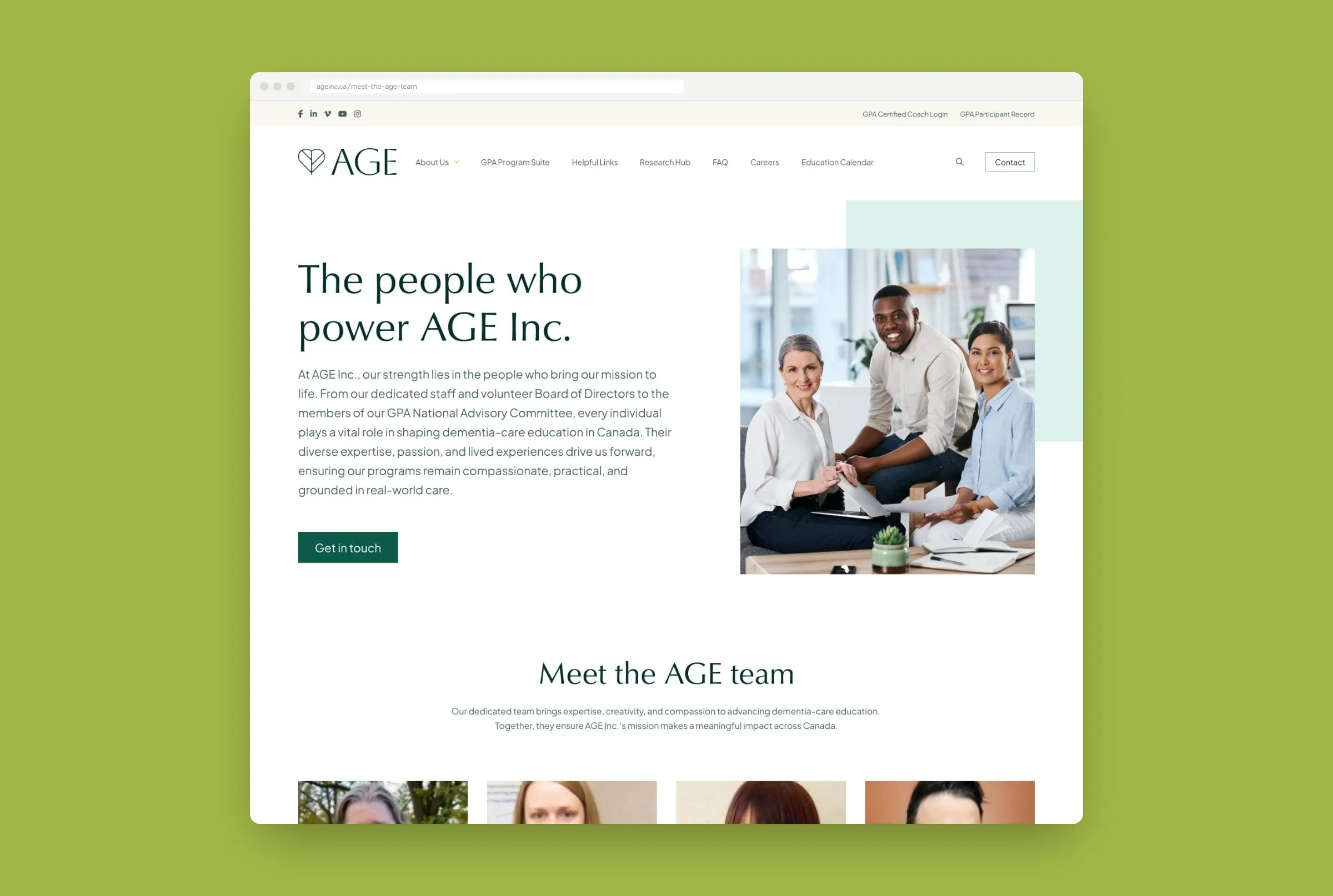
The new site is organized around what visitors come to do. Organizations learn about the GPA Program Suite; future coaches see how to become a GPA Certified Coach, step by step; and everyone can browse the Education & Training Calendar and register for upcoming workshops.
Supporting pages cover AGE's research and evaluation, helpful links for caregivers, the team and board, careers and a landing page for the learning portal. It reflects the approach in our healthcare website redesign checklist and accessibility guide.
05 — Related
More healthcare work
See how we have helped other care providers, including Oasis Health Care, Rosalie Hall and Further Learning Group.