Case study · COVRD Apparel
COVRD Apparel
A brand built from the ground up for COVRD Apparel, a new-to-market fashion label: an elegant serif wordmark, a CA monogram, social templates and a website look.
01 — Context
Fashion brand identity design for a new-to-market label
COVRD Apparel is an up-and-coming clothing brand that came to us looking for a brand built from the ground up. Its range was deliberately varied, so the team needed a versatile logo and identity that would let very different pieces shine — and still be memorable and beautiful in its own right.
Our fashion brand identity design work started with the market. We looked at the competitive landscape COVRD was entering and shared insights on where the brand could stand apart, then made a strategic case for how colour should be used. The result became the basis for the branding and identity, social content and the look of the website.
02 — Identity
A quiet wordmark that lets the clothes talk
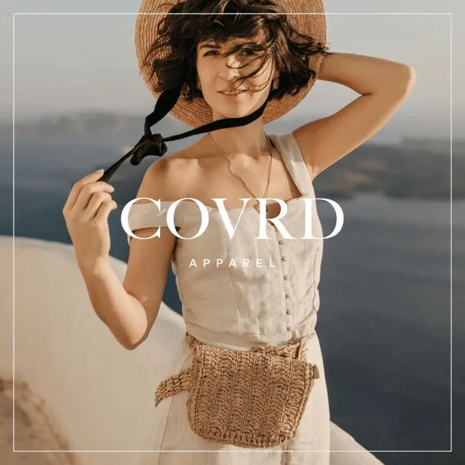
Fashion logos have to work hard while appearing to do very little. They sit on labels, swing tags, product photos and phone screens, often over busy images. We designed the COVRD wordmark in a high-contrast serif with generous letterspacing, paired with the word APPAREL set small in a tracked sans-serif underneath. It feels editorial — closer to a magazine masthead than a streetwear logo — and stays legible in white over photography.
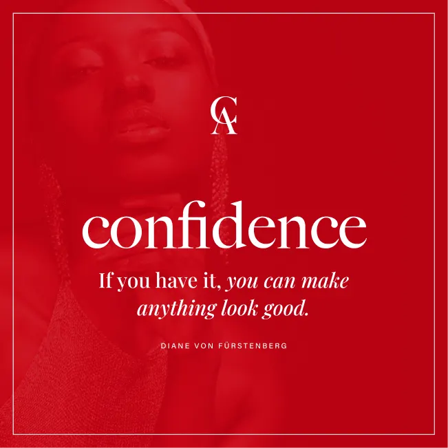
For small spaces and social avatars, we created a CA monogram: a C and an A interlocked so the curve of one frames the point of the other. It works on its own on a warm gold background or tucked into a corner of a post.
Colour does the rest. Rather than locking COVRD into one signature shade, the strategy uses a neutral base of black, white and warm gold, with bold accent colours like a rich red brought in for campaigns. That keeps the brand recognizable across very different collections, the kind of consistency we explain in why a cohesive brand matters.

03 — Social and web
Social posts and a website with editorial calm
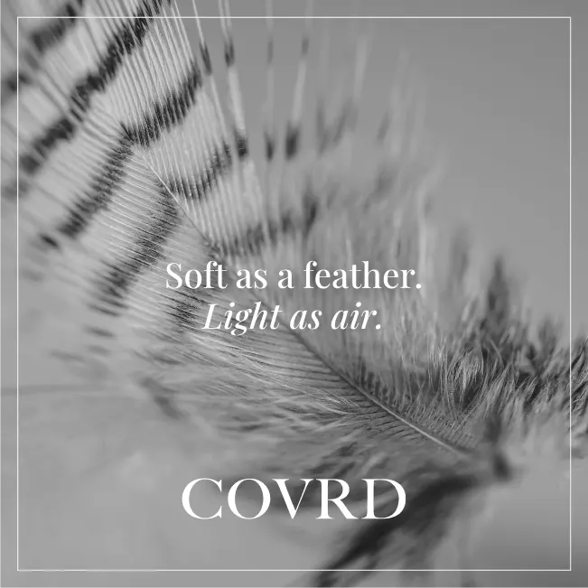
A new apparel brand often meets its first customers on Instagram, so we designed a set of social media templates that carry the identity into the feed. A thin inset frame runs around every post, giving launch images, quote posts and product teasers the same finish. A red quote post pairs the monogram with a line about confidence; a black and white feather image carries the tagline "Soft as a feather. Light as air." — a nod to how the clothing should feel.
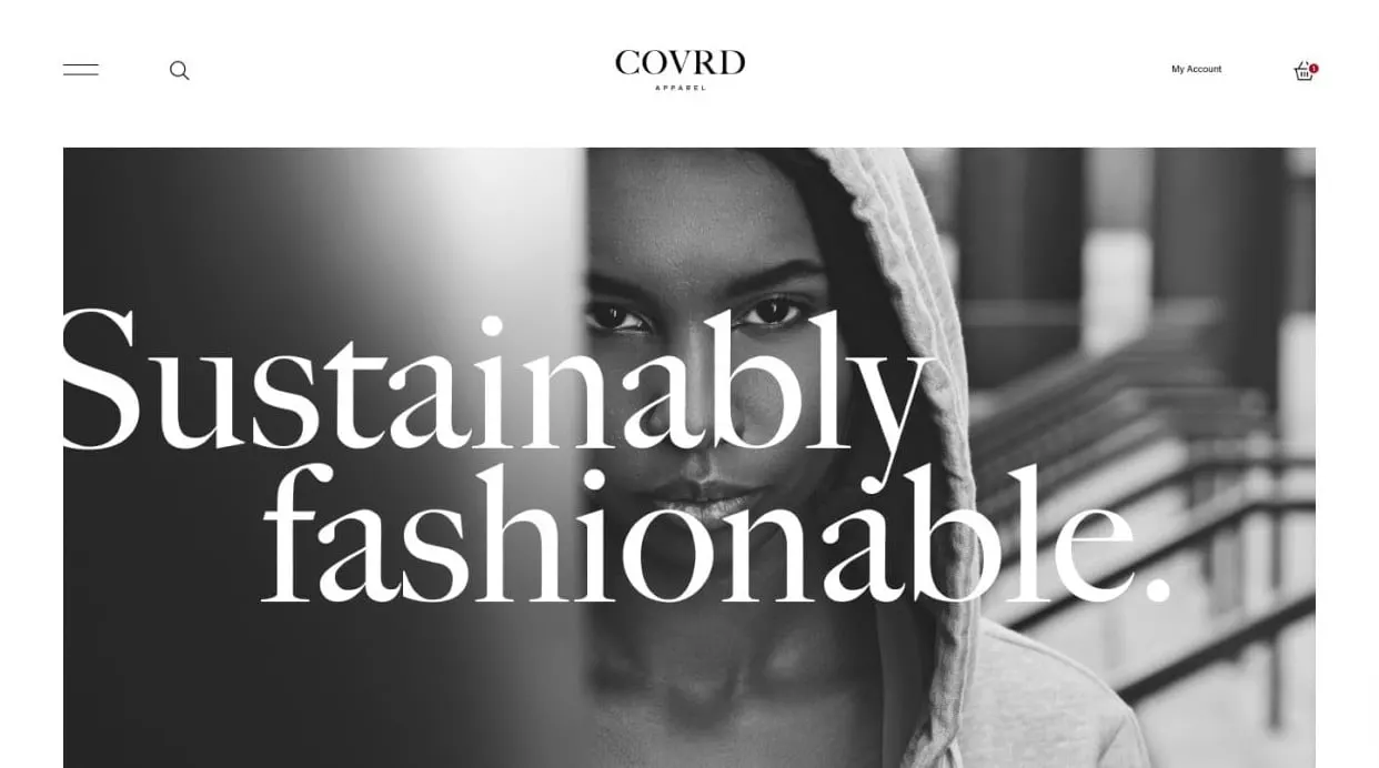
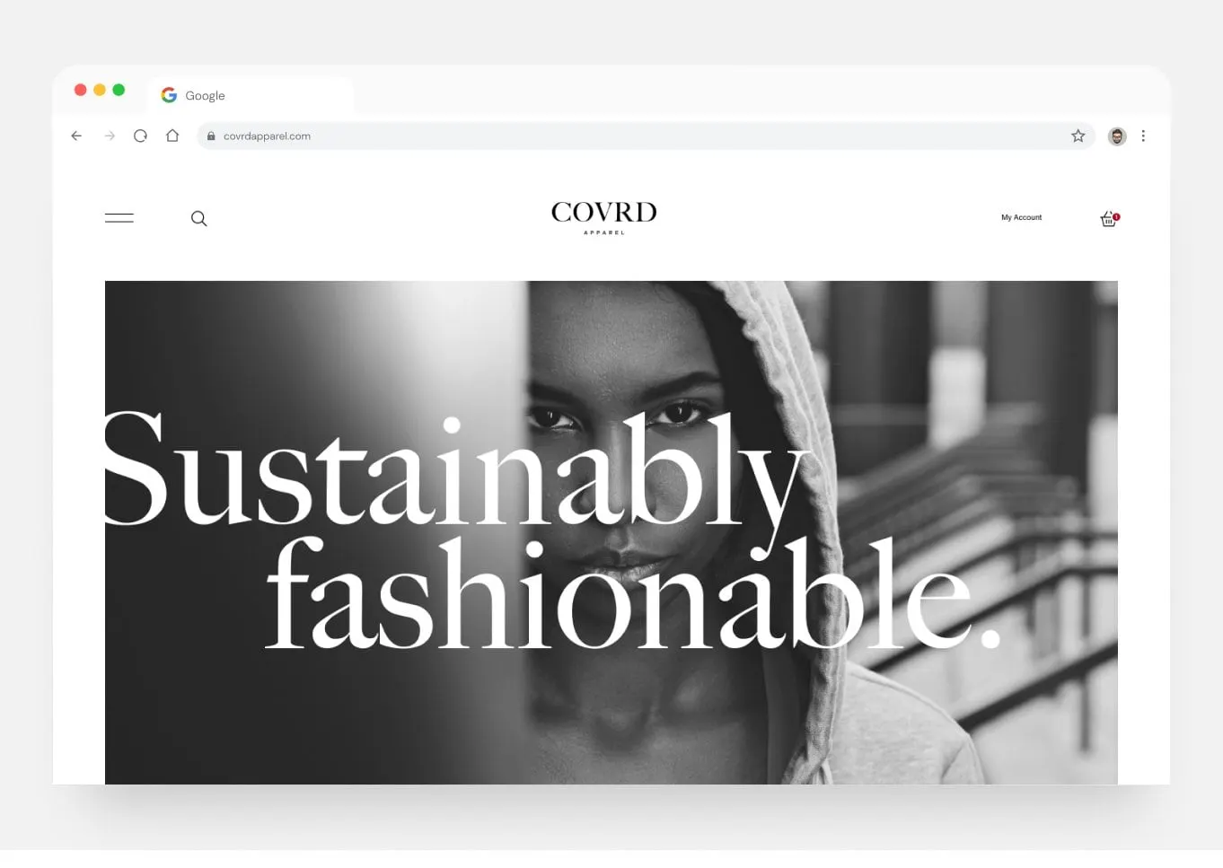
For the website design, we kept the same restraint: a centred wordmark, a clean header with search, account and basket, and a full-width black and white hero with "Sustainably fashionable." set in oversized serif type. The design leaves room for the product photography to lead.
COVRD came away with a brand the team is thrilled with and believes will support their product well. For more work with startups and emerging brands, see our brand and packaging project for Esme + Sita.