Case study · Guidelight Health
Guidelight Health
A cohesive visual identity and strategic messaging for a health startup.
01 — Context
Behavioural health branding built on one simple promise
Guidelight Health provides intermediate levels of mental health care — Partial Hospitalization Programs (PHP) and Intensive Outpatient Programs (IOP) — for adults, with adolescent programs planned. Its founders saw a gap: many providers focus on inpatient care, leaving people who need more than a weekly appointment but less than a hospital stay with few options.
Guidelight came to us before launch, and we partnered with them from brand discovery onward. The scope covered foundational brand strategy and behavioural health branding, the visual identity, the website from a first MVP to a full-scale site, print collateral, in-session materials and environmental design. Everything needed to say the same thing to a person who is often arriving at a hard moment: you are welcome here, and there is a clear path forward.
That idea became the line that runs through every touchpoint: Everyone has a seat at Guidelight.
02 — Identity
A lighthouse, a shield and a forest-and-gold palette
The name did a lot of the work. A guiding light suggested a lighthouse, but a literal lighthouse can feel nautical or cold. We drew a compact emblem instead: a lighthouse tower rising from a shield shape, with a fan of rays behind it, all contained in an arched badge. The shield says safety and protection; the rays say hope. It's simple enough to read at favicon size and still feels crafted when it's printed large.
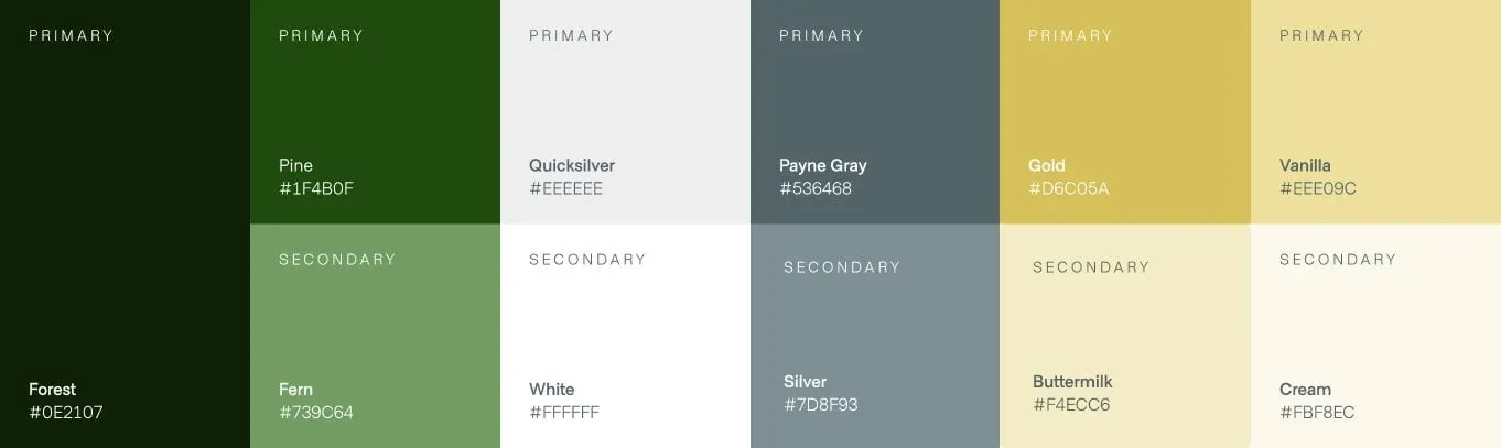
We paired the emblem with a clean, modern sans-serif wordmark in deep green, and set headlines in a warm serif with italic accents so the brand voice feels human rather than clinical. As part of our branding and identity design work, we built a palette that steers away from the usual hospital blues. Forest and Pine greens carry the brand. Gold, Vanilla, Buttermilk and Cream add warmth. Payne Gray, Silver and Quicksilver handle text and quiet backgrounds. The effect is calm, grounded and premium — closer to a well-run wellness centre than a medical facility.

03 — Website
A website that makes the first step feel small
People often reach a PHP or IOP provider through a referral or a search made at a difficult time. The website design had to answer three questions fast: what is this, is it for me, and how do I start?
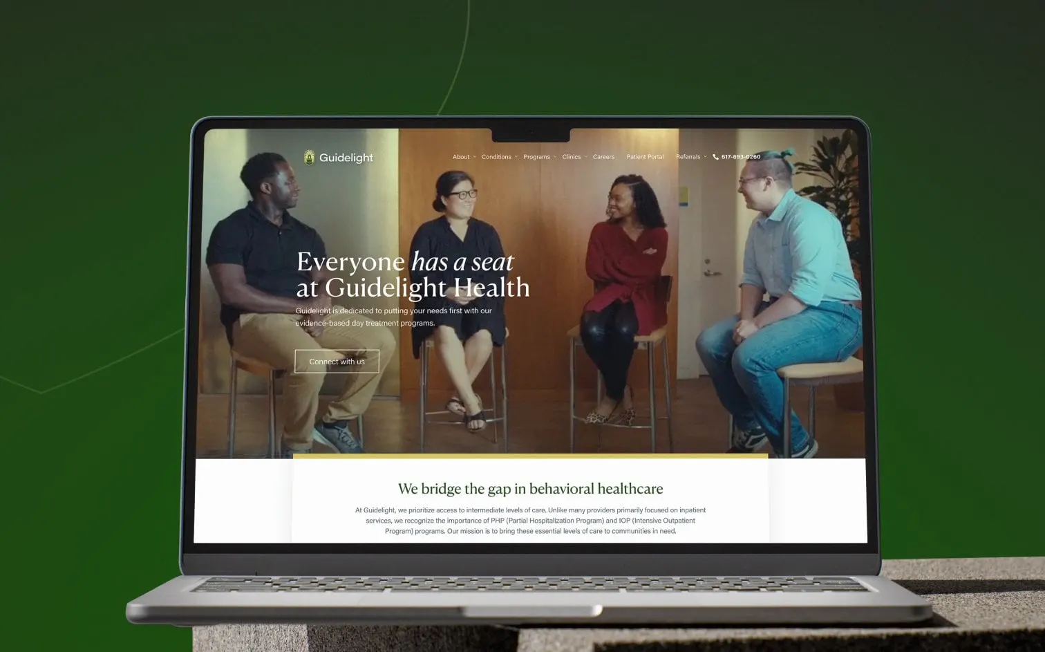
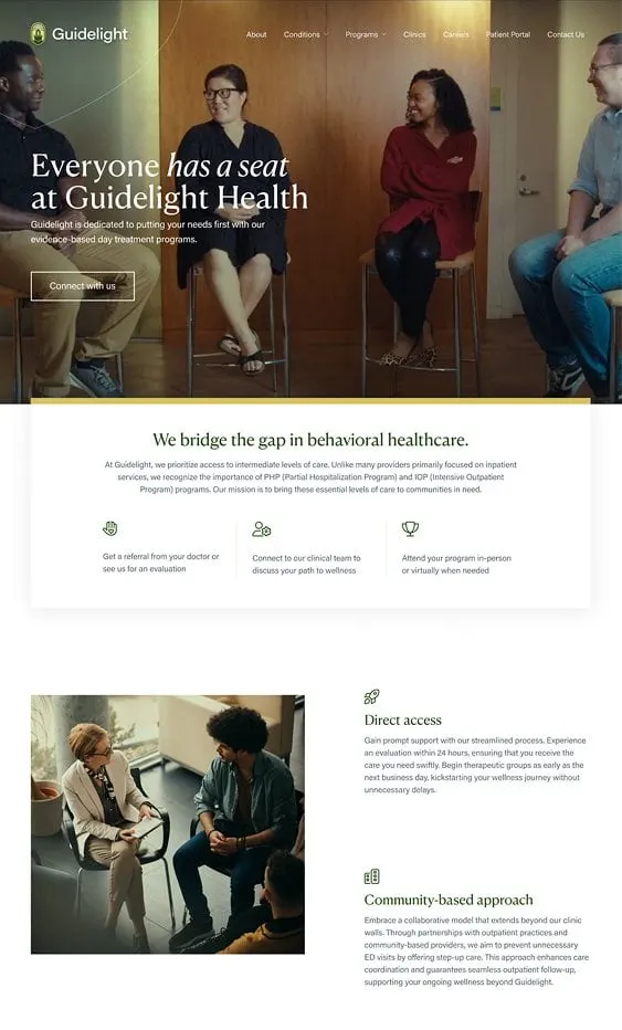
The home page leads with a full-width photo of a therapy group and the headline "Everyone has a seat at Guidelight Health," with one button: Connect with us. Directly below, a white panel with a gold top edge explains the gap Guidelight fills and breaks the process into three steps — get a referral or an evaluation, connect with the clinical team, attend in person or virtually.
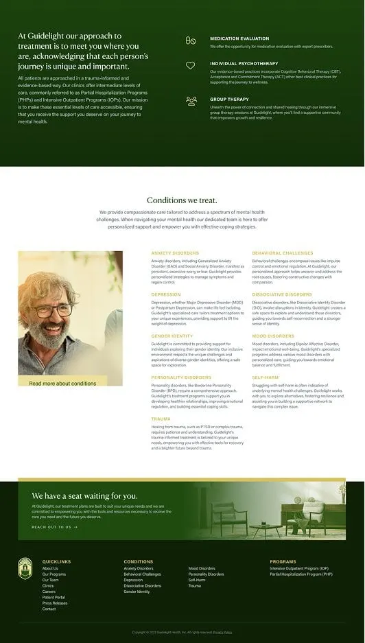
Further down, sections on direct access and a community-based approach explain how quickly people can be seen and how Guidelight works with outpatient partners. A deep green band introduces the core services: medication evaluation, individual psychotherapy using CBT, ACT and other evidence-based practices, and group therapy. A "Conditions we treat" grid then lists anxiety, depression, trauma, mood and personality disorders, self-harm and more, each with a short, plain description. The footer repeats the conditions and programs so no visitor has to hunt.
We started with an MVP so Guidelight could launch quickly, then grew it into the full site through our website development team.
04 — Print and in-session materials
Brochures, cards and slides that feel like the clinic
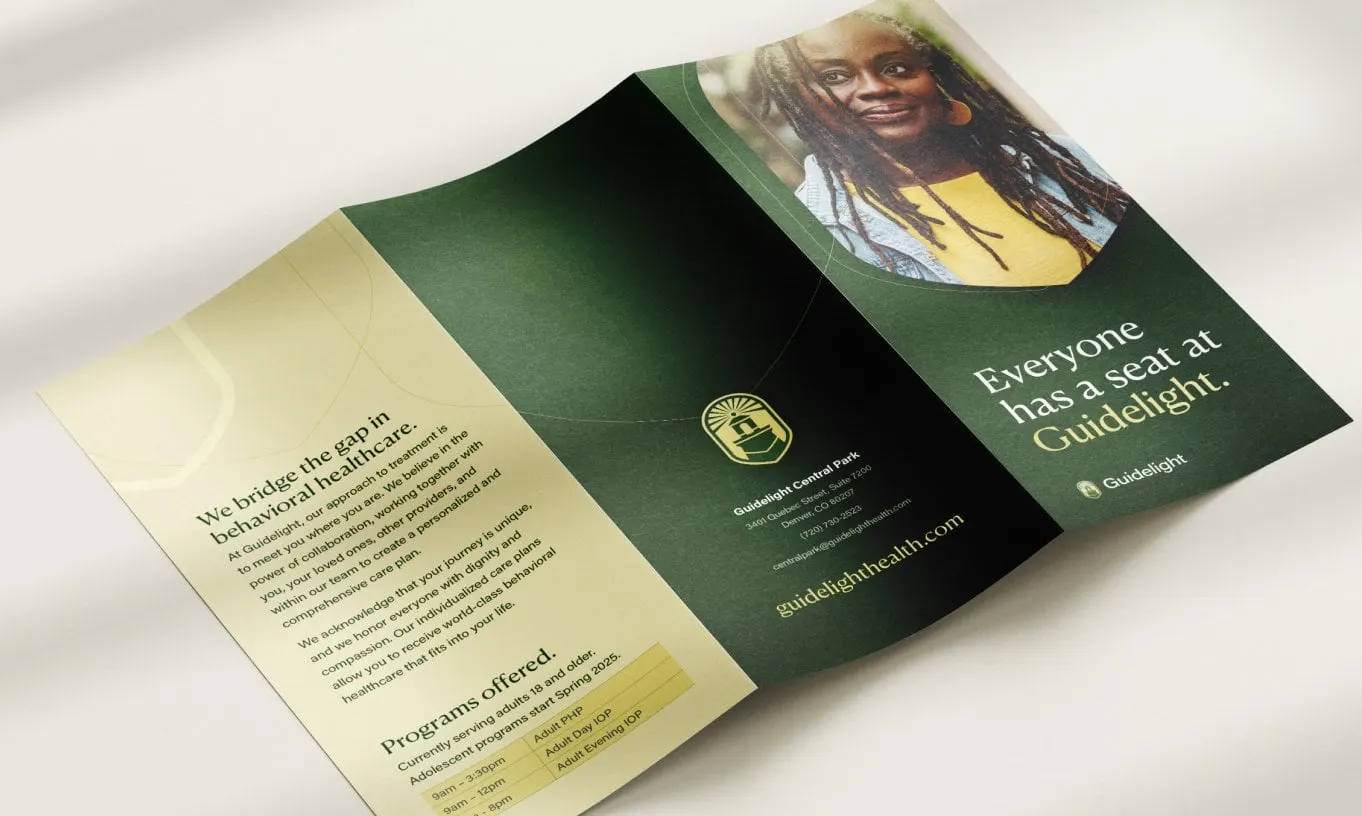
A behavioural health brand lives offline as much as online — in referral meetings, intake rooms and group sessions. We designed a tri-fold brochure that opens on a warm portrait and the line "Everyone has a seat at Guidelight," with an inside panel in Vanilla that explains how Guidelight bridges the gap in behavioural healthcare and lists the programs offered. A thin gold line and the emblem tie the panels together.
Business cards come in two finishes — cream for the front, forest green with the wordmark for the back — so staff hand over something that feels considered. We also designed presentation slides as part of the in-session materials, with slides introducing the co-founders, Rapid Access (clinical evaluation within 24 hours and admission the next business day when clinically appropriate), evidence-based care and community partnerships.
Because brand, web and print were designed together, Guidelight launched with one consistent voice. That's the case we make in why branding and web design should happen together. For more healthcare work, see Oasis Health Care.
What we delivered
A complete brand and launch toolkit for Guidelight Health.
- 01Brand strategy and identityPositioning, lighthouse emblem, wordmark, typography and colour palette.
- 02Website design and developmentAn MVP launch site, then the full-scale Guidelight Health website.
- 03Brochure and print collateralTri-fold brochure and business cards.
- 04In-session and partner presentationsBranded slides introducing the team, access model and approach to care.
- 05Environmental designBrand applications for Guidelight's physical spaces.