Case study · Leslie & Ryan
Leslie & Ryan
A watercolour wedding invitation suite, envelope stickers and a hardcover photo book for Leslie and Ryan, designed around our own engagement and wedding photography.
01 — Context
One wedding, one visual thread
Leslie and Ryan were planning an October wedding in Callander, Ontario, and they wanted everything their guests touched to feel like it belonged together. That meant custom wedding invitation design, matching RSVPs, round stickers to seal the envelopes, and later a printed photo book to hold the story of their engagement and their wedding day.
We were in an unusual position on this project. We designed the stationery, and we also took the engagement and wedding photography that would fill the book. That let us plan the whole thing as one piece of graphic design rather than a set of separate orders: the palette, flowers and type on the invitation could carry straight through to the final page.
02 — The invitation suite
Watercolour florals with a rustic edge
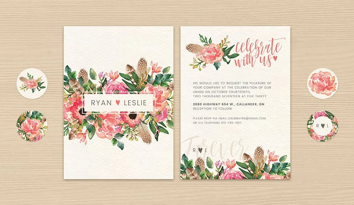
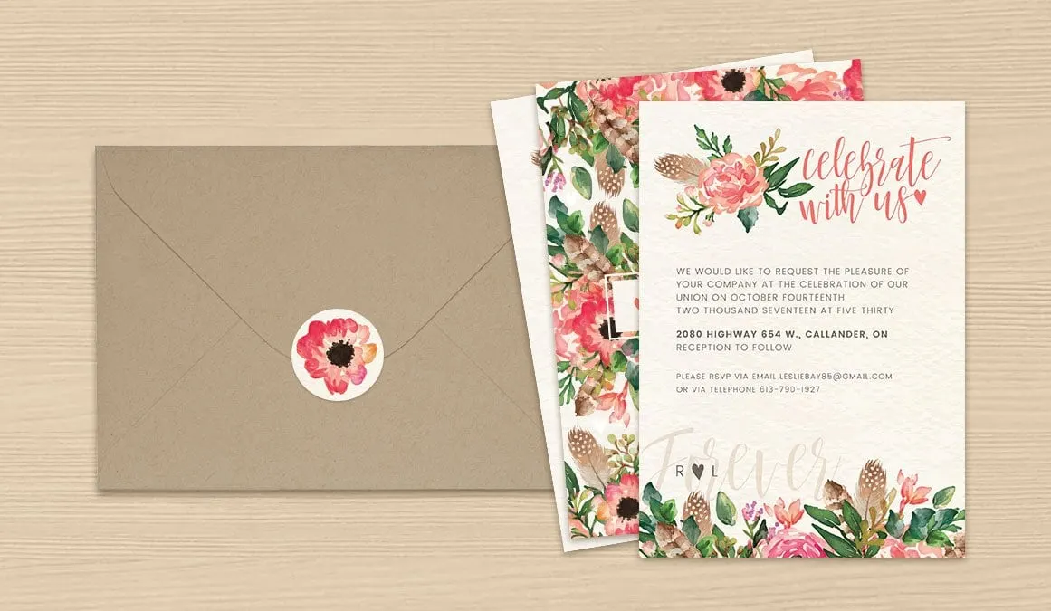
The couple wanted something warm and romantic without being precious. We built the invitation around hand-painted watercolour florals in coral, blush and peach, mixed with deep green leaves and speckled brown feathers. The feathers bring a little of the outdoors in, which suited a wedding held up north.
The front frames their names, Ryan and Leslie, in a simple white panel with a coral heart between them. The back opens with a hand-lettered "celebrate with us" in coral script, sets the event details in spaced capitals for easy reading, and finishes with a large, faint "Forever" behind an R and L monogram.
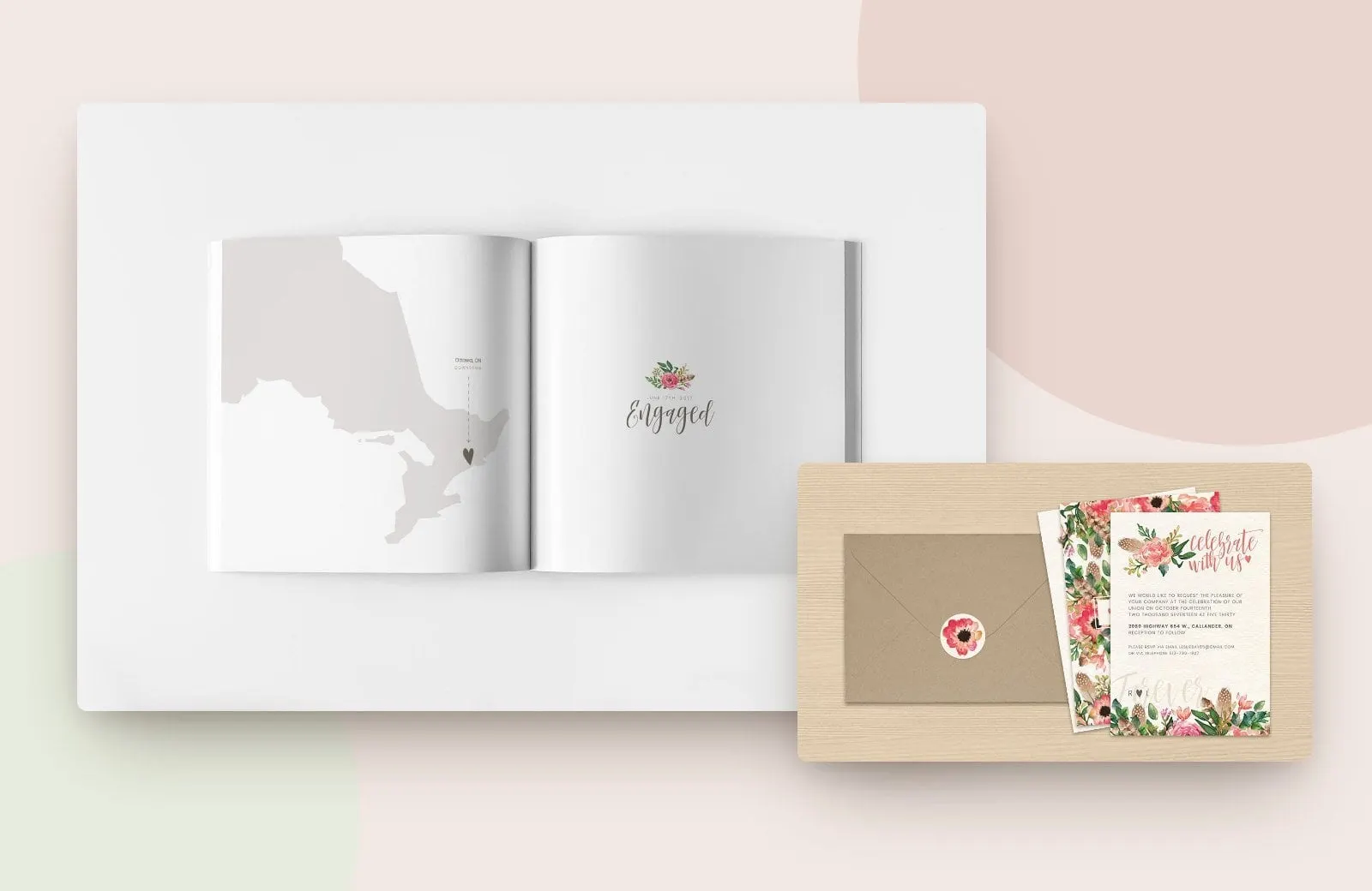
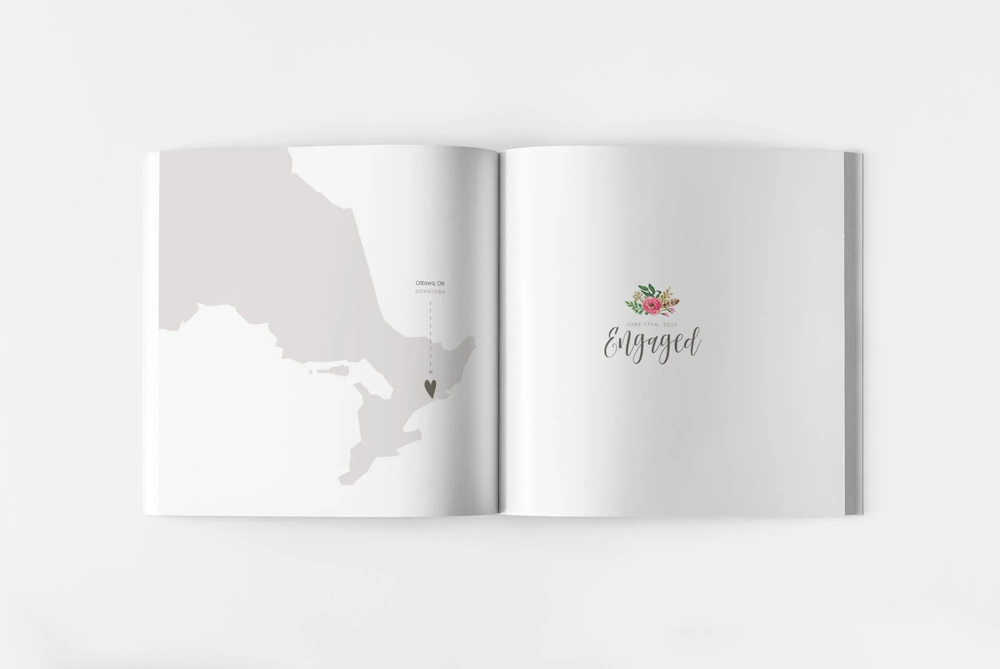
For the print pieces we chose an off-white, textured card stock and a kraft envelope. The round stickers come in four versions, including the monogram and single blooms, so each envelope could be sealed with a small piece of the same artwork. The same floral cluster then reappears on the opening page of the photo book, right above the word Engaged.
03 — The photo book
Pacing a photo book like a story
A wedding album can easily turn into a grid of every photo ever taken. We treated Leslie and Ryan's book as publication design instead, with a beginning, a middle and a quiet rhythm from spread to spread.
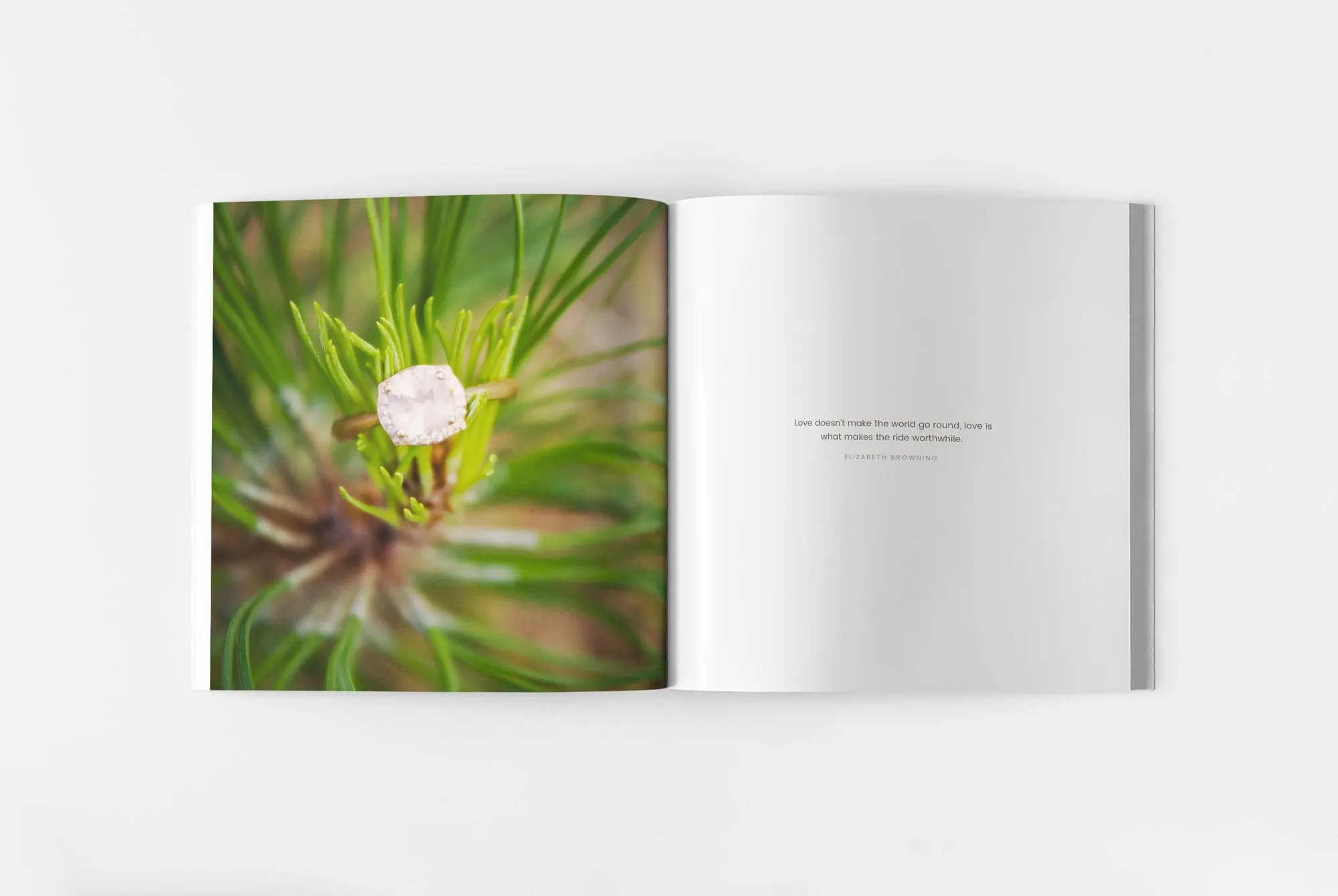
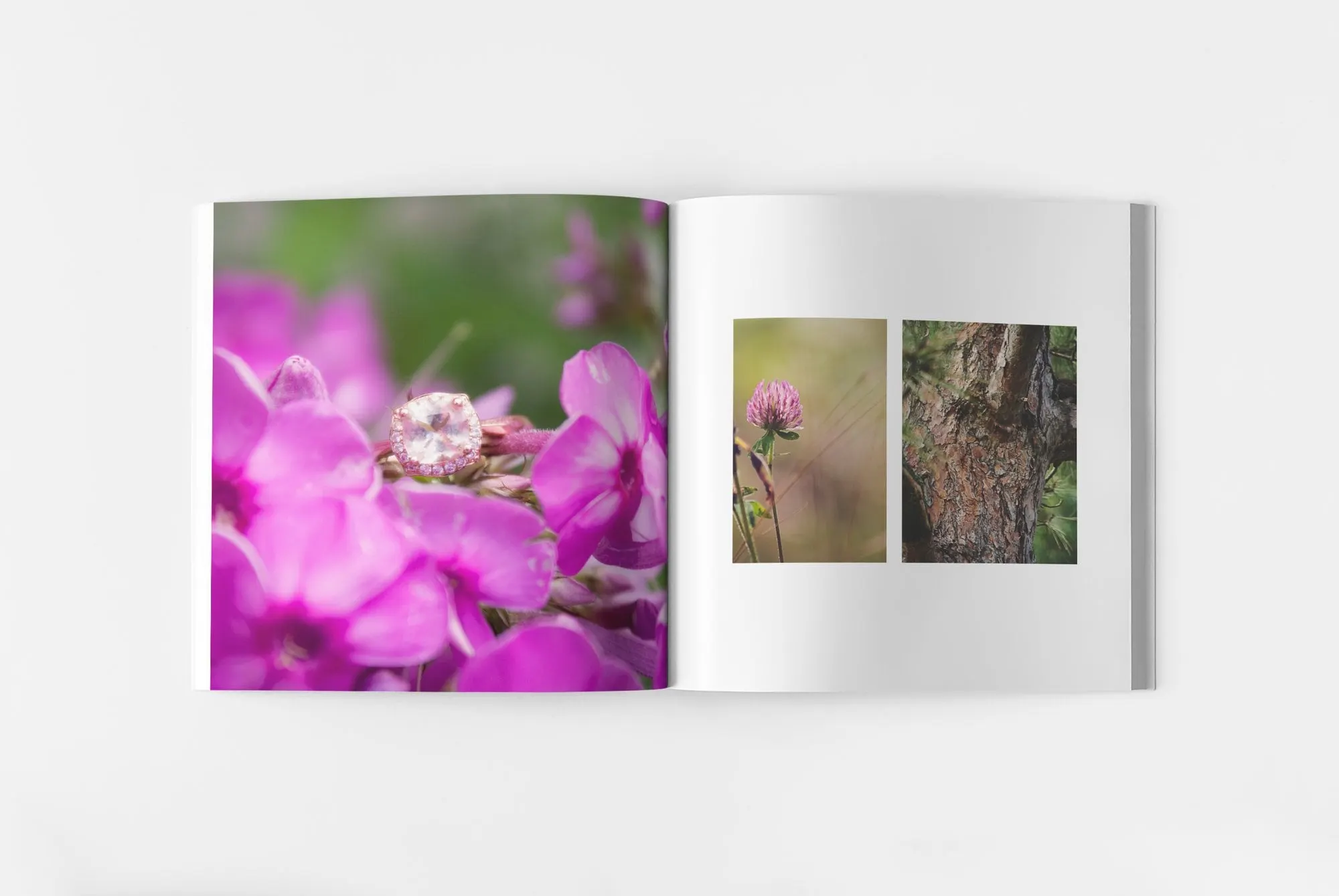
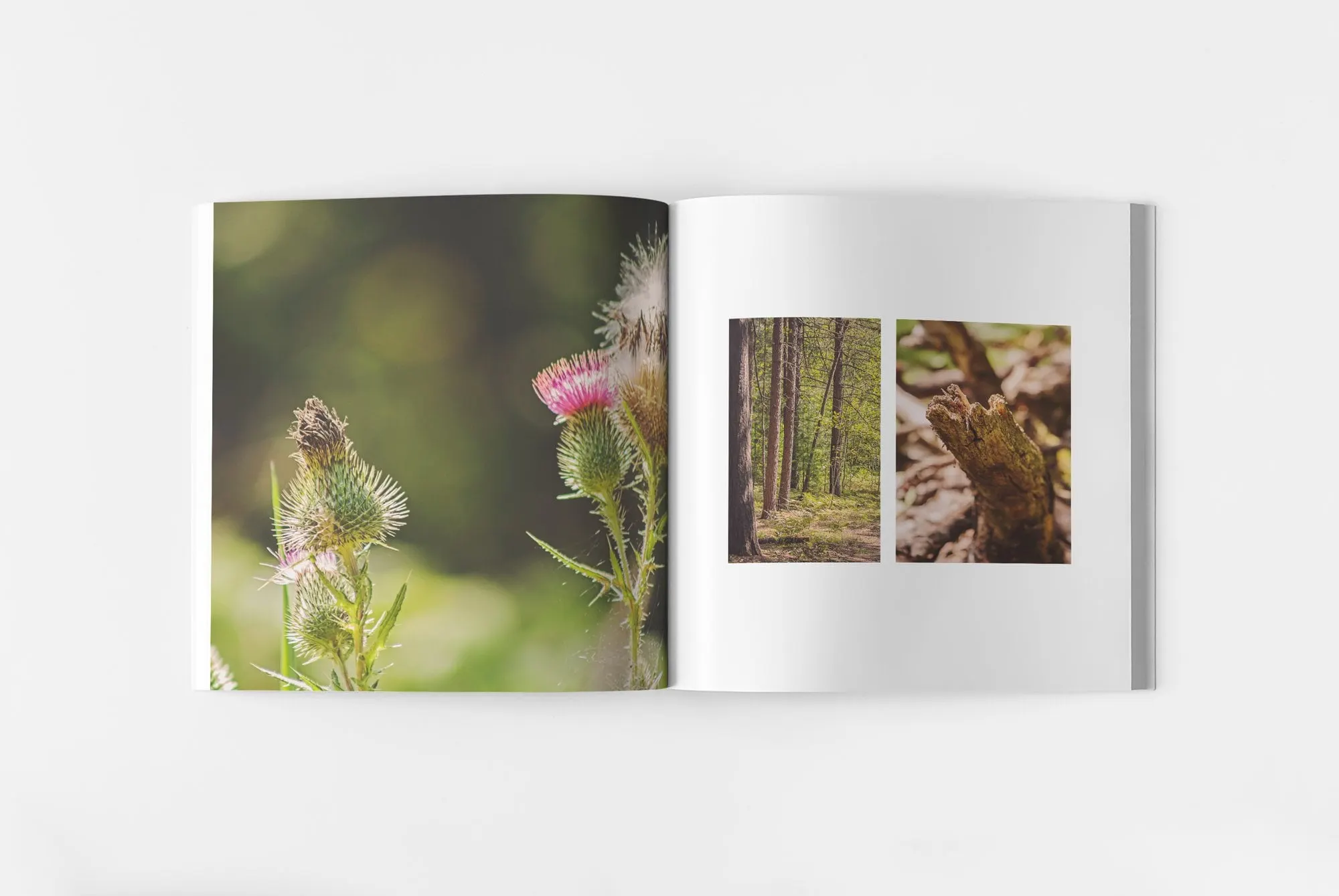
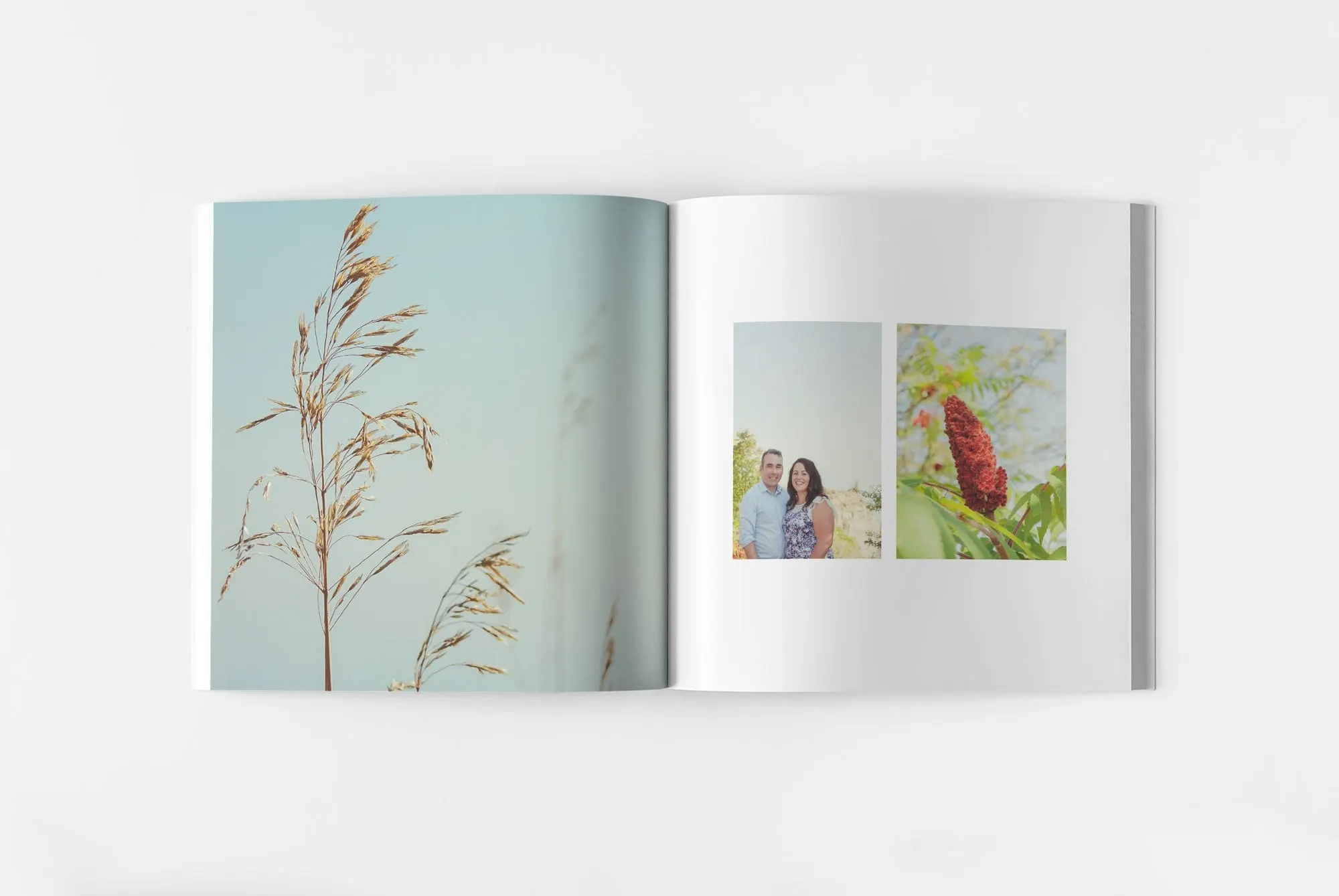
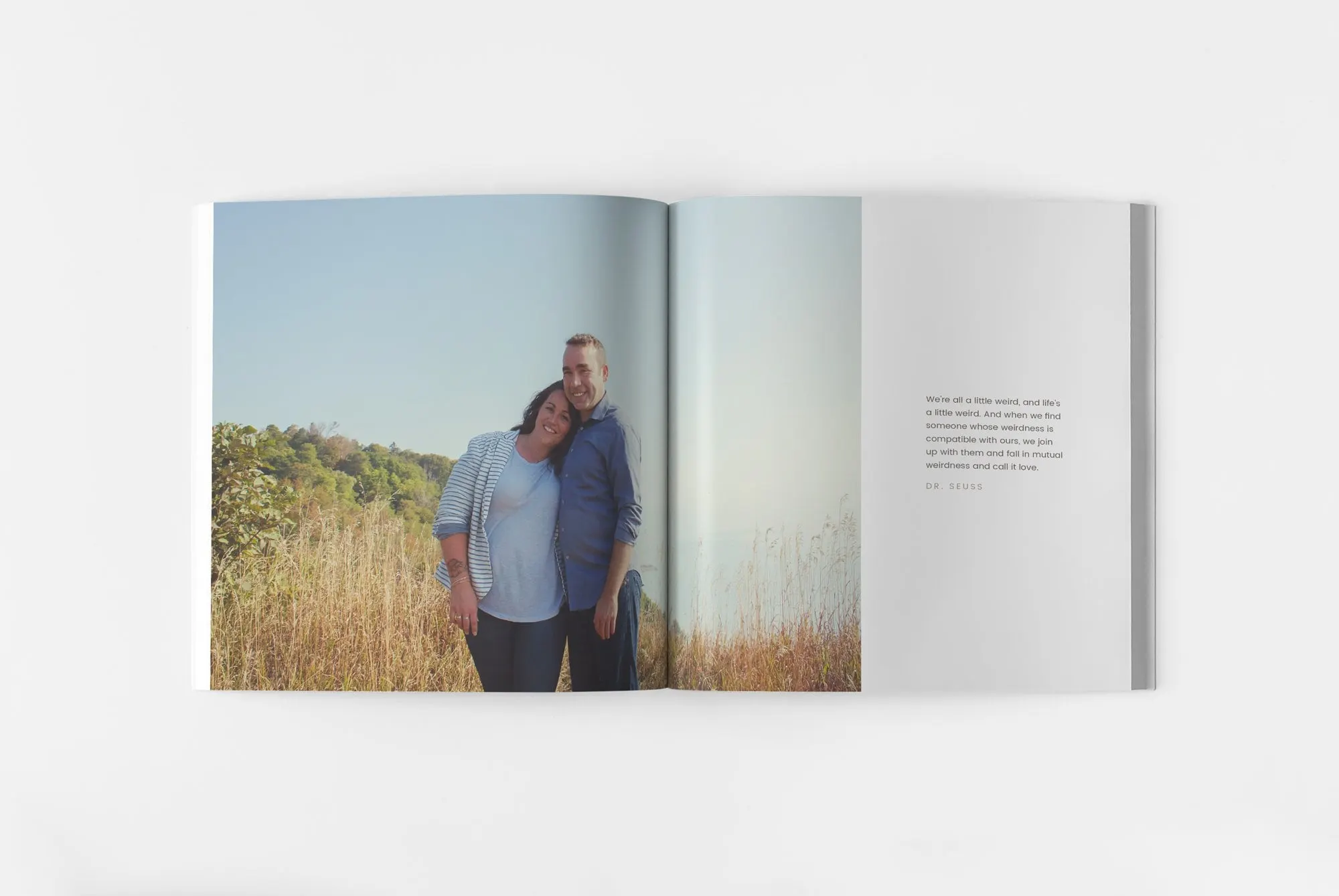
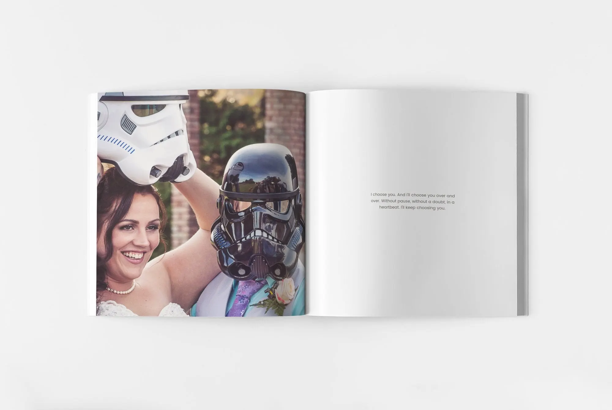
Most spreads follow a simple pattern. One side carries a full-bleed photograph: a ring in pine needles, a thistle in soft focus, backlit wild grass, a bluff above the lake. The other side is mostly white, holding either a pair of small photos or a single short quote about love set in small grey type. That contrast gives each big image room to breathe and slows the reader down.
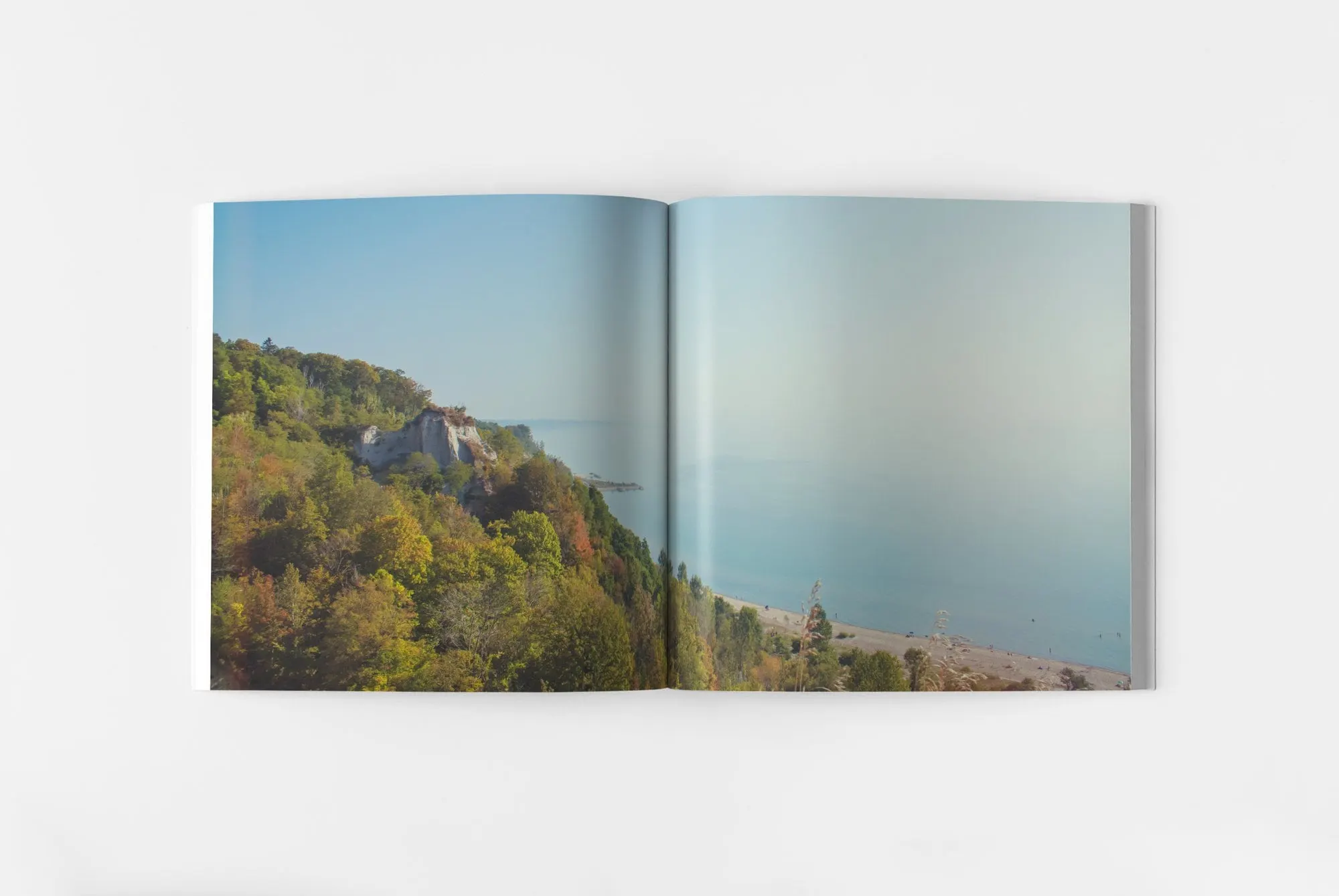
The landscape spreads are where we let the photography do the most work. One runs a wide view of a tree-covered bluff and open water across both pages, with no text at all. It's a pause between the details and the portraits, the way a wedding day has its own quiet moments.
Because we shot the images knowing they were headed for a square book, we could plan for that format: close-ups with clean backgrounds for full-page use, and verticals that sit neatly as pairs.
04 — The wedding day
Leaving room for the couple's personality
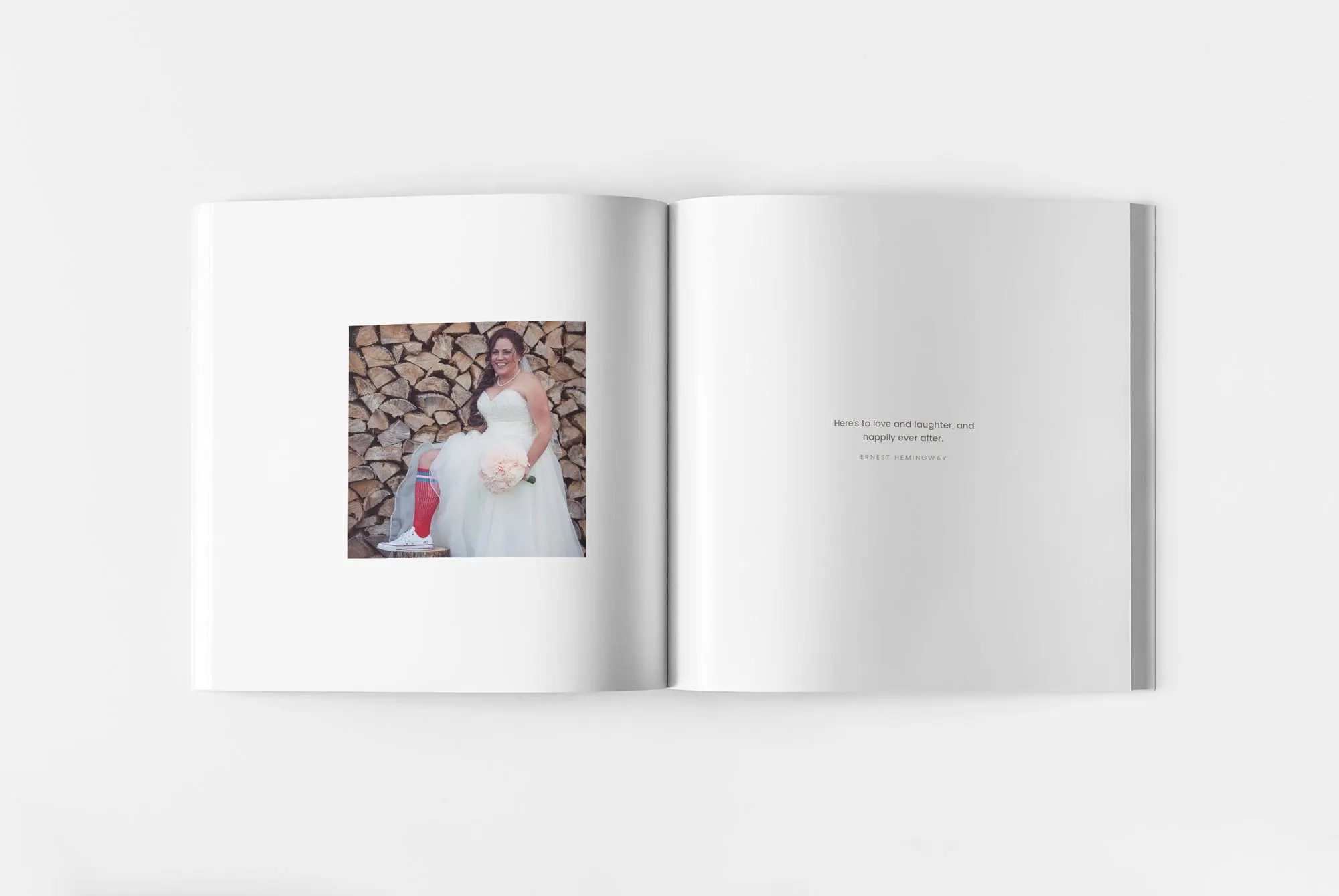
The wedding half of the book is where Leslie and Ryan's sense of humour shows. The bride sits in her gown in front of a wall of stacked firewood, with a red sock and white sneaker peeking out from under the tulle. In another spread she lifts a white stormtrooper helmet while the groom wears a black one, a moment we gave a full page.
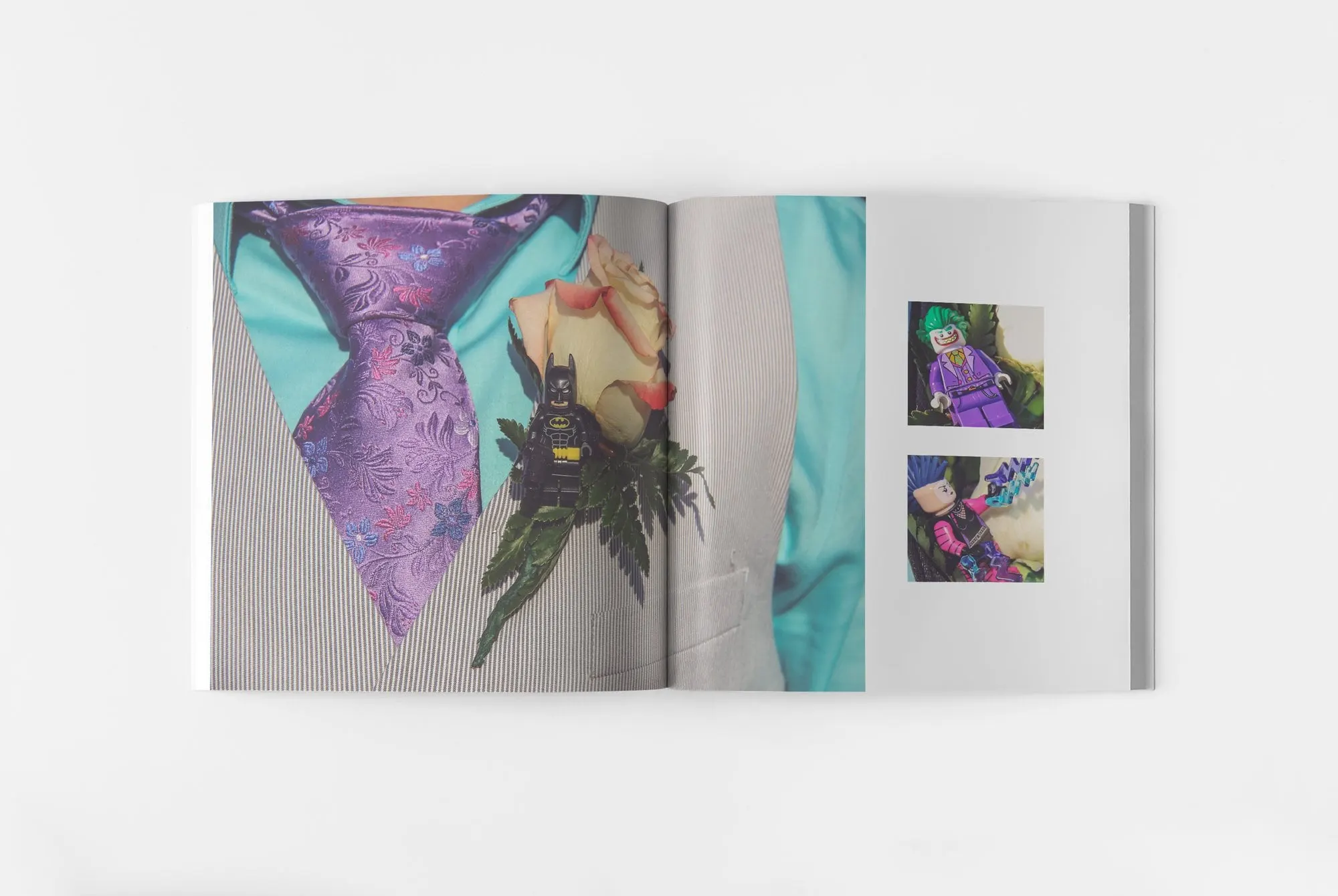
The detail shots carry the same playful thread. The groom's purple floral tie and rose boutonniere fill one spread, with a LEGO Batman minifigure tucked into the flowers, and the facing page adds two small close-ups of more minifigures from the day.
The design stays out of the way here. The same white pages, small grey quotes and generous margins from the engagement section hold everything together, so the book feels calm even when the photos are loud. It's the same idea behind why a cohesive brand matters for a business, applied to one couple's day.
Small projects like this get the same care as our business work. Whether it's a wedding suite or the logo and cards we made for Le Petit Bowtique, a crafting company that sells custom hair bows, the goal is the same: every piece should look like it came from the same hand.
What we delivered
A coordinated wedding stationery and keepsake set, from first invitation to finished album.