Case study · True Interactive
True Interactive
A clear, confident website for a digital marketing group.
01 — Context
Digital marketing agency website design for True Interactive
True Interactive is a digital marketing agency: a team of seasoned marketers running paid search and shopping, retail media, programmatic, paid social and analytics for brands. Its own brand and website were due for the same modernization it delivers for clients.
The agency came to us for a revitalization, not a reinvention. That meant a polish of the existing logo, a careful adjustment of its colours, and then the main event: a complete overhaul of its digital presence. Digital marketing agency website design is an unusual brief, because the audience is marketing directors who judge every layout, headline and button with a professional eye. We started with the brand identity, so the website would be built on solid ground.
02 — Brand refresh
Keeping the equity, sharpening the details
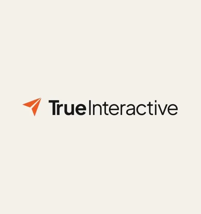
True Interactive already had recognition with its clients, so we kept the paper-plane mark and the shape of the name. The polish is in the details: a cleaner orange mark, and a wordmark that sets "True" in a heavy weight against a lighter "Interactive," so the agency's promise of honesty reads first.
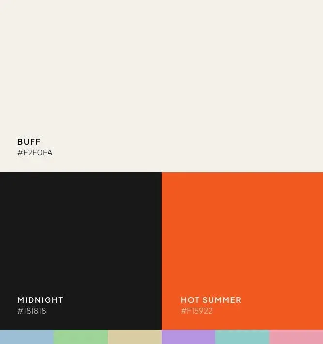
The colour change was small on paper and large in effect. We named the core palette so the team could talk about it: Buff (#F2F0EA), a warm off-white for backgrounds; Midnight (#181818) for type; and Hot Summer (#F15922), a brighter orange for calls to action. Six soft accent tints, from sky blue to blush, give the website and campaigns room to colour-code services without diluting the brand. Doing the brand and the site together is something we recommend often, and we explain why in why branding and web design should happen together.
03 — Website
A site that proves the work before it pitches it
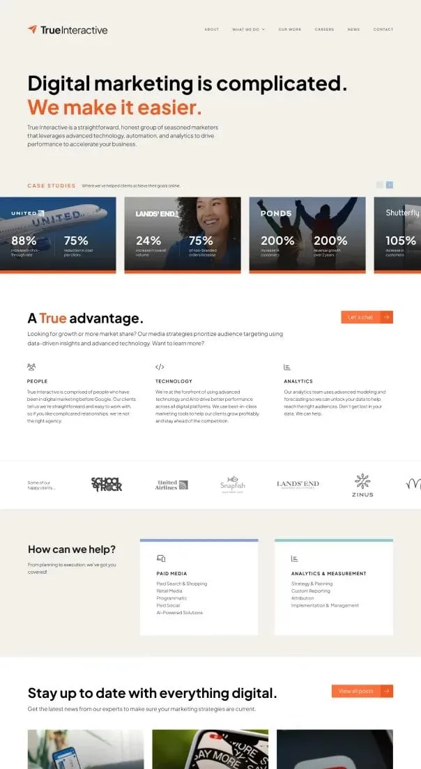
The new homepage opens with the line we built the whole site around: "Digital marketing is complicated. We make it easier." Directly under it, a row of case study cards puts client results on screen before any service description. For a marketing agency, the work is the strongest argument, so we put it first.
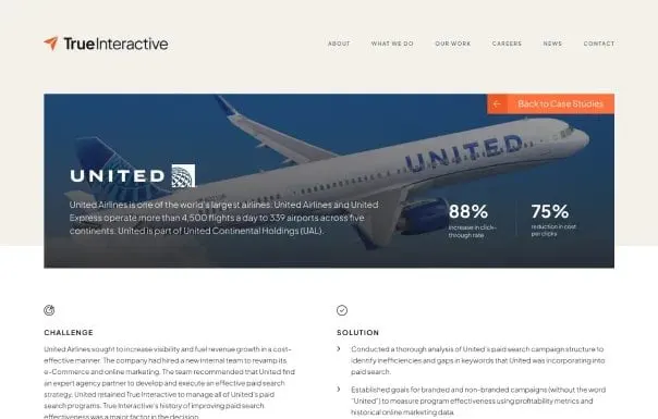
Below that, "A True advantage" sets out the agency's three pillars, People, Technology and Analytics, with simple line icons. A logo strip of past clients, a "How can we help?" section with Paid Media and Analytics & Measurement cards, and a blog feed follow. Each case study page uses a full-width image hero, headline results and a two-column Challenge and Solution layout so readers can scan fast.
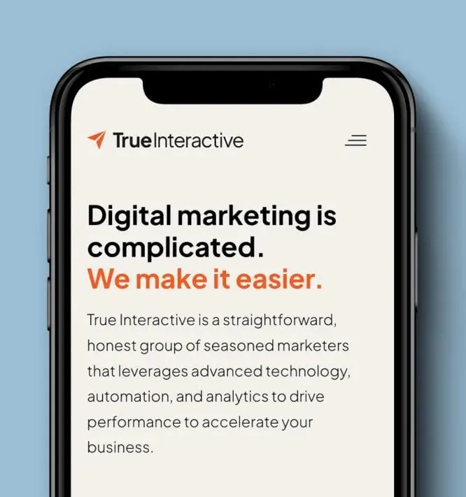
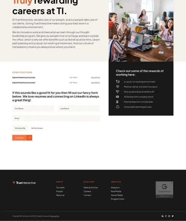
The careers page gives recruiting its own voice, with a benefits list on Midnight and a short application form. Throughout, the website design uses generous Buff space and orange only where it means something. We handled the UX and UI design for mobile with the same care; the headline and intro hold up on a phone without losing their hierarchy.
04 — Campaign creative
Ads that sell the agency in its own voice
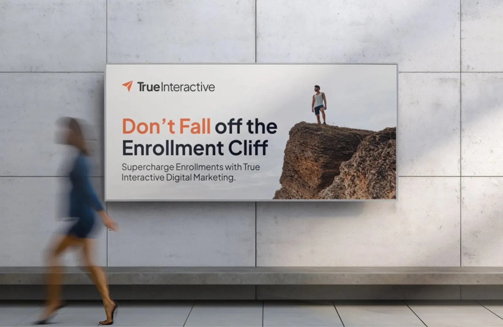
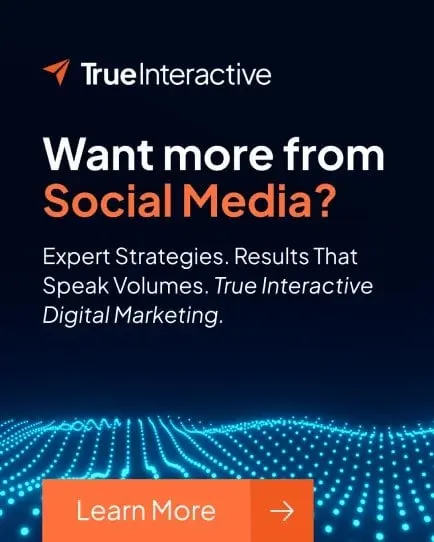
With the brand and site in place, we carried the system into True Interactive's own marketing. The ad set follows one simple template: logo top left, a two-colour headline in Midnight and Hot Summer, a single supporting line, and an orange Learn More button anchored at the bottom.
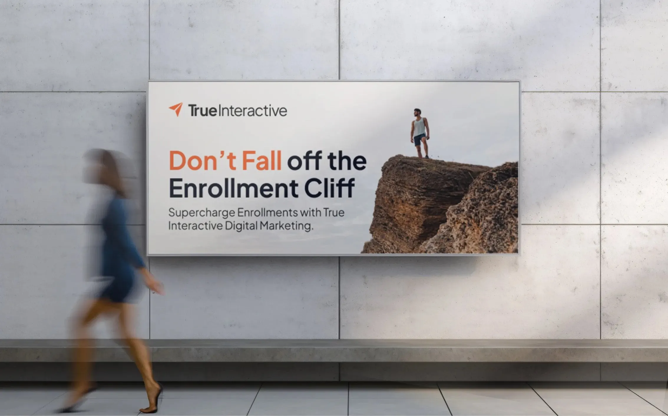
Two of the ads speak to higher education, a sector the agency was targeting: "We Don't Just Get Leads, We Get Enrollments" and "Don't Fall off the Enrollment Cliff." A third, on deep navy with a field of glowing dots, asks "Want more from Social Media?" The cliff concept scaled up to a billboard format without a single change to its structure, which is the test of a template that works. This kind of social media design is most effective when it borrows directly from the brand system, not from a separate campaign look.


05 — Outcome
One brand system, from logo to billboard
True Interactive now has a brand that matches the confidence of its work: a sharper logo, a named palette its team can use consistently, a website that leads with proof, and an ad template it can adapt to any sector it wants to reach.
Agencies are some of our most demanding clients, because they know what good looks like. For more on how we approach sites like this, read web design for creative agencies, see our work for O'Rorke Marketing, or browse more professional services projects.
What we delivered
A brand revitalization and digital overhaul for True Interactive.