Case study · Winning Edge Equine Services
Winning Edge Equine Services
A flowing horse-head logo, business cards and branded merchandise for Winning Edge Equine Services, an Ontario show grooming business offering banding, braiding and body clipping.
01 — Context
A groomer's brand for the show ring
Winning Edge Equine Services is a small business in Ontario, Canada, that gets horses ready to compete. Its services, listed right on the business card, are banding, braiding, body clipping and show grooming. It's skilled, hands-on work, done in barns and at horse shows where riders, trainers and owners all notice the details.
The owner came to us for Winning Edge Equine Services branding that felt organic, feminine and professional all at once. There was a practical brief too: the logo had to be simple enough to embroider on clothing and promotional items, yet still look refined on a plain business card. As a new venture, she needed one strong mark that could do all of that from day one.
02 — The logo
A horse drawn in a few sweeping lines
Our branding and identity design started with movement. Grooming for the show ring is about the finished look: a braided mane, a clean coat, a horse that looks its best in motion. So rather than a detailed illustration, we drew the horse's head in a handful of long, tapering strokes, with the mane sweeping back in curves that suggest speed and polish.
Line art also solved the embroidery brief. Thin, continuous strokes stitch cleanly, avoid fussy detail at small sizes and work in a single colour, which keeps production costs down on hats, shirts and bags.
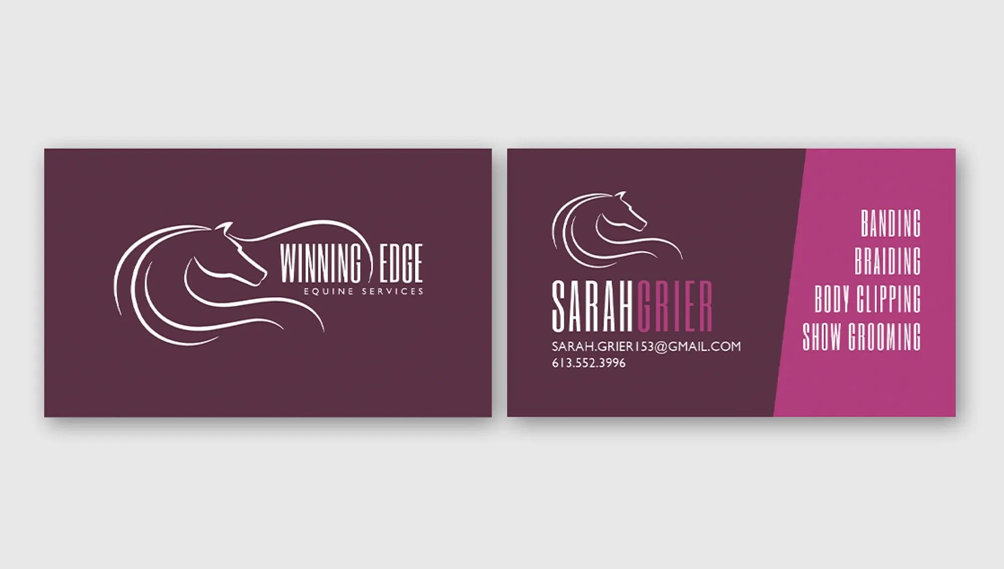
The wordmark sets WINNING EDGE in tall, condensed capitals divided by a slim vertical line, with EQUINE SERVICES spaced out underneath. The palette is a deep plum paired with bright magenta: feminine without being soft, and easy to spot on a busy show grounds. On the business card, the front holds the full logo on plum, while the back puts the services in a bold magenta panel so a prospective client knows exactly what's on offer. We handled the print design to keep the colours rich on both sides.
03 — Merchandise
A logo that works on a ball cap
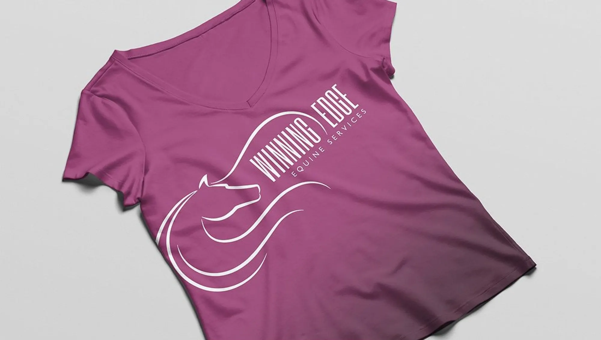
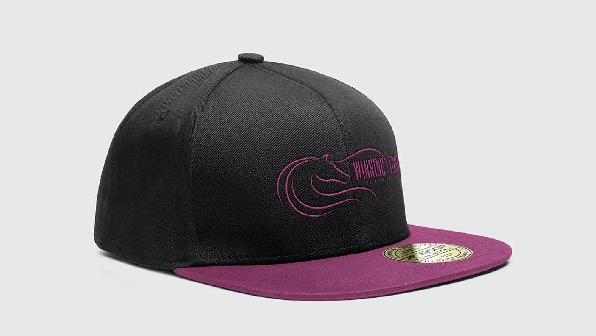
A show groomer is a walking advertisement. Whatever she wears around the barn or the ring is seen by riders, trainers and owners, so we mocked up the brand across the items she'd actually use: a V-neck T-shirt, a snapback cap, a drawstring bag and a mug. This graphic design work showed how the logo would hold up before anything was ordered.
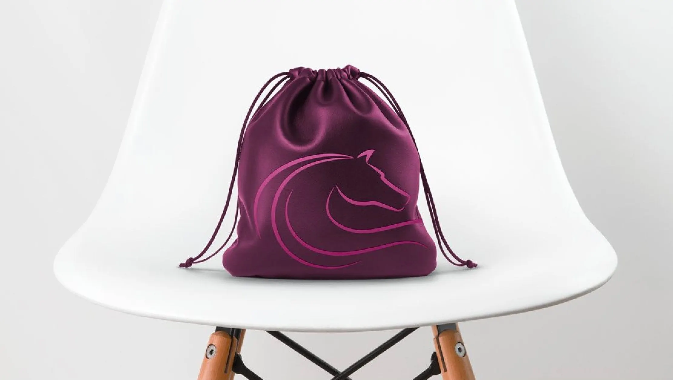
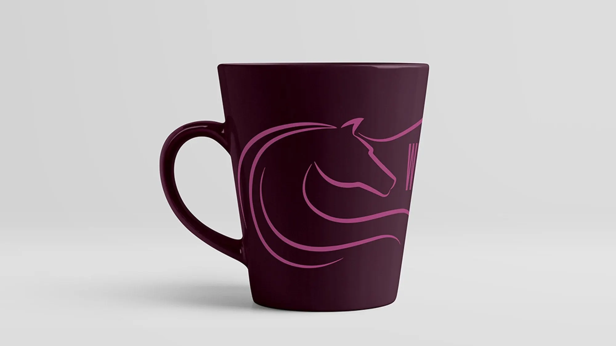
The mark adapts easily. On the shirt, the whole logo runs diagonally in white across magenta fabric. On the cap, it's embroidered in magenta on black with a plum brim. The horse head alone works as a standalone icon on the bag and mug.
A mark that moves between thread, ink and ceramic needs the right file for each job. If you've ever wondered which file goes where, our guide to logo file types explains it. For more equestrian work, see our brand and platform for Stallion Compare and the show ads for Carly Epp and PF Shy Guy, or explore how we help emerging brands get started.
What we delivered
A small-business brand built to be embroidered, printed and worn.