Case study · Conceive Health
Conceive Health
A brand refresh and new website for Conceive Health, an Ontario naturopathic fertility clinic, built to make preconception care feel calm, credible and easy to book.
01 — Context
A fertility clinic website design that meets patients where they are
Conceive Health is a naturopathic fertility clinic in Ontario, led by Dr. Tracy Malone ND and Dr. Jennifer Fitzgerald ND. The team offers preconception care, IVF and IUI support, metabolic programs and holistic fertility services, working alongside reproductive endocrinologists and fertility centres rather than in place of them.
The clinic came to us for a brand refresh and a full fertility clinic website design and build. The old presence no longer matched the calibre of the practice, and the content was hard to scan for someone arriving anxious, often mid-treatment, trying to work out whether this kind of care was for them.
Our brief to ourselves was simple: make the clinic look as expert as it is, and make the next step obvious on every page. That meant a refreshed brand identity, a new information structure and a site that reads as easily on a phone as on a desktop.
02 — Brand refresh
Warm plum, clinical teal and a seed of green
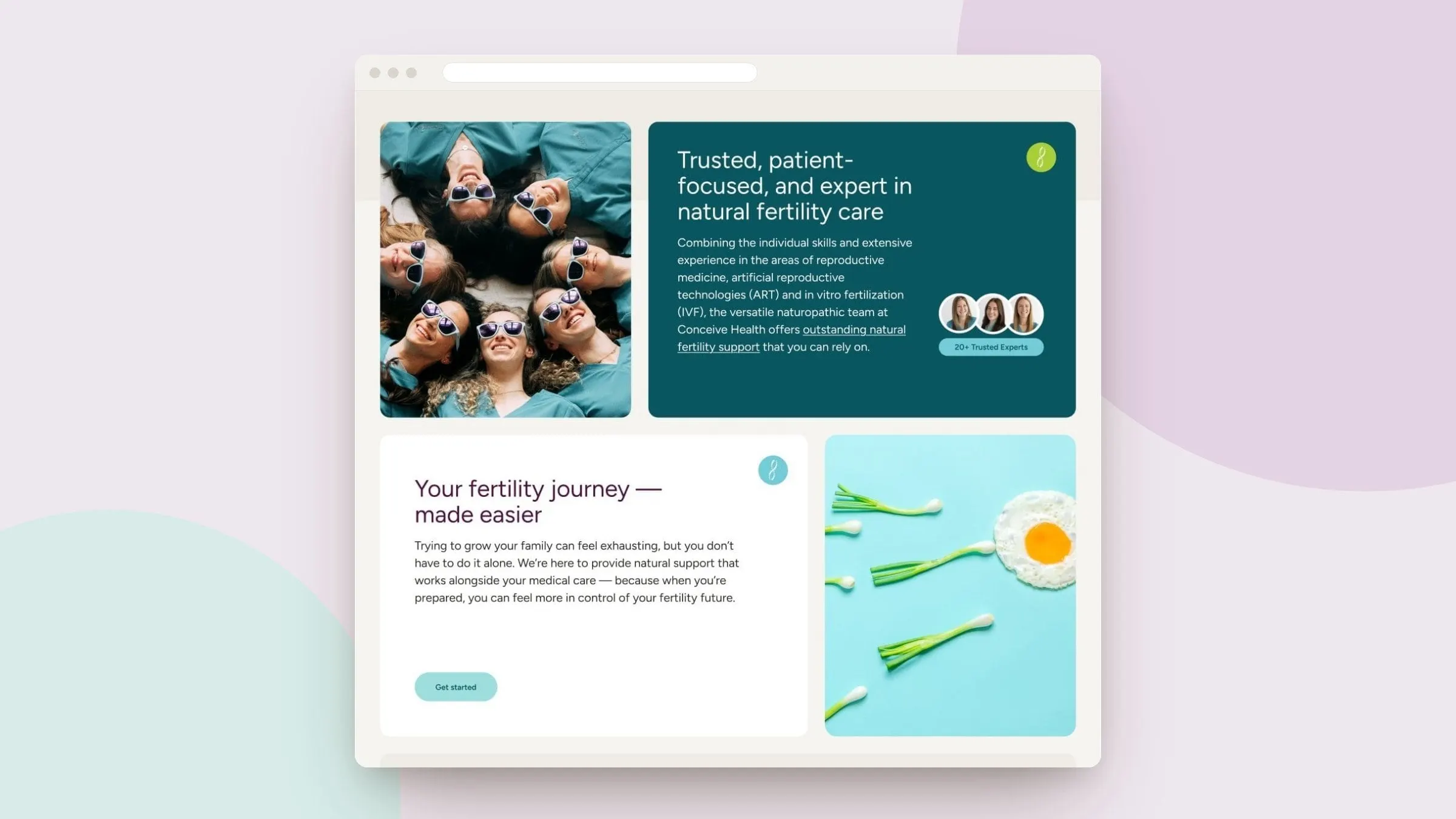
Fertility care sits between two moods: it has to feel deeply personal, and it has to feel medically serious. We built the refreshed palette to hold both. A deep plum carries the headlines and the wordmark, a dark teal anchors the trust-building content, and a soft aqua highlight picks out key words like 100 days and naturally. A small lime-green leaf mark, drawn from the dot in the Conceive wordmark, appears as a recurring signature in buttons and card corners.
Typography is set in Figtree throughout. It is rounded and friendly without going soft, and it stays legible at small sizes in dense service descriptions. Photography leans on real, smiling people and light, botanical still lifes rather than sterile clinic imagery, so the brand reads as hopeful before a single line is read.
03 — Homepage
One page that answers is this for me?
Most visitors land on the homepage with one question. So the hero states what the clinic does and who it is for in a single line, followed by a positioning statement: the first and largest preconception care clinic in Canada. An accreditation bar sits directly beneath, so the professional bodies the team belongs to are visible before anyone scrolls.
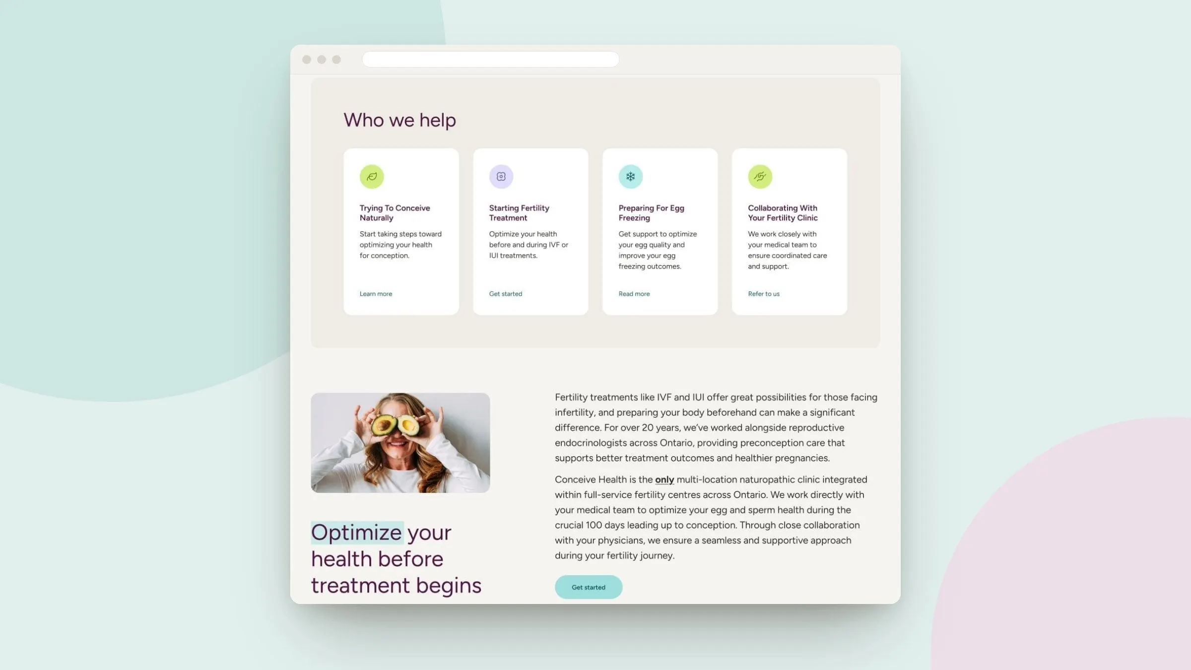
From there the page moves through the reasoning a patient goes through. Why preparation matters before IVF or IUI. Why this team is trustworthy, with a 20+ Trusted Experts badge on the teal card. Then a Who we help section that splits visitors by situation: trying to conceive naturally, starting fertility treatment, preparing for egg freezing, or collaborating with a fertility clinic.
Every block ends in the same aqua Get started button, and Book Online stays pinned in the header. We wrote about this pattern in our guide to healthcare website CTAs that get patients to book: one consistent action, repeated where the decision actually happens.

04 — Inner pages
Doctors, locations and specialties, easy to find
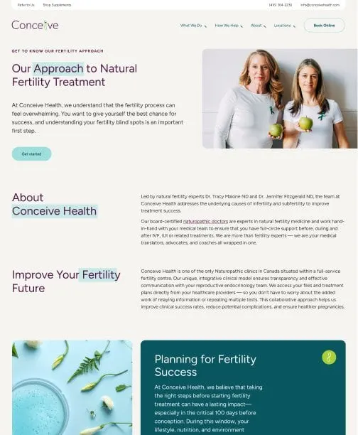
Behind the homepage, the website design follows the same card system so every page feels related. The About page explains the clinic's approach to natural fertility treatment and its integrated model with medical teams. A specialties grid lists the conditions the team treats, including thyroid disorders, insulin resistance, endometriosis, PCOS and IVF preparation, each marked with a coloured dot from the brand palette.
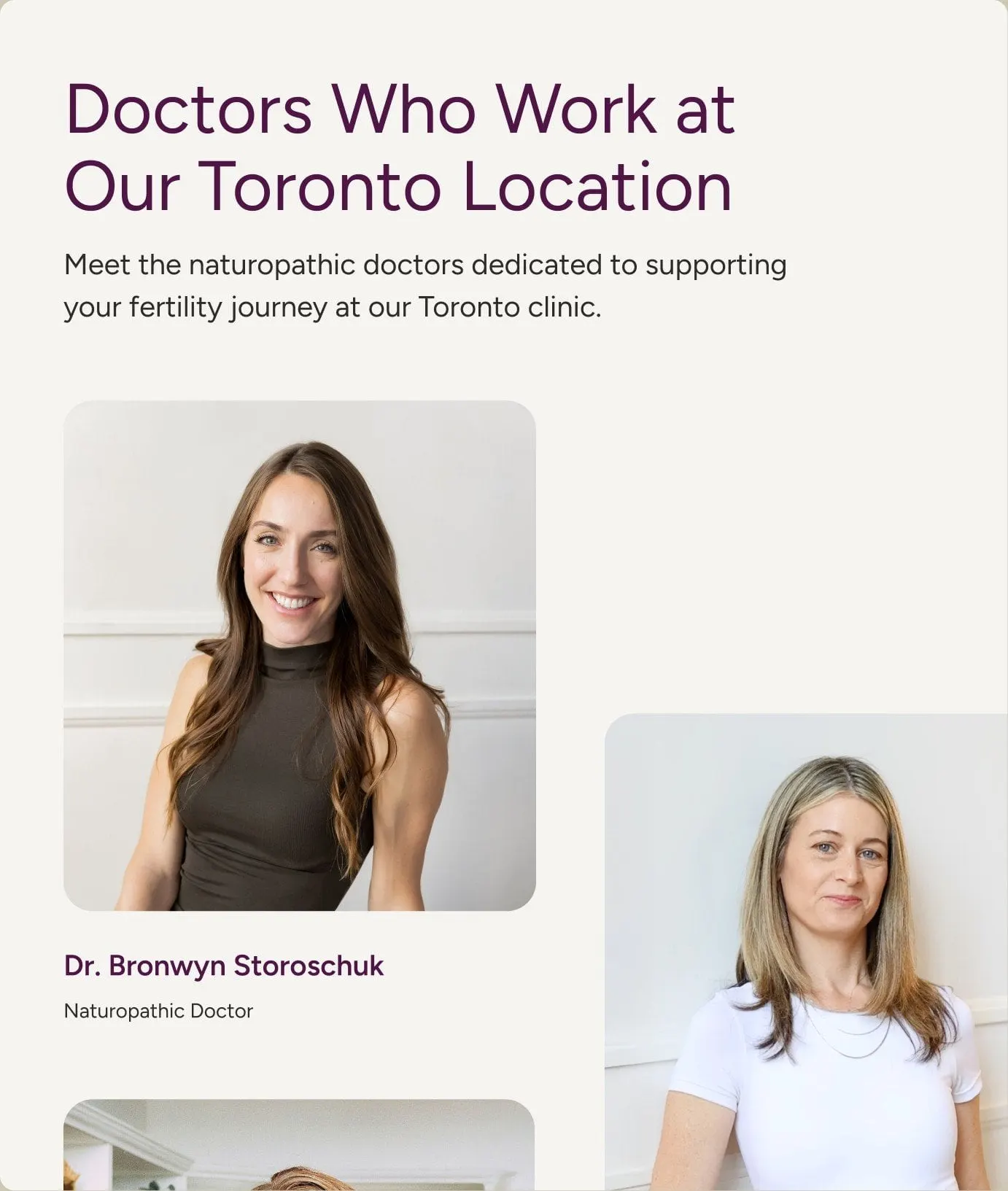
Because Conceive Health is a multi-location practice, each location gets its own page with address, phone numbers, hours and the doctors who work there. The downtown Toronto page, for example, pairs the clinic's Bay Street address and weekend hours with profiles of its naturopathic doctors. Patients can see who they will meet before they book.
We handled the website development as well, building responsive templates so the cards restack cleanly on mobile, where most of this audience is reading. It is the same thinking behind our roundup of the best medical website design examples: clarity first, warmth second, decoration last.

05 — What it makes possible
A clinic brand that matches the care
Conceive Health now has a visual identity and a website that work as one system. New services, doctors and locations can be added using the same cards and colour rules, and every page points patients toward booking. For a practice that sits between naturopathic medicine and fertility clinics, that consistency does a lot of quiet work: it tells patients and referring physicians alike that this is a serious, organized team.
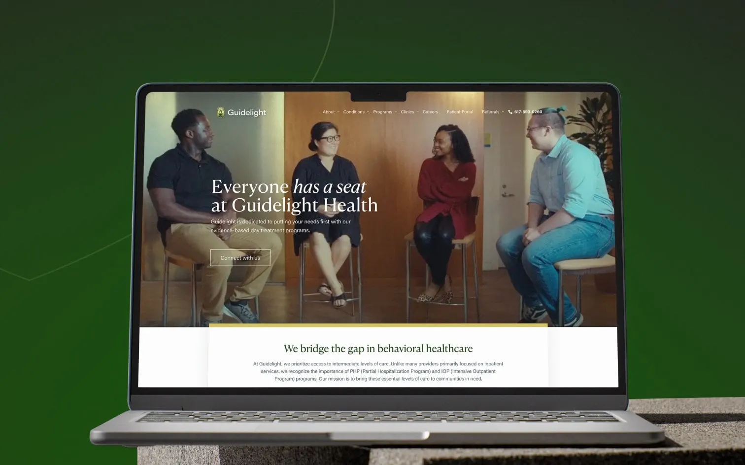
It sits alongside our other healthcare design work, including the brand and site for Guidelight Health.