Case study · Doctor Logic
Doctor Logic
A flexible corporate PowerPoint template for DoctorLogic, the Plano, Texas digital marketing agency for medical practices, built for sales pitches and internal use.

01 — Context
A corporate PowerPoint template for a healthcare marketing agency
DoctorLogic is a digital marketing agency in Plano, Texas, that builds websites and reputation tools for medical practices. Their team presents constantly — to prospective clients, to existing accounts and internally — and they needed a corporate PowerPoint template that could handle all of it while looking unmistakably like DoctorLogic.
We were asked for presentation design that would work in two directions at once. Externally, the deck had to sell: answer "What can we offer your business?" for a doctor or practice manager who has a few minutes and plenty of other vendors calling. Internally, it had to be a reliable toolkit that anyone on staff could open, duplicate a slide, and drop in new content without calling a designer.
That second requirement shaped most of our decisions. A beautiful deck that breaks the moment someone edits it is not much use to a busy agency.
02 — Building from the brand
Hexagons, gradients and three ways in
The DoctorLogic logo — a rounded cross split into blue and teal segments — gave us the core palette. We extended it with a gradient that runs from deep blue to teal, and introduced a row of hexagon icons in blue, green, purple, pink, orange and violet — a laptop, a thumbs-up, a speech bubble, stacked layers, a target, a rising bar chart and a rocket — that hint at the range of what the agency offers.
The hexagon became the template's recurring shape. It frames icons on the title slides, stacks into soft clusters on statistic slides, and anchors section breaks, so even a slide with no logo still feels like it belongs to the same family.
Instead of a single cover, we designed three title slide options: clean white for print and bright rooms, full gradient for on-screen pitches, and a photographic version with the logo over a faded office scene. Presenters pick the one that suits the audience, and the closing "Thank you" slide mirrors the gradient so a deck always ends where it began.



03 — Content layouts
Slide layouts that sell a service
DoctorLogic's pitch rests on a handful of clear messages: modern medical websites built to convert, unlimited pages that grow a practice's local search presence, HIPAA-compliant hosting and forms, and online reviews that build reputation. We gave each type of message a layout designed around it.
- Feature slides pair a short headline and paragraph with an illustration or a fan of real practice website screenshots, so the product is shown rather than described.
- Statement slides like the HIPAA question run text over a purple gradient photograph, slowing the pace for a serious point.
- Statistic slides isolate a single figure with its source — "94% of patients use online reviews to evaluate physicians," credited to Software Advice — next to a cluster of hexagons and a quotation mark.
Generous white space and a single geometric sans-serif throughout keep the template calm. In healthcare, where the audience is often clinicians, clarity reads as credibility. It is the same principle behind a cohesive brand: every touchpoint should feel like it came from the same company.





04 — Data slides
Native charts in brand colour
Reputation and growth reporting are a big part of DoctorLogic's conversations with clients, so the template needed data slides that could be updated in seconds.
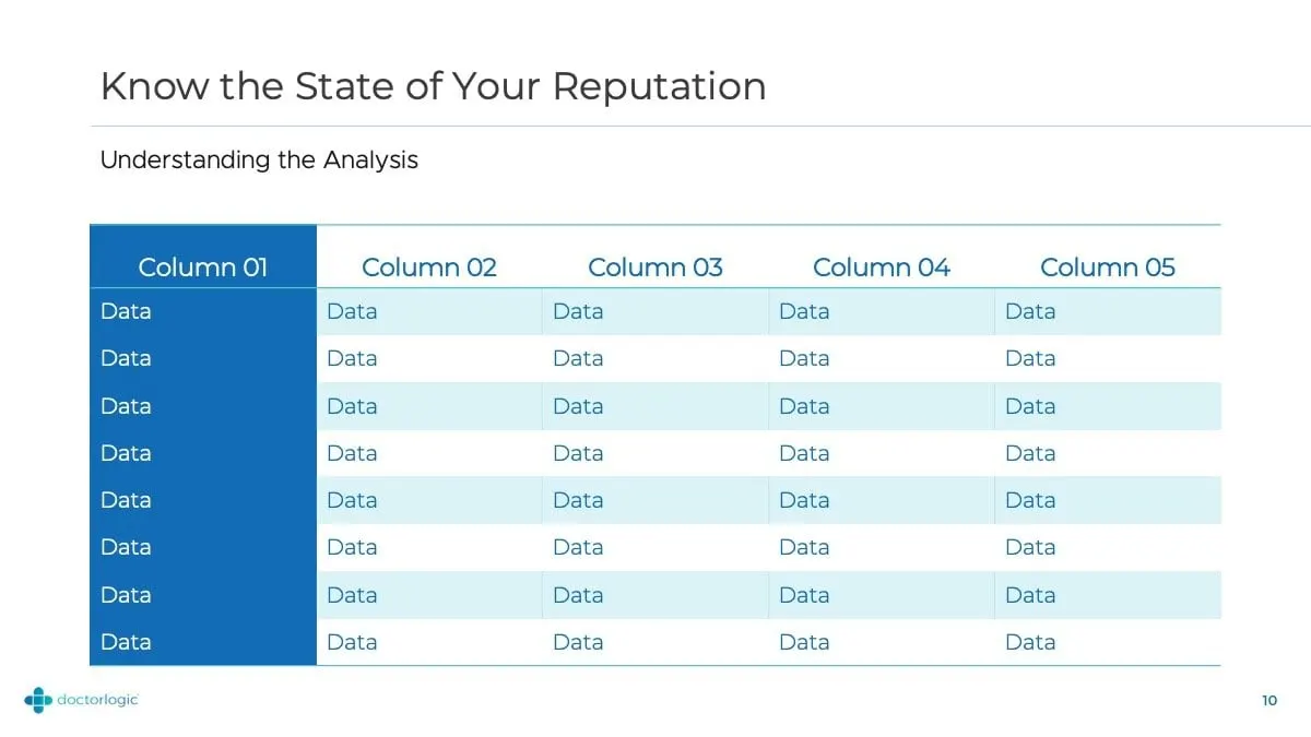
Rather than pasting in static images, we styled PowerPoint's own chart and table objects. Bar charts use gradient fills that run from the brand blues into green and orange; area charts fade from blue into magenta; tables have a solid blue header column with alternating pale-teal rows. Because they are native objects, staff simply open the data sheet, type in a practice's numbers and the chart redraws in the right colours.
The placeholder labels you see here — Category 1, Series 1, Column 01 — are deliberate. They show the team exactly where their data goes, and they keep the template honest: it is a frame for real results, not a picture of invented ones.


05 — The result
One toolkit for every presentation
DoctorLogic now has a single, on-brand corporate communication tool for sales meetings, client check-ins and internal updates. Title options, content layouts, statistic slides, charts and tables all share the same colours, hexagon motif and type, so a deck assembled by a salesperson on a Friday afternoon still looks like the agency planned it.
For an agency that serves healthcare practices, that consistency is part of the pitch: if DoctorLogic's own materials look this considered, a practice can trust them with its website. Other presentation systems we have built include the Fortified Retirement presentation and a deck for Rémy Cointreau.
What we delivered
A fully editable PowerPoint template for DoctorLogic.