Case study · Kalypso: A Rockwell Automation Business
Kalypso: A Rockwell Automation Business
Brand discovery and a refreshed identity direction for Kalypso, a Rockwell Automation business: a woven K mark, an expanded colour palette and concept collateral.
01 — Context
A brand refresh for a professional services firm after an acquisition
Kalypso is a professional services firm that helps clients discover, create, make and sell better products with digital — and runs a European Innovation Center in Bucharest. After Kalypso was acquired by Rockwell Automation, its internal teams wanted to re-invigorate a well-established brand so it could stand confidently inside a much larger parent company.
That is a delicate brief. A brand refresh for a professional services firm with a long track record can't throw away the equity it has built, and it has to sit comfortably next to Rockwell's own identity. Kalypso asked us to reimagine the brand: thread a story into the logo, branch out in colour, and show how the new direction would look in real communications. We approached it as branding and identity design grounded in research rather than taste.
02 — Discovery
Starting with an in-depth discovery document
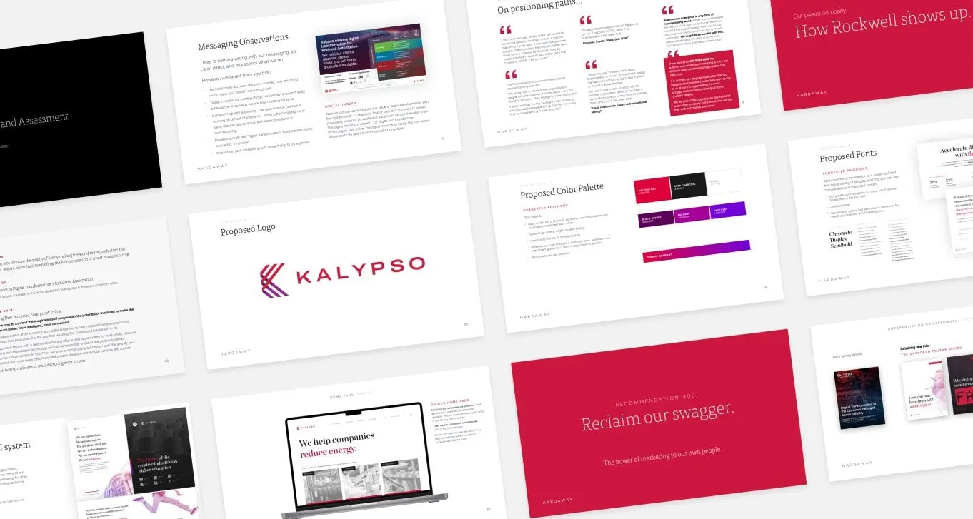
Before drawing anything, we produced an in-depth discovery document that explored Kalypso's points of differentiation from both a design and a business standpoint. It reviewed the existing messaging, laid out possible positioning paths, and looked at how Rockwell shows up in the market so the two brands could be read as one family.
The document then moved from assessment to recommendation: a proposed logo, a proposed colour palette and proposed fonts, each with its reasoning on the page. A rallying idea ran through it — "Reclaim our swagger" — about the power of marketing that comes from Kalypso's own people. Having everything in one document let the Kalypso team align on goals and direction before any final artwork, which is exactly why we argue that branding without strategy is just expensive art.
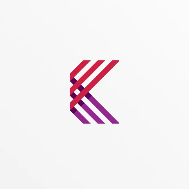
For the mark itself, we took "thread a story into the logo" literally. The new K is built from parallel bands that weave over and under one another — red crossing purple — suggesting connected disciplines, teams and data coming together into one shape. Set beside a widely tracked KALYPSO wordmark, it reads as precise and technical but still warm.
03 — Colour and collateral
Branching out in colour, then proving it on paper
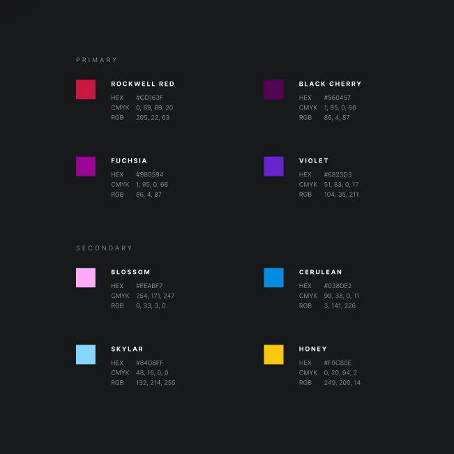
The palette keeps a strong link to the parent company with Rockwell Red as a primary colour, then branches out with Black Cherry, Fuchsia and Violet. A secondary set — Blossom, Cerulean, Skylar and Honey — gives designers room for charts, illustrations and campaigns. Every colour is specified in HEX, CMYK and RGB so it reproduces consistently, the start of a set of brand guidelines.
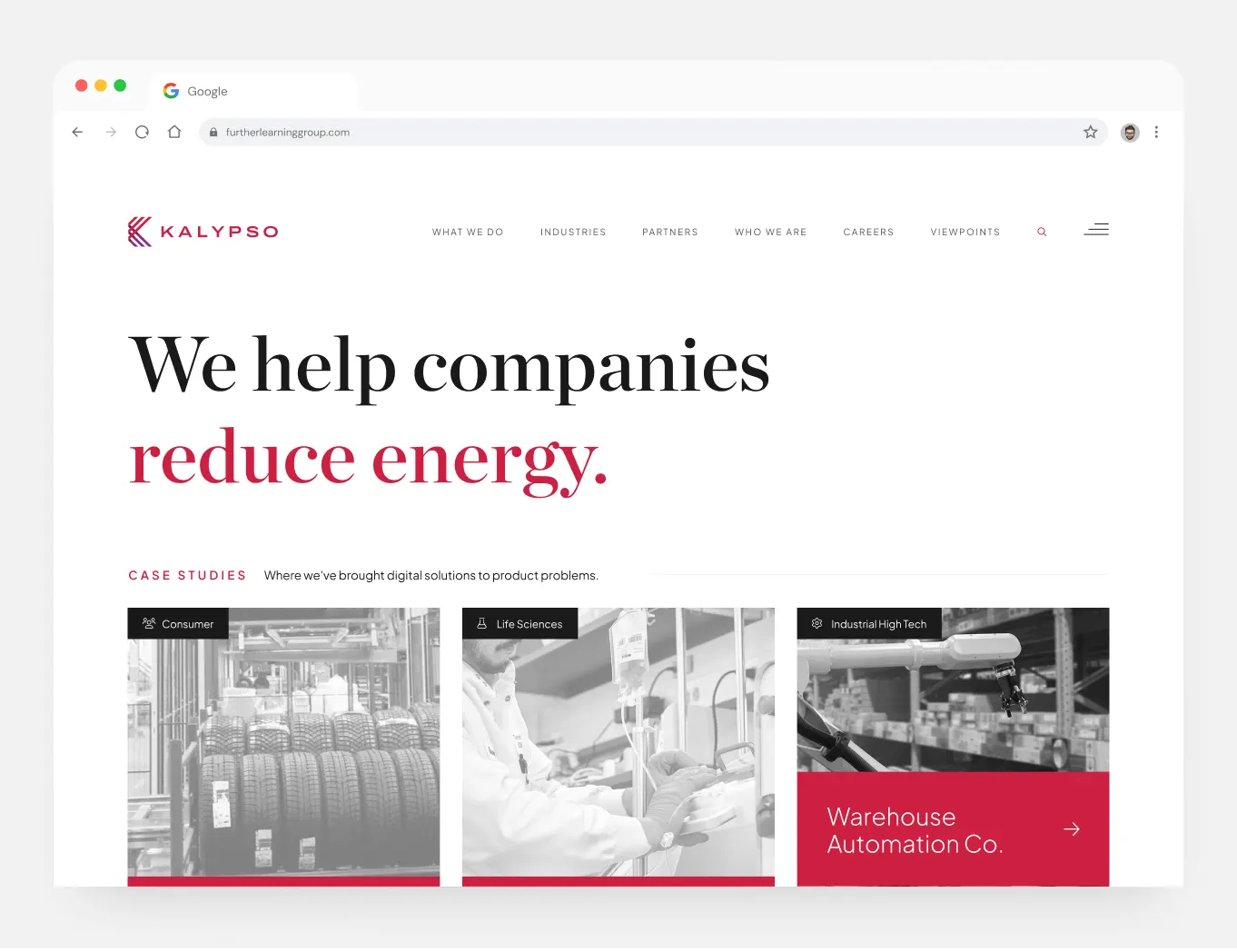
Recommendations are easier to agree on when people can see them in use, so we produced a series of concept pieces of corporate collateral. A recruitment poster stacks short serif lines — "We are innovators. We are strategists. We are data scientists." — ending on "We are Kalypso." in red, with a soft red-to-violet gradient over an ornate architectural photo. A website concept pairs a large serif headline with red emphasis, monochrome photography and case study tiles sorted by industry.
These concepts gave Kalypso's teams a clear picture of how the refreshed brand could carry across corporate communications. For similar enterprise work in professional services, see our brand and presentation project for Deloitte DFX.
What we delivered
Brand discovery and a refreshed identity direction for Kalypso.