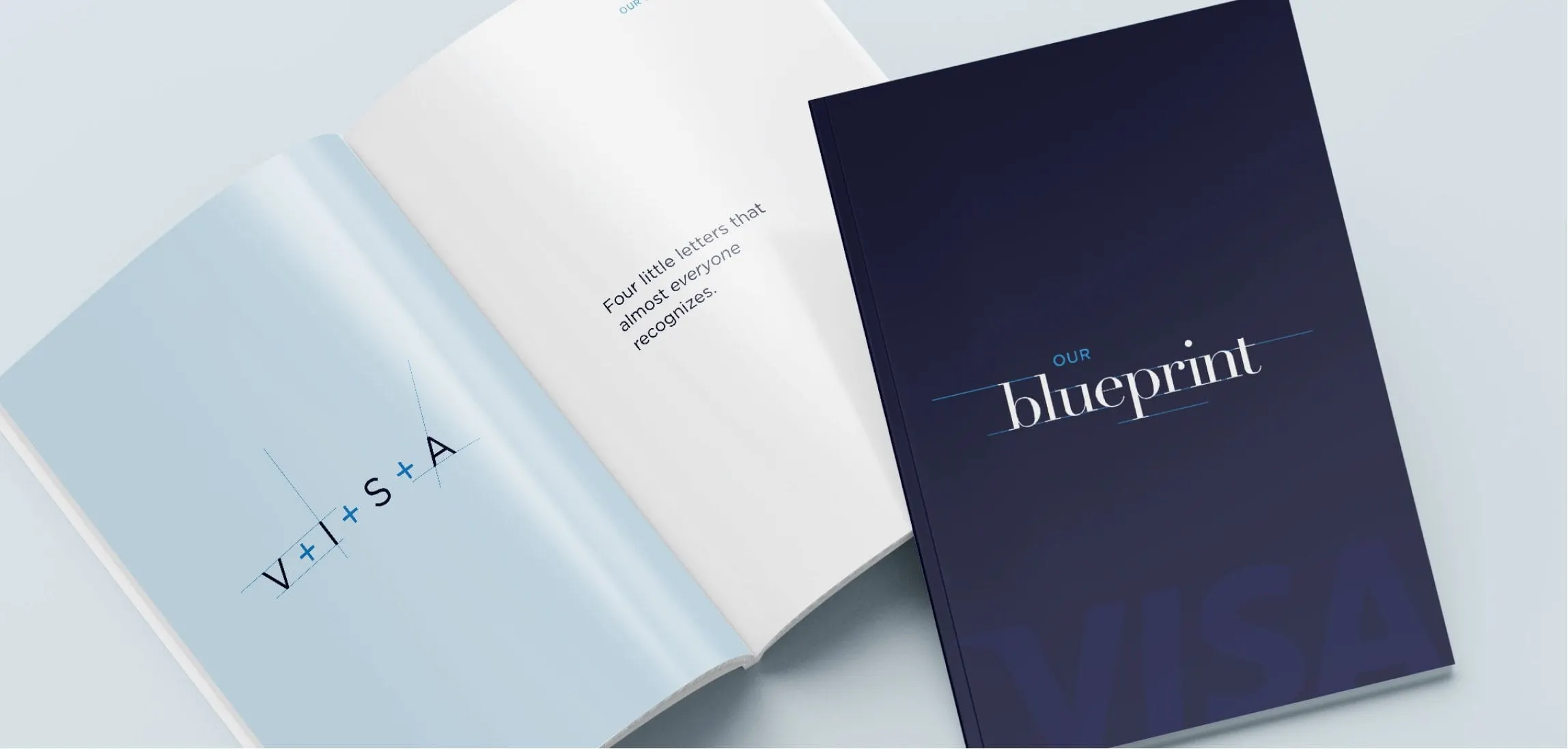
Case study · The Miller Group
The Miller Group
Ongoing design for The Miller Group, a century-old Canadian infrastructure company: display banners, event pieces, social posts and internal materials.
01 — Context
Construction company marketing design for a 100-year-old brand
The Miller Group, a Colas company, builds and supports urban and rural infrastructure across Canada and throughout the Southeastern United States. Its work spans roads, aggregates, equipment and site rehabilitation, and its brand carries more than a hundred years of history.
When we started working with Miller, the goal was clear: give that heritage brand a new lease on life, use its history in thoughtful and creative ways, and help the team reach its goals. Rather than one big project, it has become an ongoing relationship. We work with the Miller team on a steady stream of internal and external pieces, from material displays and employee swag to social media designs and business cards. It is construction company marketing design at its most practical: a lot of different formats, all needing to feel like Miller.
02 — Material display
Banners built from the material itself
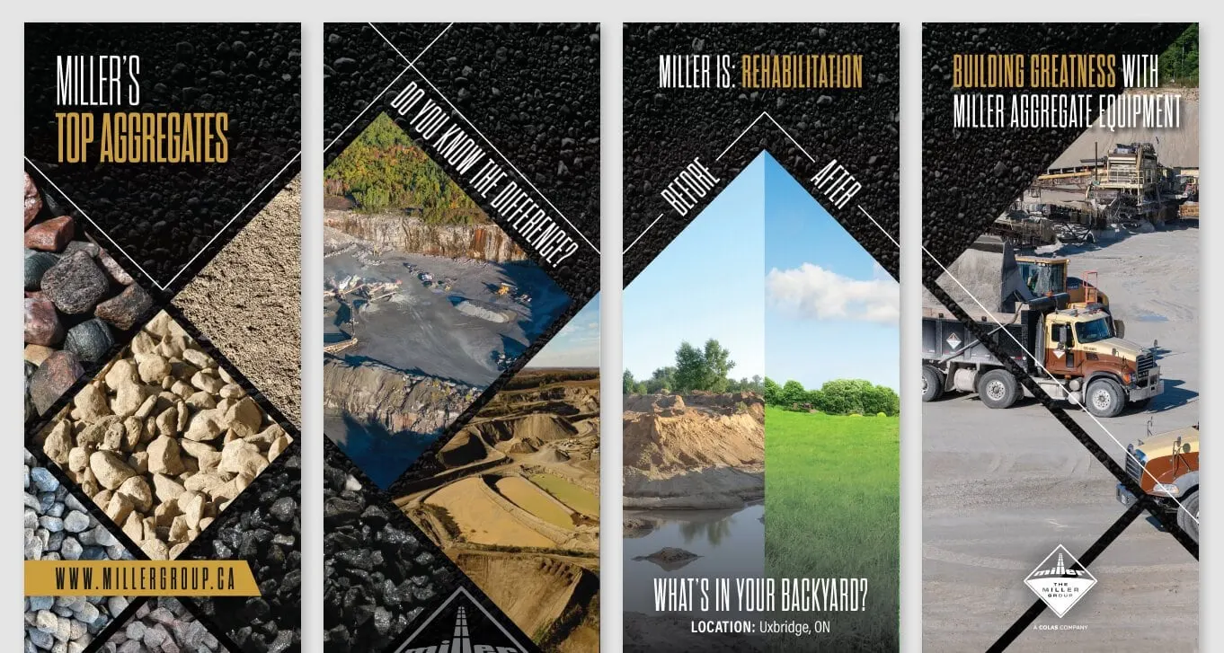
The Miller banner series turns the company's own products into the design. Each tall panel uses a black stone texture background, cut by sharp diagonal lines that echo the diamond shape of the Miller logo. Within those diamonds sit photographs: piles of graded stone, quarry faces, haul trucks and crushing equipment.
Headlines are set in a condensed, all-caps typeface in white and gold: "Miller's Top Aggregates," "Do you know the difference?" and "Building Greatness with Miller Aggregate Equipment." The rehabilitation banner is the most persuasive of the set. A before-and-after split shows a quarry site in Uxbridge, Ontario, alongside the green landscape it became, under the question "What's in your backyard?" It answers a community concern without a paragraph of copy.
As a set, the banners work together at events and in offices, and each one stands alone. That balance is central to our signage and environmental design work.
03 — Internal and social
Heritage with a sense of humour
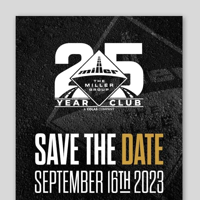
A company with a long history also has long-serving people. For Miller's 25 Year Club, we designed a save the date for September 16th, 2023, building a large "25" around the Miller diamond and setting "Save the Date" in white and gold over an asphalt texture. It looks like the company and honours the people who built it, a good example of corporate communication design that staff actually want to keep.
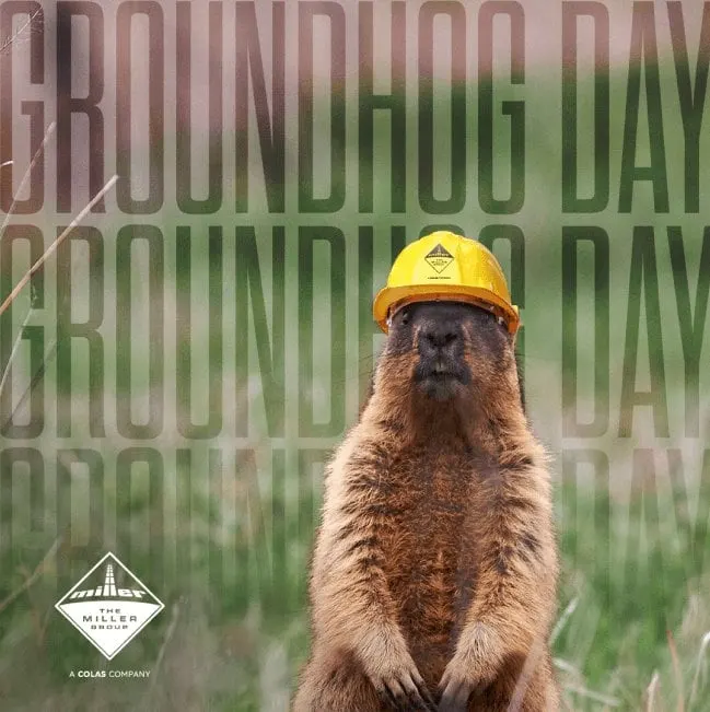
Not everything needs to be serious. For Groundhog Day, a groundhog in a yellow Miller hard hat stands under the words repeated, fading down the frame. It is the kind of social media design that gets an industrial brand noticed in a feed. "Ahead of the Curve" takes a broader view, with tall condensed type over an aerial photograph of a highway winding along a lakeshore.
Across all of it, the logo, condensed type, gold accent and diamond geometry stay consistent, which is why a varied stream of work still reads as one brand. We explain why that matters in why a cohesive brand matters for your business. See more of our construction and engineering work, including the WB Melback website.
What we deliver
Ongoing design support for The Miller Group's internal and external teams.