Case study · Kennion Benefits
Kennion Benefits
An interactive PDF benefits guide for Kennion, an Alabama employee benefits program, turning plan options, contributions and enrolment steps into a clear, navigable read.
01 — Context
Employee benefits guide design for a program built on choice
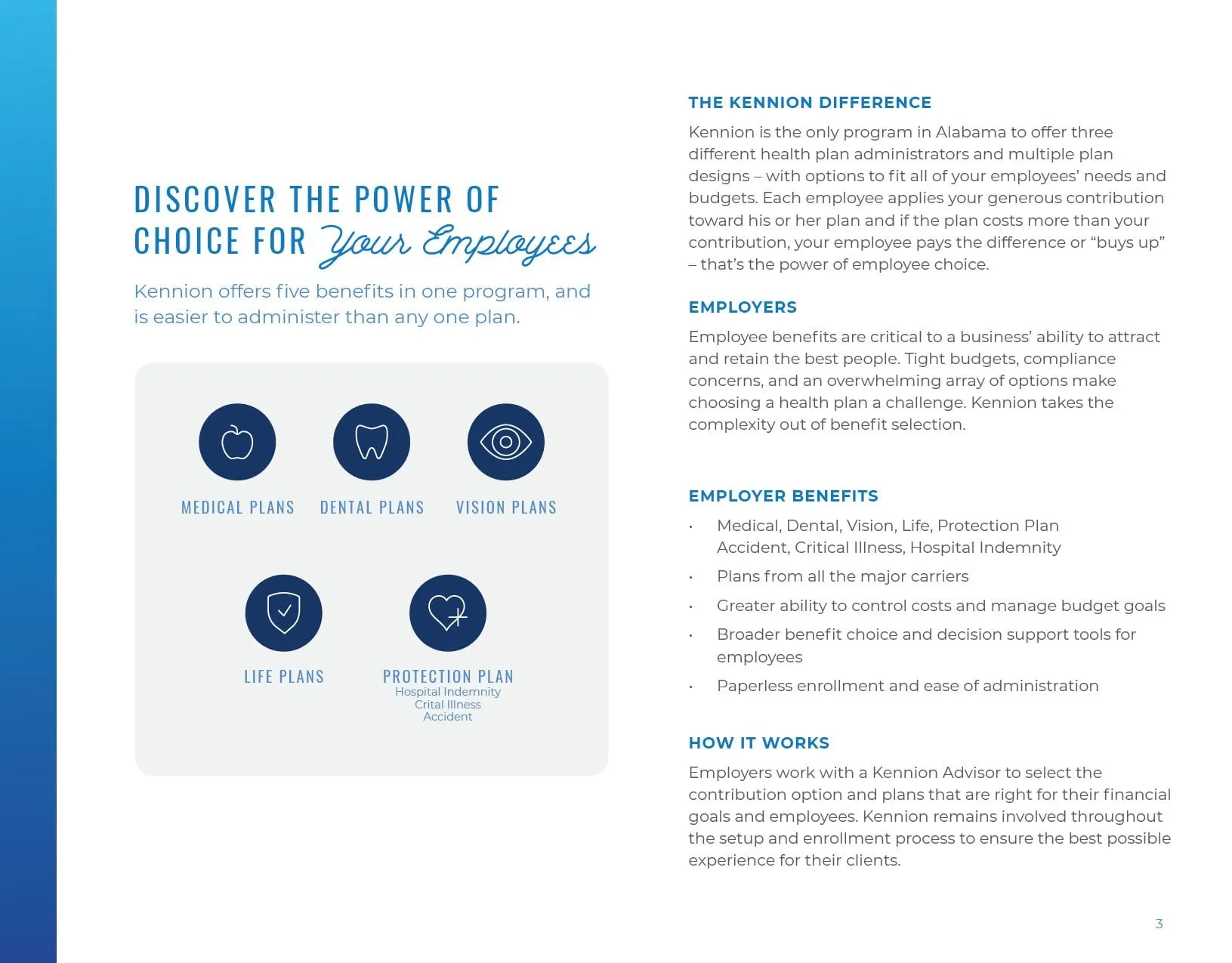
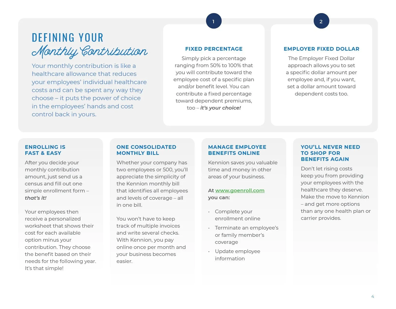
Kennion is an employee benefits program in Alabama that lets employers offer medical, dental, vision, life and supplemental protection plans in one package. Its big idea is choice: the employer sets a contribution, and each employee picks the plan that fits their own needs and budget.
That idea is powerful, and it is also a lot to explain. Ahead of its 2019 enrolment season, Kennion needed a benefits guide that employers and their staff could actually work through: plan details, contribution models, rate tables, admin tools and the steps to get set up. The old material asked for a poster and an interactive PDF, both matched to Kennion's existing brand.
Our job was employee benefits guide design that made a dense, technical subject feel simple to navigate, without dropping any of the detail people need to make a decision.
02 — Structure
Icons that work as a map of the guide
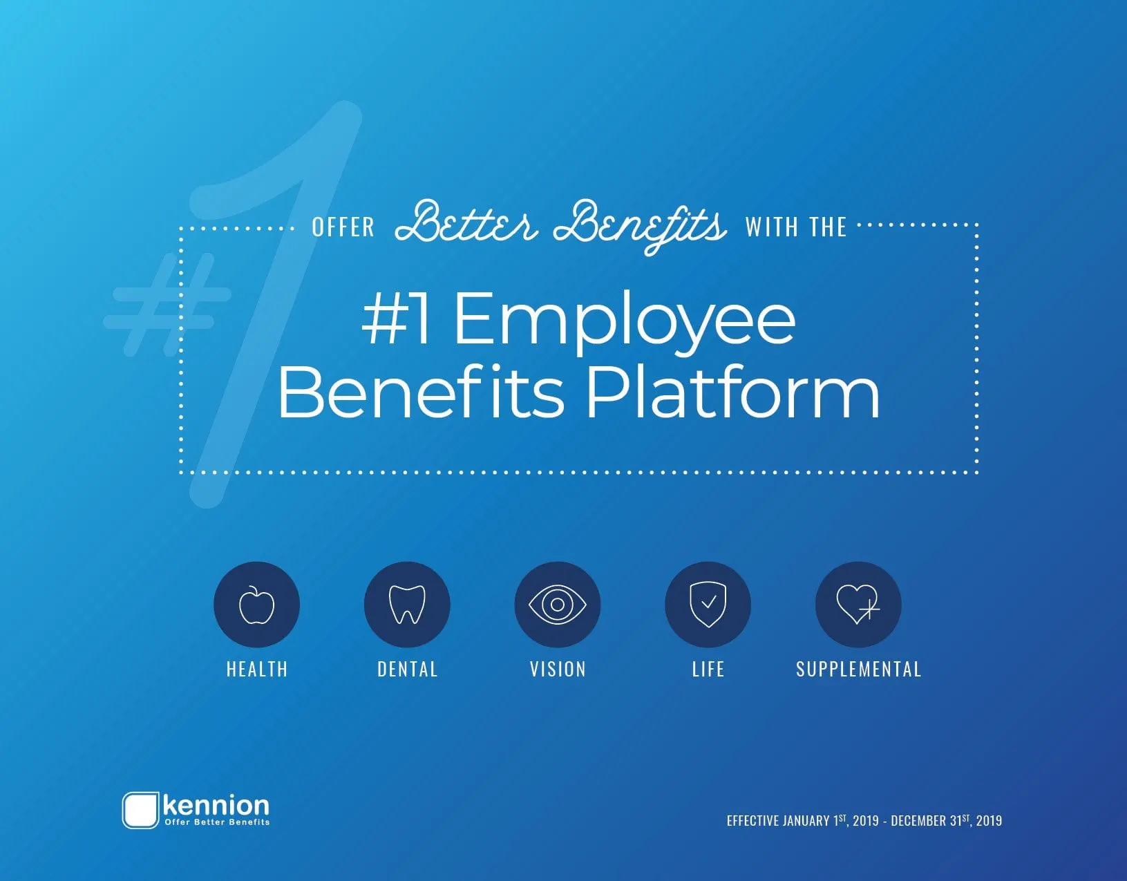
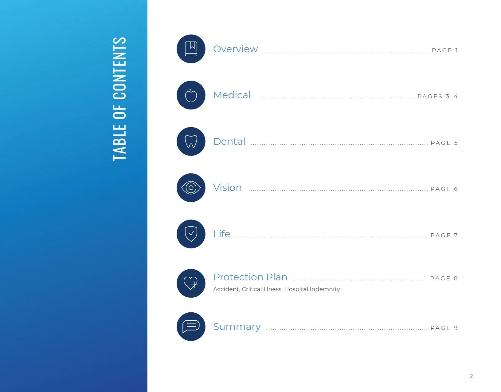
We started with structure. A long benefits document only works if readers can find their section quickly, so we built the guide around five icons: an apple for health, a tooth for dental, an eye for vision, a shield for life and a heart for supplemental coverage. They appear on the cover, again in the table of contents with page numbers, and again as each section opens.
Because this was an interactive PDF, the table of contents does double duty as navigation. A reader can jump straight to the medical plans or the protection plan summary without scrolling through pages that do not apply to them.
Within Kennion's brand we set a clear typographic system: tall condensed capitals for section titles, a clean sans serif for body copy, and a flowing script accent on words like Your Employees, Options and Simple. The script brings a touch of warmth to a subject that is usually all numbers.
03 — The detail
Rate tables people can read
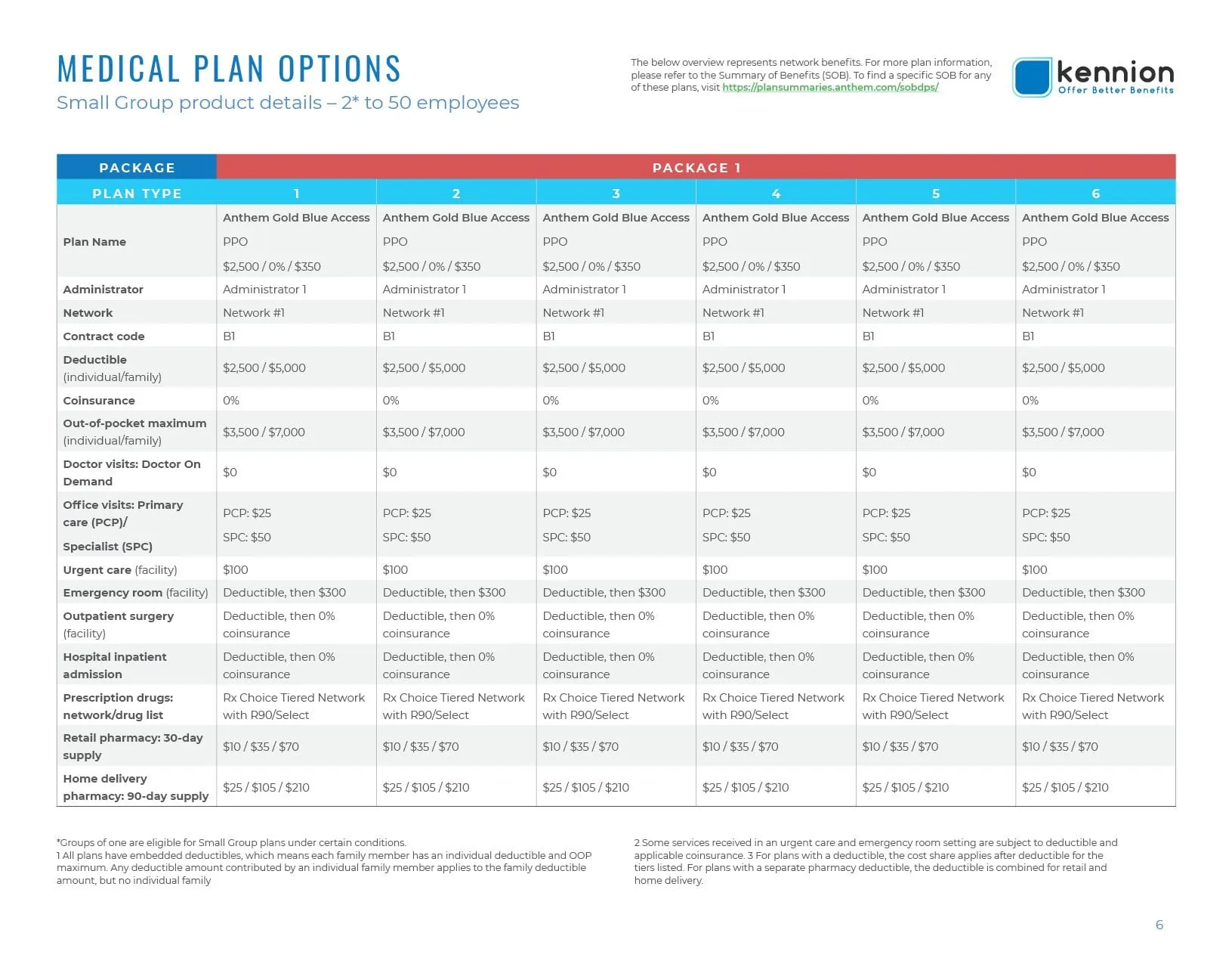
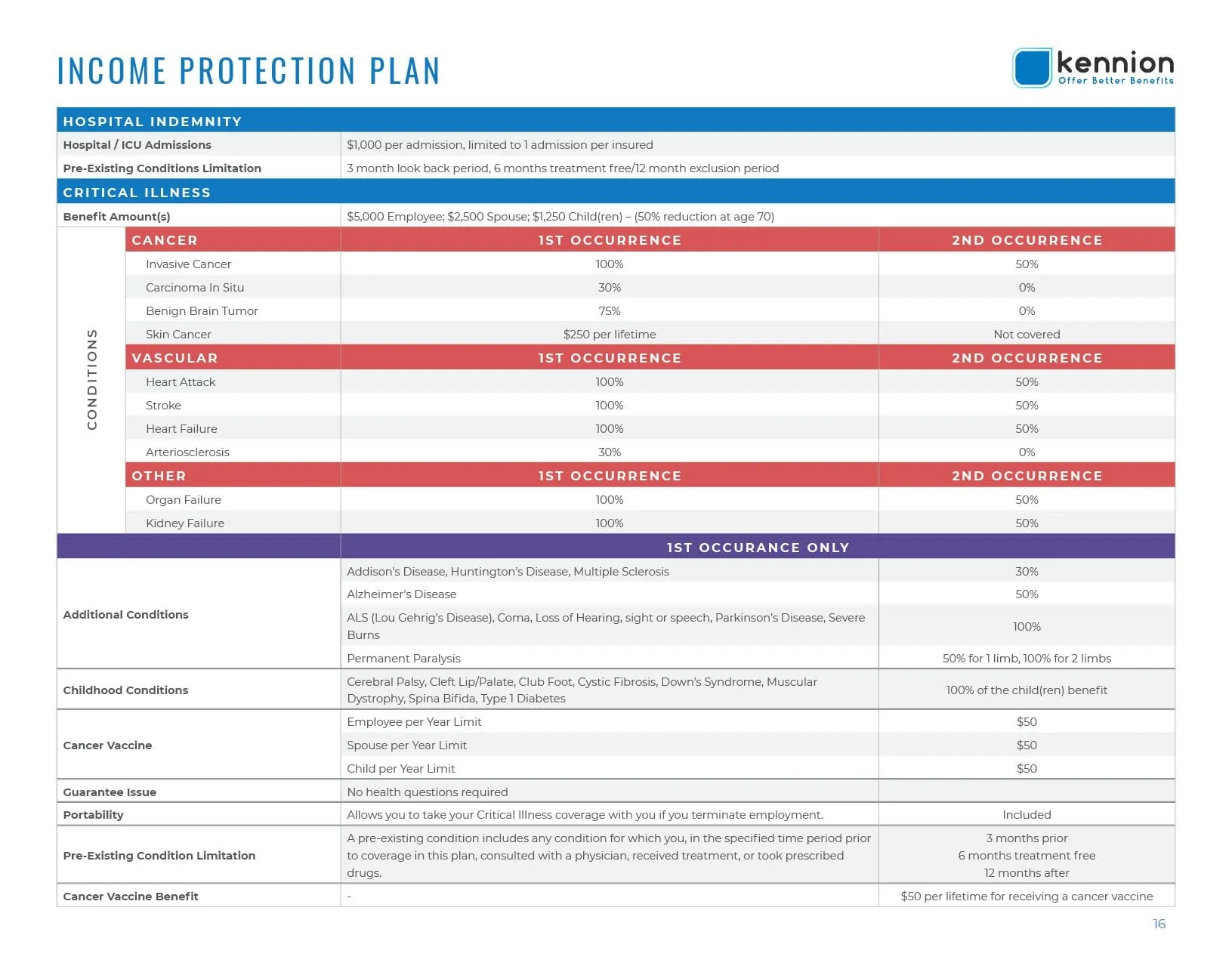
The hardest pages in any benefits guide are the comparison tables. Kennion's medical plan options compare six plans across deductibles, out-of-pocket maximums, coinsurance, office visits, prescriptions and more. The income protection plan lists hospital indemnity, critical illness conditions and payout levels for first and second occurrences.
We treated these as information design rather than spreadsheets. A blue header band frames each table, row labels are set in bold so the eye can track across, and alternating tints separate the rows. Within the critical illness table, coloured sub-headers group conditions into cancer, vascular and other, so readers can find their row without reading every line.
Footnotes stay on the same page as the table they explain, and plan names repeat in each column so nothing gets lost when a reader zooms in on a single plan.

04 — The pitch
Selling the program, not just listing it
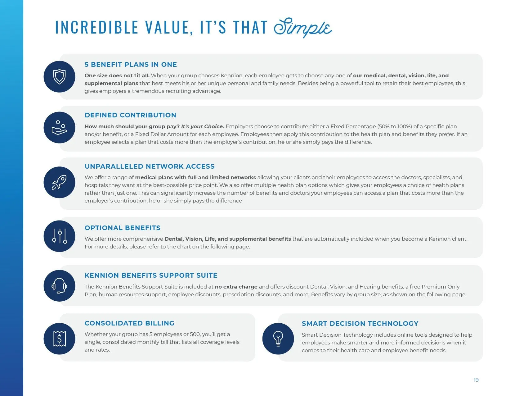
A benefits guide is also a sales tool. Employers read it to decide whether Kennion is worth switching to, so the back half of the document makes the case. A page titled Incredible Value, It's That Simple sets out the program's selling points as a list of icon-led cards: five benefit plans in one, defined contribution, network access, optional benefits, a support suite, consolidated billing and decision support technology.
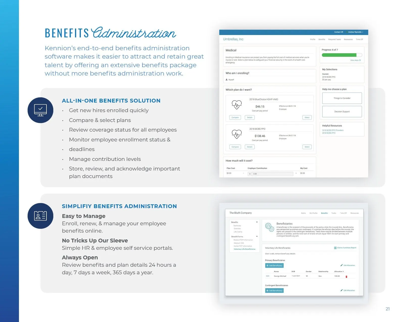
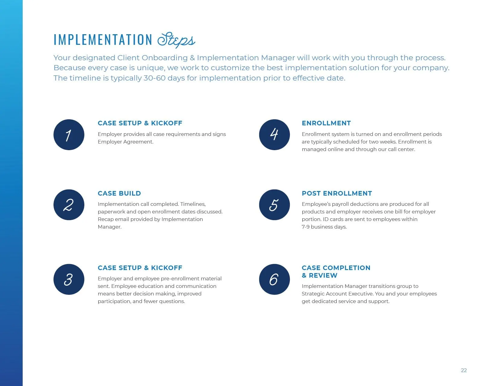
A benefits administration spread pairs real screens from the enrolment software with short feature lists, so employers can picture the day-to-day. The guide closes with six numbered implementation steps, from case setup through enrolment to case review, which answers the practical question every HR lead has: what happens after I sign?
It is the same approach we bring to brochure design and other finance and insurance work, including our materials for Tribal Custom Insurance: lead with the reader's decision, then give them everything they need to make it.
05 — Outcome
One guide for employers and employees
The finished publication gives Kennion a single document that works for two audiences. Employers get the business case, the contribution models and the implementation plan. Employees get clear, comparable plan details and a navigable PDF they can return to when it is time to choose. Because the page templates, icons and table styles are consistent, the guide can be updated for future plan years without starting over.
What we delivered
- 01Interactive PDF benefits guideA multi-section guide with linked table of contents, section dividers and plan pages.
- 02Rate and coverage tablesMedical, dental, vision, life and protection plan tables designed for quick comparison.
- 03Enrolment collateralBrochure-style sales pages and a matching poster for the enrolment kickoff.