Case study · Lapa Lopa
Lapa Lopa
A bright, friendly website for Lapa Lopa, a Washington, D.C. tech startup offering app-based apartment cleaning and tools for multifamily communities.
01 — Context
A website to support a new app
Lapa Lopa is a technology-enabled services company based in Washington, D.C., founded in 2018 to make apartment living easier. Its first offering, Lapa Lopa Clean, lets residents of multifamily communities book a regular cleaning every other week, through an app, at a budget-friendly price.
With the app on the way, Lapa Lopa needed a corporate website to support it: a place to explain the service, build trust with residents and partners, and point people to the App Store and Google Play. As a new company, it also needed the site to feel established from day one. That was the brief for our startup website design.
The audience is busy renters who want less to do and more time to enjoy. The site had to be quick to understand, easy to scan on any device and warm enough to make inviting a stranger into your home feel comfortable.
02 — Visual language
A squeaky-clean look with real energy
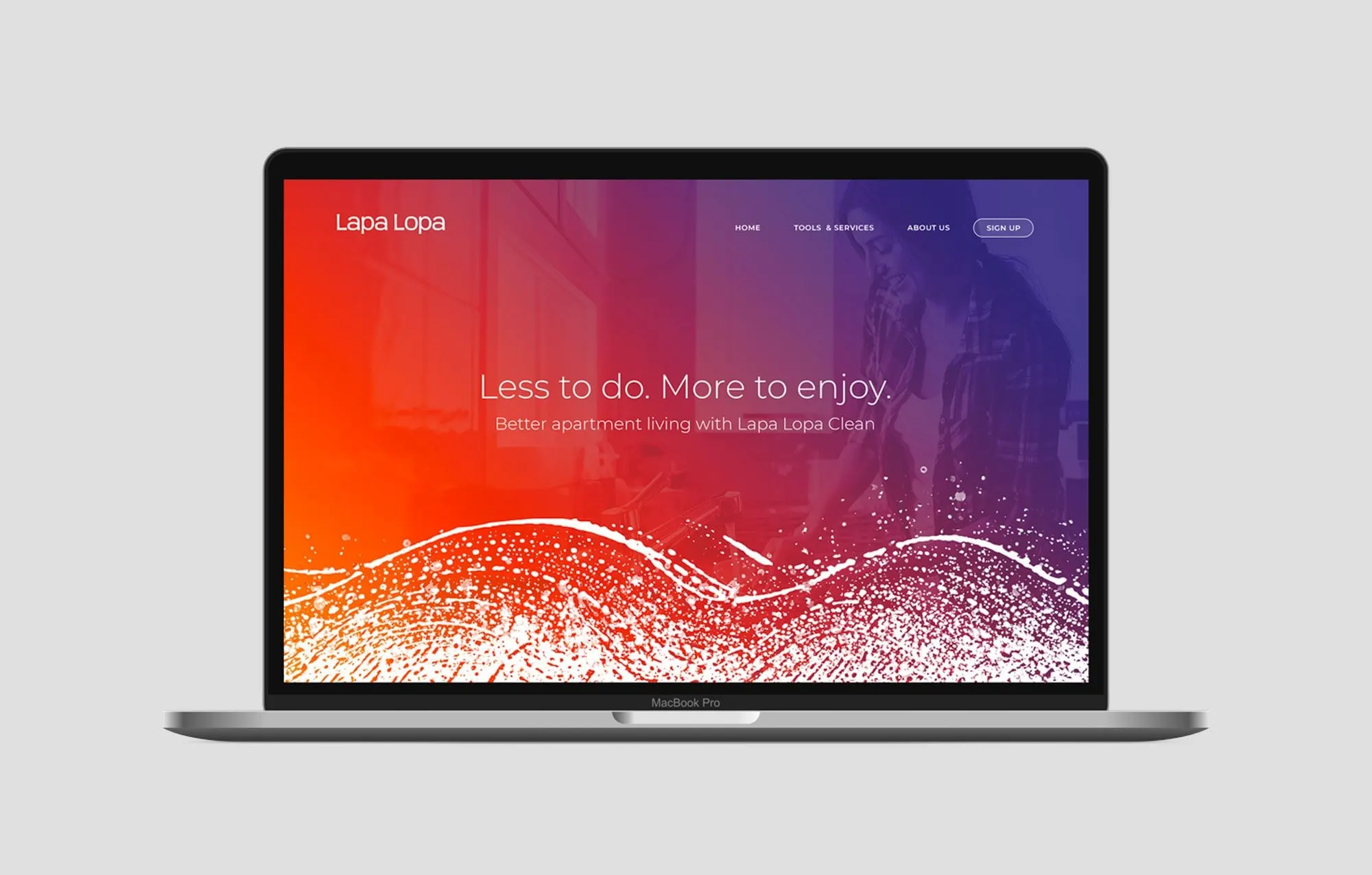
Cleaning services often look sterile: white, blue and stock photos of spray bottles. We wanted Lapa Lopa to feel lively instead. The hero uses a bold gradient from warm orange to deep purple over a photo of a resident at home, with the headline "Less to do. More to enjoy."
At the base of the hero, a textured wave of splashes and droplets sweeps across the page. It suggests water and movement without being literal, and it becomes a signature element we reuse to divide sections throughout the site.
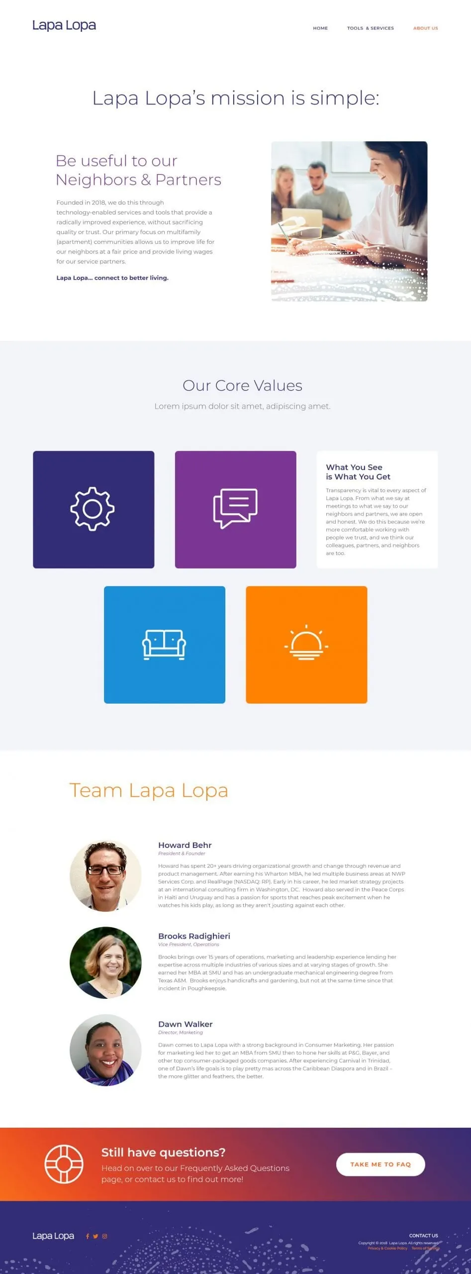
The rest of the system is clean and simple. A light, rounded sans serif keeps headlines friendly. Purple circular icons explain key benefits at a glance, and white space gives each section room to breathe. The palette extends to blue and orange in the core values tiles, so the brand has range without losing its identity.
03 — Pages
Three pages, each with one job
We kept the website design focused on three pages: Home, Tools & Services and About Us, with a Sign Up button always in reach.
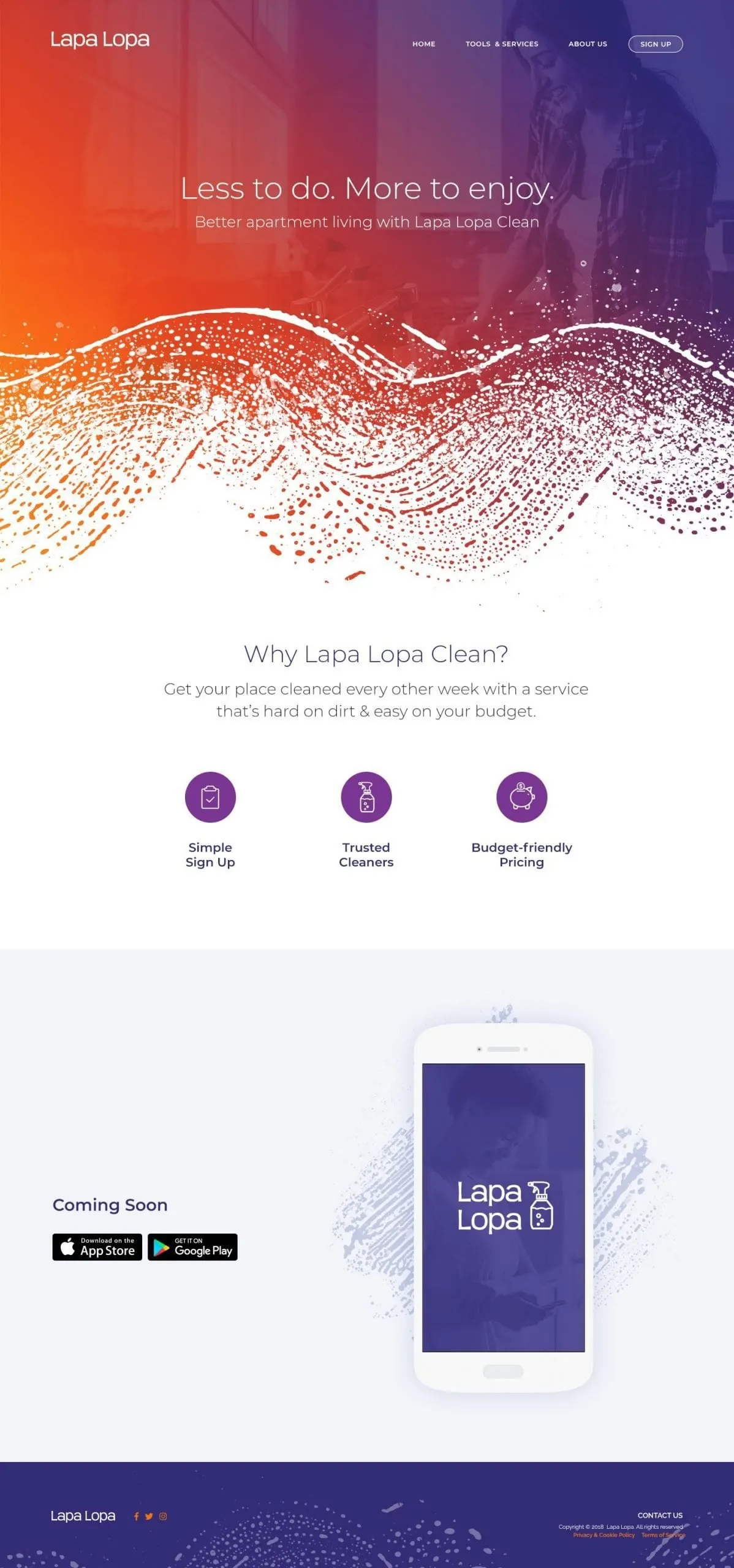
The homepage answers "Why Lapa Lopa Clean?" in one line and three icons: Simple Sign Up, Trusted Cleaners and Budget-friendly Pricing. A Coming Soon section shows the app on a phone with download badges, ready to switch on at launch. It follows the principles in our guide to what makes a great homepage.
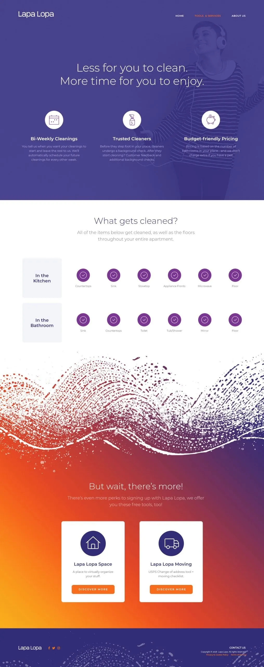
Tools & Services goes deeper. It explains bi-weekly cleanings, background checks for cleaners and pricing based on the number of bathrooms. A "What gets cleaned?" checklist shows every item in the kitchen and bathroom with purple check icons, so there are no surprises. A "But wait, there's more!" section introduces extra free tools for members.
About Us shares the mission, "Be useful to our Neighbors & Partners," alongside core values and team bios, giving residents and property partners real people behind the service. For more work with startups and emerging brands, see Roamr, a travel platform we branded and designed from the ground up.
What we delivered
A corporate website to support Lapa Lopa's app launch.