Case study · LifeSolutionz
LifeSolutionz
A corporate identity and investor-style pitch deck for LifeSolutionz, a North Carolina company offering alternative compensation plans to community health centres.
01 — Context
A financial idea that needed a clear face
LifeSolutionz is a North Carolina company that designs alternative compensation plans for community health centres and the physicians, providers and executives who work in them. The model is clever, but it's not simple: it involves restructured compensation, an over-funded life insurance policy, a loan between employer and participant, and tax treatment that has to be explained carefully.
When LifeSolutionz came to us, they needed two things that had to work together. First, a corporate identity that looked established enough to sit across the table from health centre executives. Second, a pitch deck that could walk a room through the plan without losing anyone. The LifeSolutionz branding and pitch deck were designed as one system, so the logo we drew became the visual engine of every slide.
02 — Identity
Four bars, one shared outcome
Our branding and identity design work started with what the plan actually does: it brings an employer, a provider, an insurer and the provider's family into one arrangement where everyone benefits. The mark is four rounded bars in green, yellow, sky blue and teal that cross at a single point. Where they overlap, the colours mix into new tones, which is the whole idea in a single shape.
We kept the mark abstract on purpose. A dollar sign or a medical cross would have boxed the company into one side of the story; an asterisk-like form reads as care, growth and connection at once. We wrote more about that thinking in our piece on why literal logo marks rarely work.
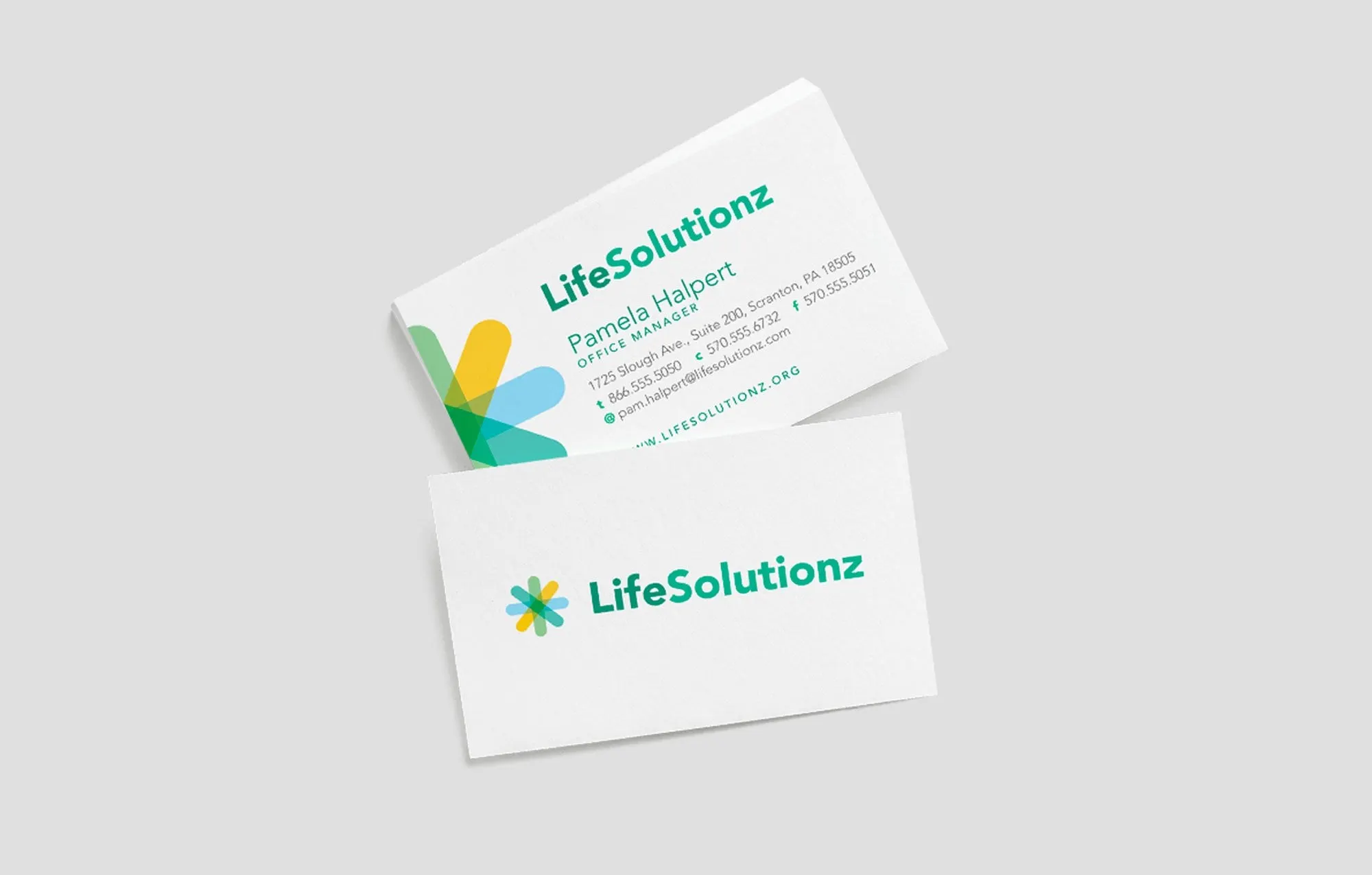
The wordmark is set in a friendly geometric sans in a deep green-to-teal, so the name stays readable at business card size and on a projector. For print, the business card front holds the logo alone on white, while the back crops the mark off the edge and lets it frame the contact details.
03 — The story
Opening the deck with the problem, not the product
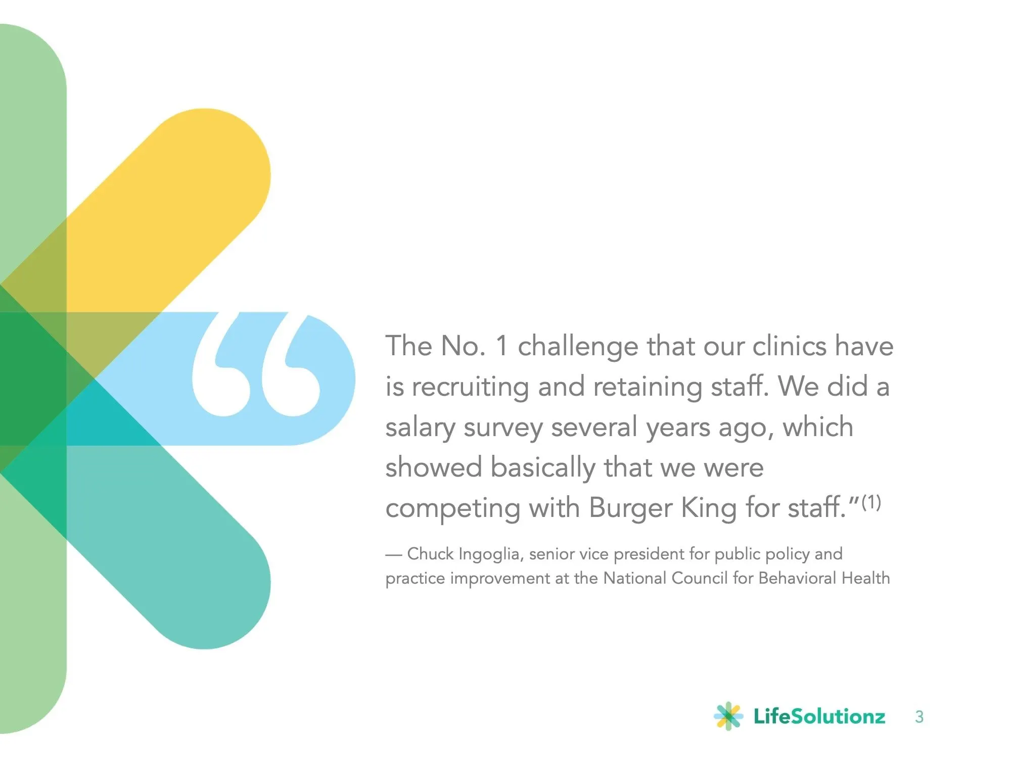
Good presentation design starts with the order of ideas. Health centre leaders already know their biggest headache, so the deck opens there. An early slide gives a full page to a quote from the National Council for Behavioral Health about clinics competing with fast-food chains for staff, with the logo bars sweeping in from the left like a frame.
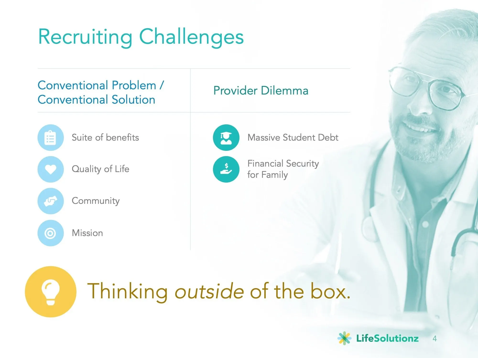
The next slide, Recruiting Challenges, lays out the conventional answer (benefits, quality of life, community, mission) beside the provider dilemma of student debt and financial security for family. A soft teal photo of a physician sits behind the content, and a yellow lightbulb introduces the turn: thinking outside of the box. Only then does LifeSolutionz appear as the answer.
04 — Explaining the mechanics
Turning insurance language into something you can follow
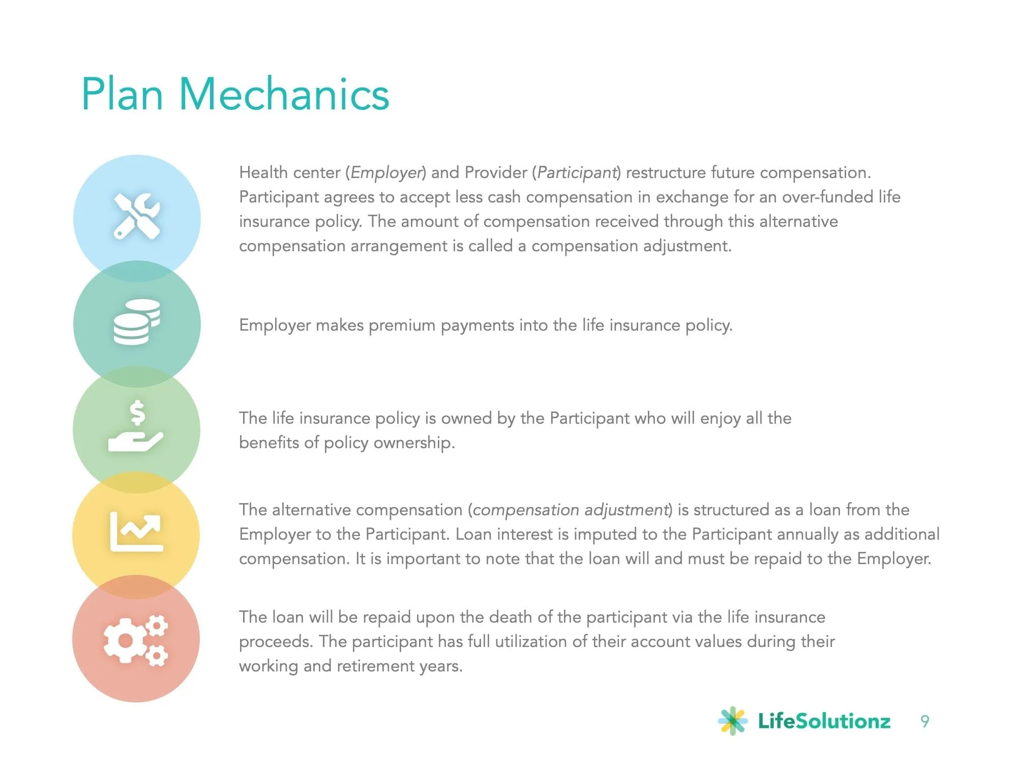
The heart of the deck is the part most financial presentations get wrong: the mechanics. The Plan Mechanics slide breaks the arrangement into five steps, each marked by an overlapping circle in the brand colours, so the eye travels down the page in order. Italics flag the roles (Employer, Participant, compensation adjustment) the first time they appear.
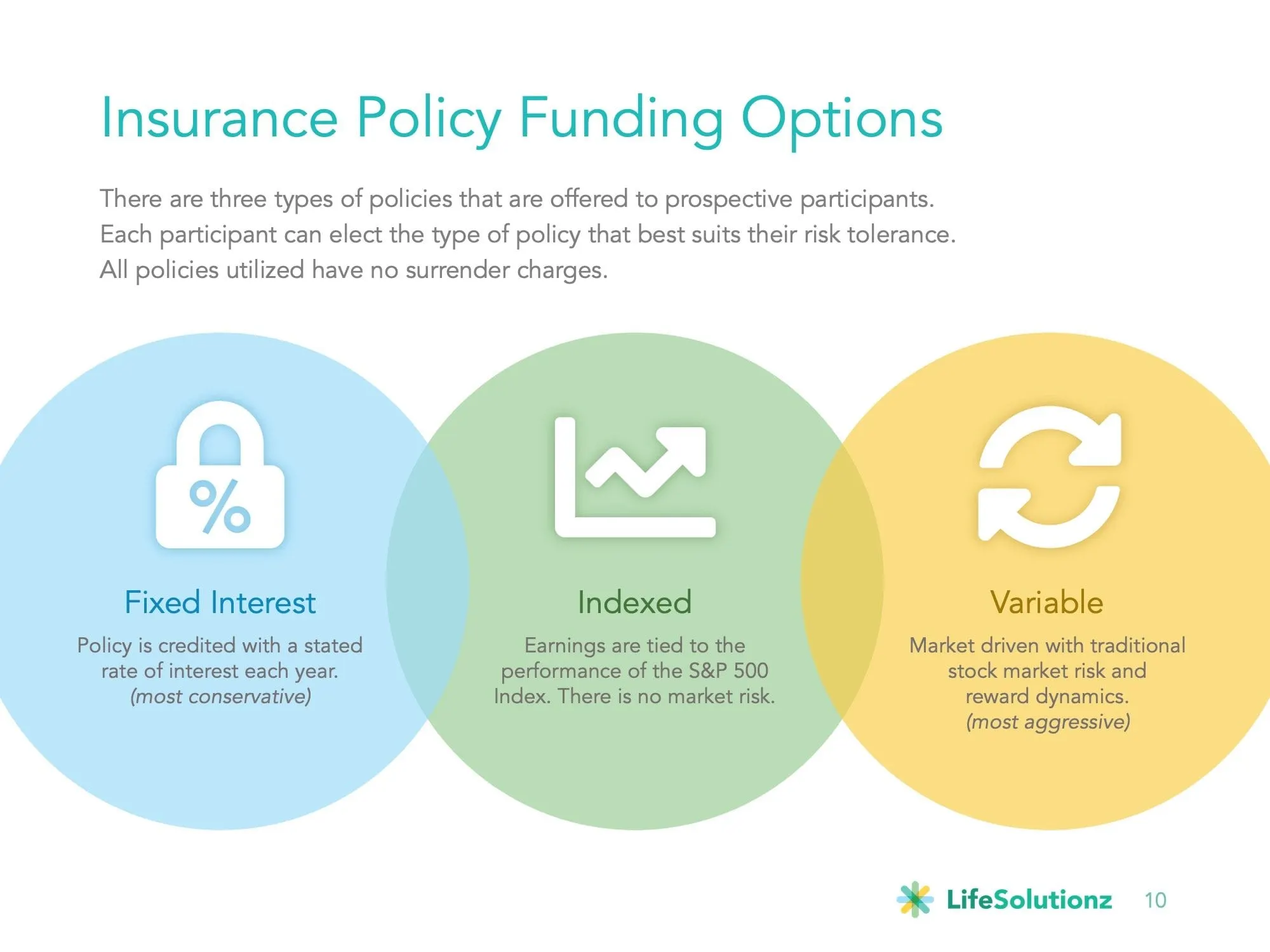
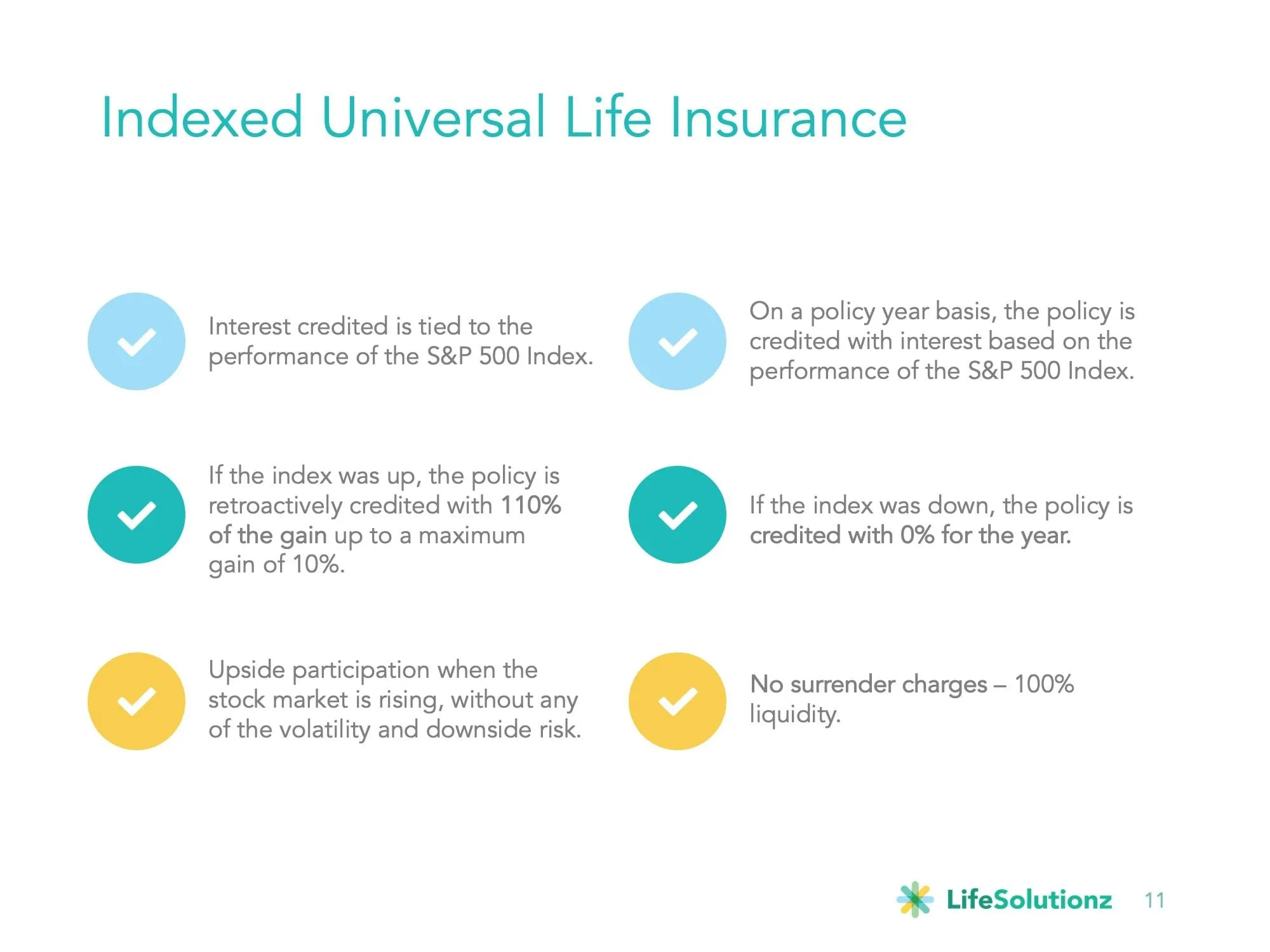
The funding options slide uses three overlapping circles for fixed interest, indexed and variable policies, running from most conservative to most aggressive. The indexed universal life slide then answers the follow-up questions in six short checkmarked statements. Each colour does a job. Blue, teal and yellow repeat as a rhythm rather than decoration, and the logo sits quietly in the same corner of every slide.
This is the same approach we take in other finance and insurance work, like the Fortified Retirement presentation: every slide earns its place by answering the next question in the room.
05 — Proof in the client's numbers
Case study slides that show the maths
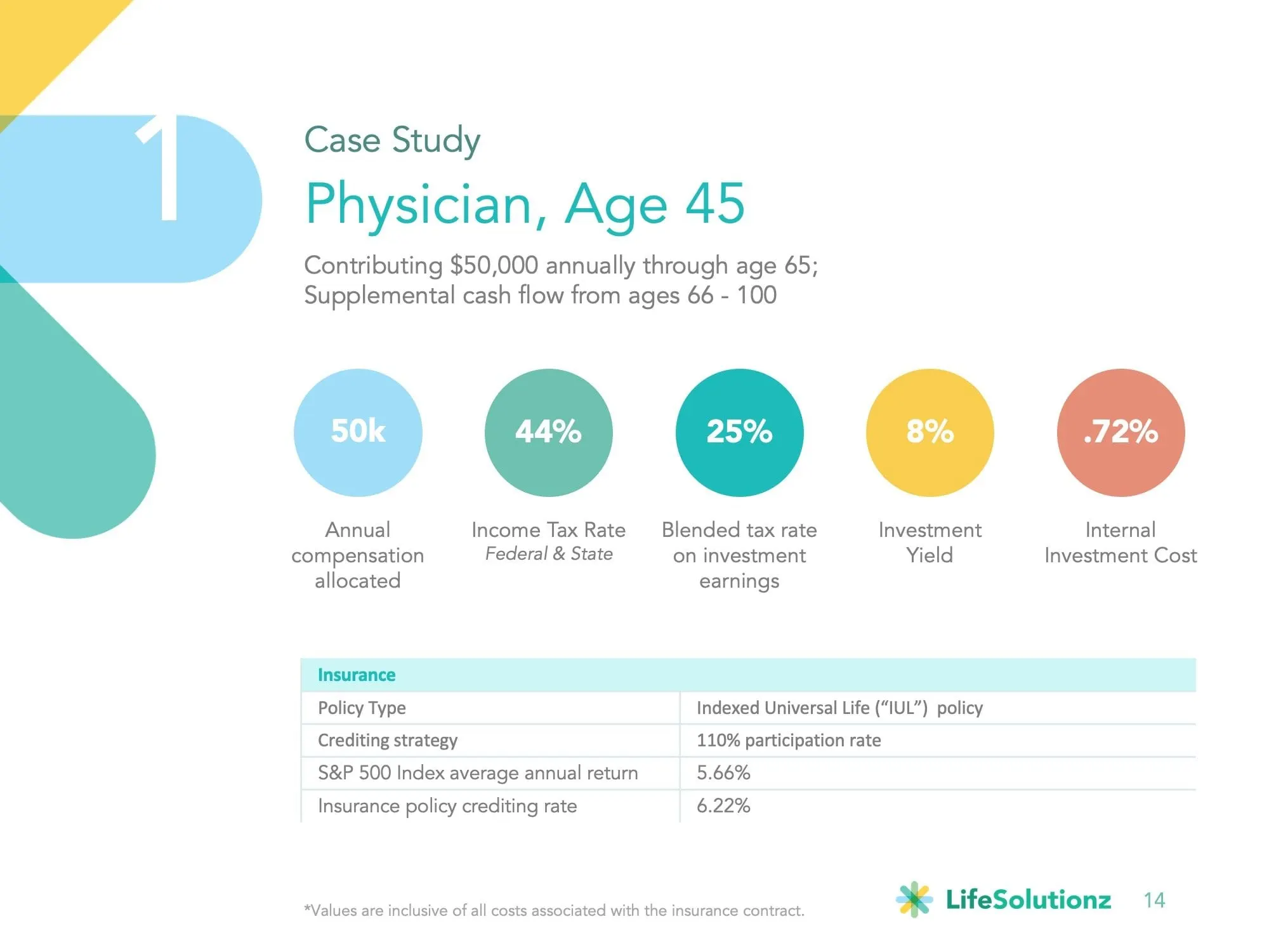
LifeSolutionz wanted prospects to see the plan applied to a real-world profile, so the deck includes worked case studies introduced by full-bleed divider slides. The first follows a physician, age 45, contributing to the plan through age 65. Five coloured circles pull out the key assumptions, and a clean table underneath handles policy type and crediting strategy.
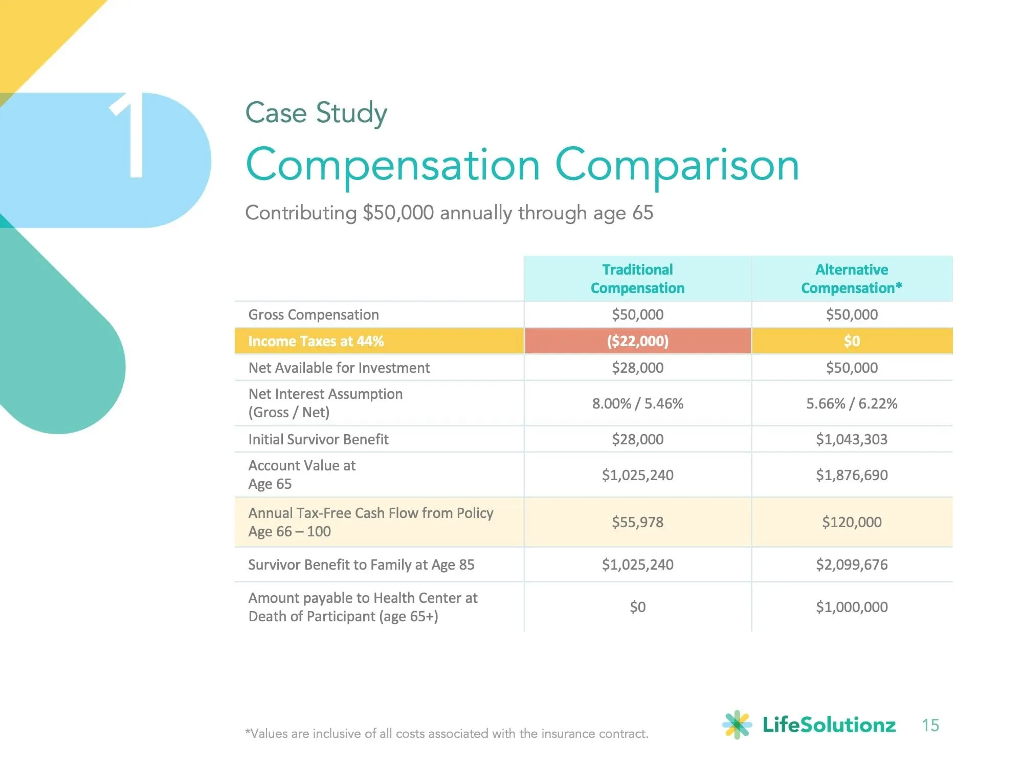
The compensation comparison slide sets traditional compensation against the alternative plan line by line. We highlighted the row where the two diverge most, income taxes, in yellow and coral, and shaded the annual cash flow row so the reader's eye lands on the two lines that matter. All the figures are the client's own illustrations; our job was to make them legible.
The result is a deck the LifeSolutionz team can present in a boardroom or send ahead as a leave-behind, backed by business cards and a mark that look like they came from the same company. For another example of a benefits story told visually, see our Kennion Benefits project.
What we delivered
A connected identity and sales presentation for a specialist compensation company.