Case study · Love Law firm
Love Law firm
A complete rebrand and website for Love Law Firm, a Savannah, GA family law practice built around mediation, collaborative law and uncontested divorce.
01 — Context
A Savannah family law practice ready for a new chapter
Love Law Firm is a family law practice in Savannah, Georgia, led by attorney Amanda Love. When the firm moved away from contested litigation toward a collaborative practice built on mediation, collaborative law and uncontested divorce, the old brand no longer told the right story. The firm came to us for family law firm branding that would carry through everything, from the logo to the website.
The people Amanda works with are often in one of the hardest seasons of their lives. Many are parents. They are looking for someone calm, fair and focused on their children, not for a firm that promises to win a fight. Our job was to make that difference visible the moment someone lands on the site.
We started with a brand session to understand what Love Law Firm wanted to be known for and what its clients needed to feel. That conversation shaped every decision that followed in our branding and identity design work.
02 — Identity
An olive branch as the mark of a peacemaker
The olive branch was the obvious symbol for a practice built on resolving disputes, so the question was how to use it without becoming literal or sentimental. We drew a fine, hand-sketched sprig and set it against a classic serif wordmark. The primary logo reads LOVE in confident capitals with "family law" in a relaxed script beneath it, framed by thin rules. It feels established, but not stern.
For smaller spaces we built an L monogram inside an open square, with the sprig breaking out of the frame. The brand guide spells out where it belongs: the website footer, the favicon and app icon, embroidery, simple signage and in-office labels. We also tested the monogram on every brand colour so the firm has approved versions for dark, light and tinted backgrounds.
03 — Colour & type
A palette that feels warm, not clinical
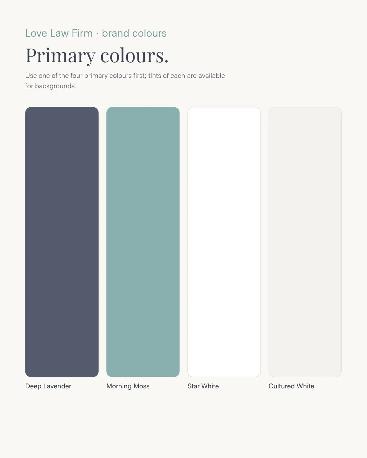
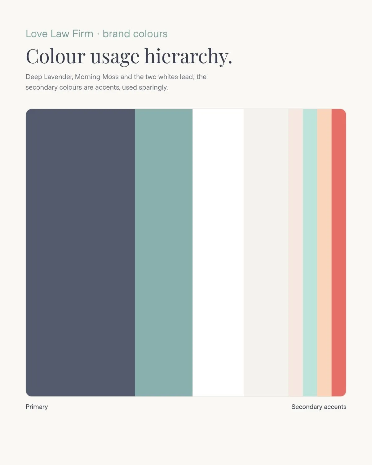
Most law firms reach for navy and gold. We went the other way. The primary palette pairs Deep Lavender, a soft slate, with Morning Moss, a muted green-grey that echoes the olive leaves, plus two whites that keep the layouts open and airy.
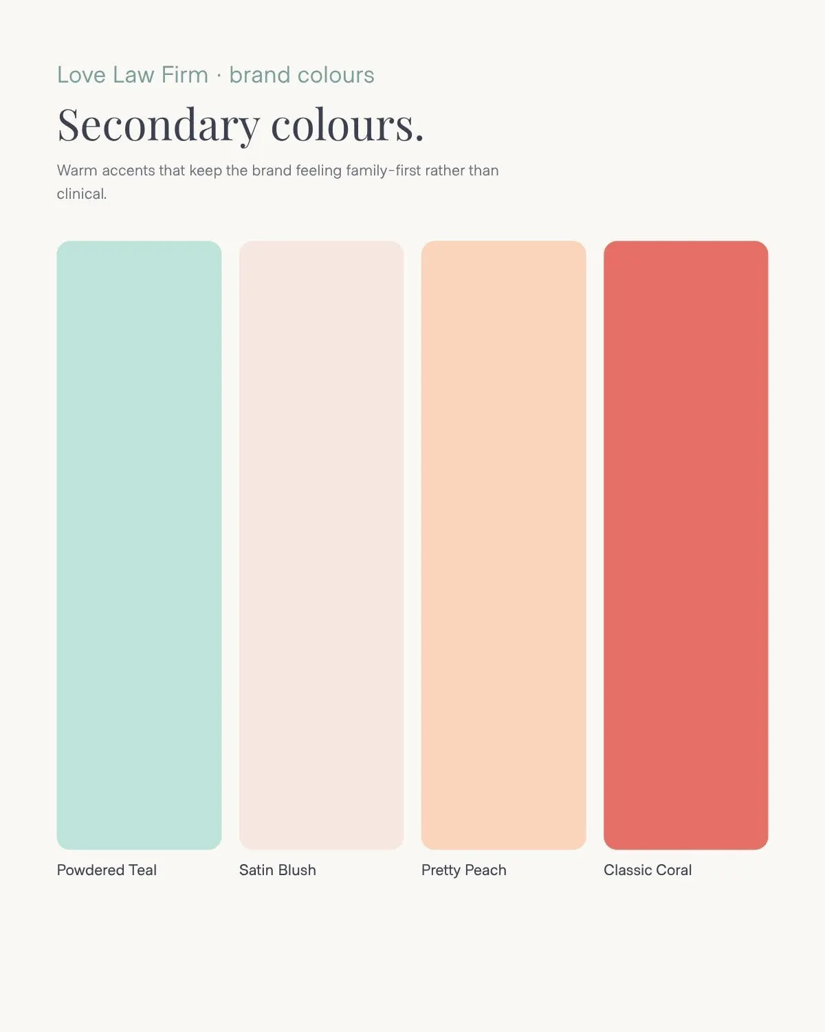
The secondary palette adds Powdered Teal, Satin Blush, Pretty Peach and Classic Coral. These tones give the website its gentle background panels and let the firm add warmth without losing focus. A colour usage hierarchy in the guide shows exactly how much of each to use, so the lavender and moss always lead.
Typography follows the same balance. Crimson Text, an elegant serif with a lovely italic, handles headlines like "Focus on children rather than conflict." DM Sans, a clean, friendly sans serif, carries body copy and small labels. Together they read as professional and approachable at the same time.

04 — Website
A family law website that leads with children
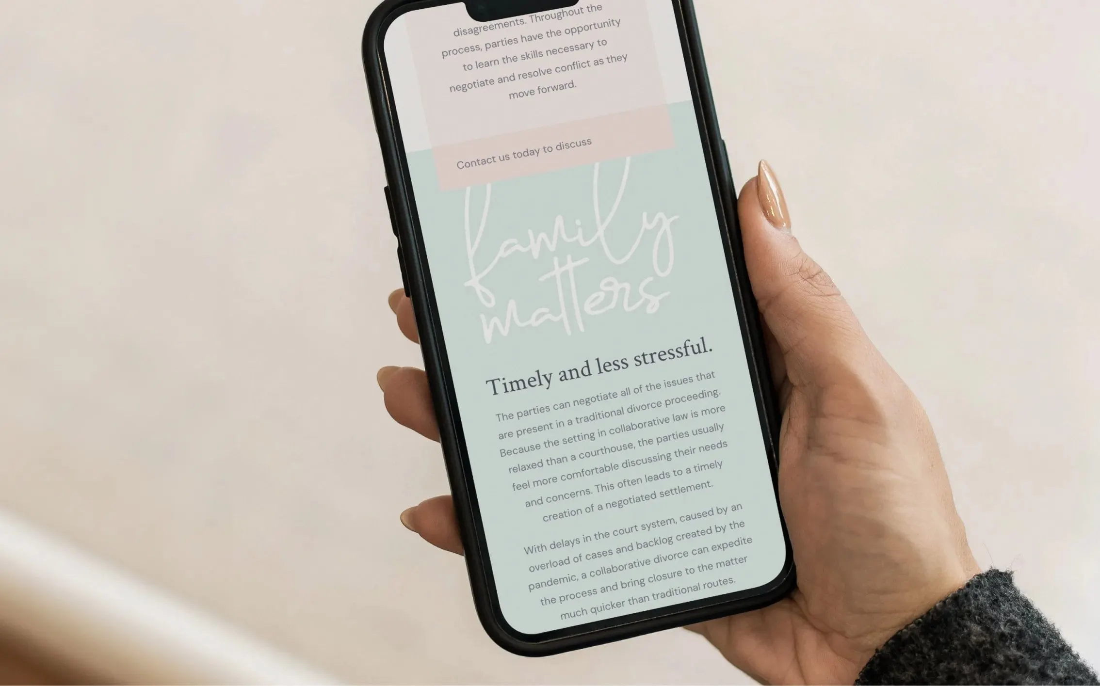
With the identity in place, we carried it into a full website design. The navigation is simple and practical: Attorney Profile, Family Law, Uncontested Matters, Client Reviews, Make Payments and a clear Contact button. Every practice page explains a process in plain language and ends with a quiet call to action to get in touch.
Each page opens with a calm, serif headline that answers the question a visitor is really asking. "Mediation is a cost-effective way to resolve a divorce case." "At the Love Law Firm, we focus on families first." Long explanations sit beside tinted service panels in blush and teal, which break up the reading and point to the next step, such as the firm's flat rates on uncontested cases.
Photography follows the guide: families at home, children laughing, olive branches in soft light. The handwritten "family matters" script appears where the content turns most personal, a reminder of what the whole practice is about. It is the same thinking behind designing the brand and website together: one voice, start to finish.
05 — Brand guide
A brand guide that keeps the firm consistent
A rebrand only holds up if it is used the same way every time. We documented the system in a full brand guide covering logos and marks, clear space, colour values in CMYK, RGB and HEX, colour hierarchy, typography, photography and icon treatment.
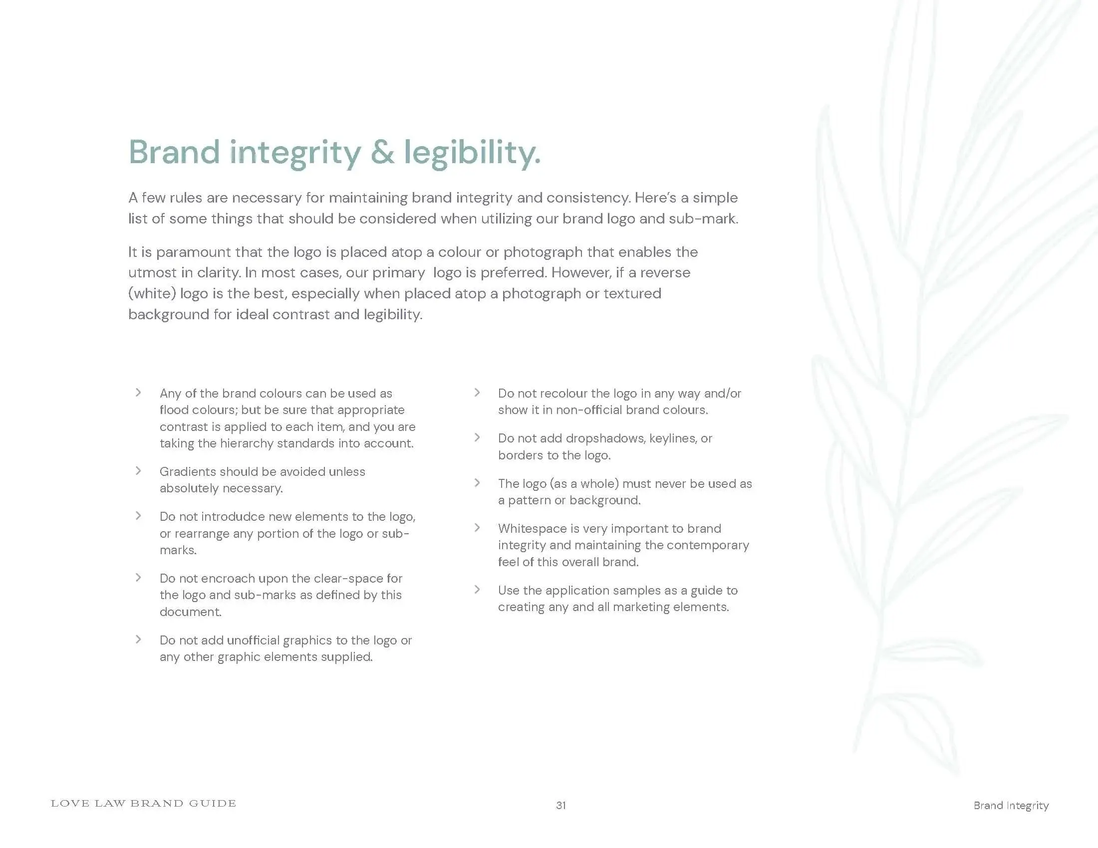
A page on brand integrity and legibility gives simple rules anyone can follow: don't recolour the logo, avoid gradients, protect the clear space and keep plenty of white space so the brand stays contemporary. With the guide in hand, the firm can brief a printer, a sign maker or a future web developer without starting from scratch.
For other professional services firms weighing a similar shift, see our work for Kentucky Injury Claims.
What we delivered
A complete rebrand for Love Law Firm, from the first brand session to a live website.