Case study · Visa Corporate
Visa Corporate
A Blueprint booklet, fold-out poster and PowerPoint slides that helped Visa's team present its mission, vision and values to executives during a brand repositioning.
01 — Context
Brand booklet design for a global repositioning
Visa is a global leader in digital payment technology, serving individual and commercial clients around the world. Its team was working through a brand repositioning exercise, defining Visa's future within banking and commerce and setting out a new mission, vision and values.
That thinking needed a home. We were asked to support it with brand booklet design: the Blueprint booklet, a set of PowerPoint slides and help with print production. The words and strategy came from Visa; our role was to give them a form that executives would want to keep. The Visa brand itself was not ours to change, so every choice had to sit comfortably beside it. In finance, where trust is the product, a document like this has to feel as considered as the strategy inside it.
The booklet was made for a high-level meeting, and the brief included a special detail: the cover wraps the booklet and unfolds into a full Blueprint poster, a leave-behind for the executive team.
02 — The booklet
A calm, editorial pace for big ideas
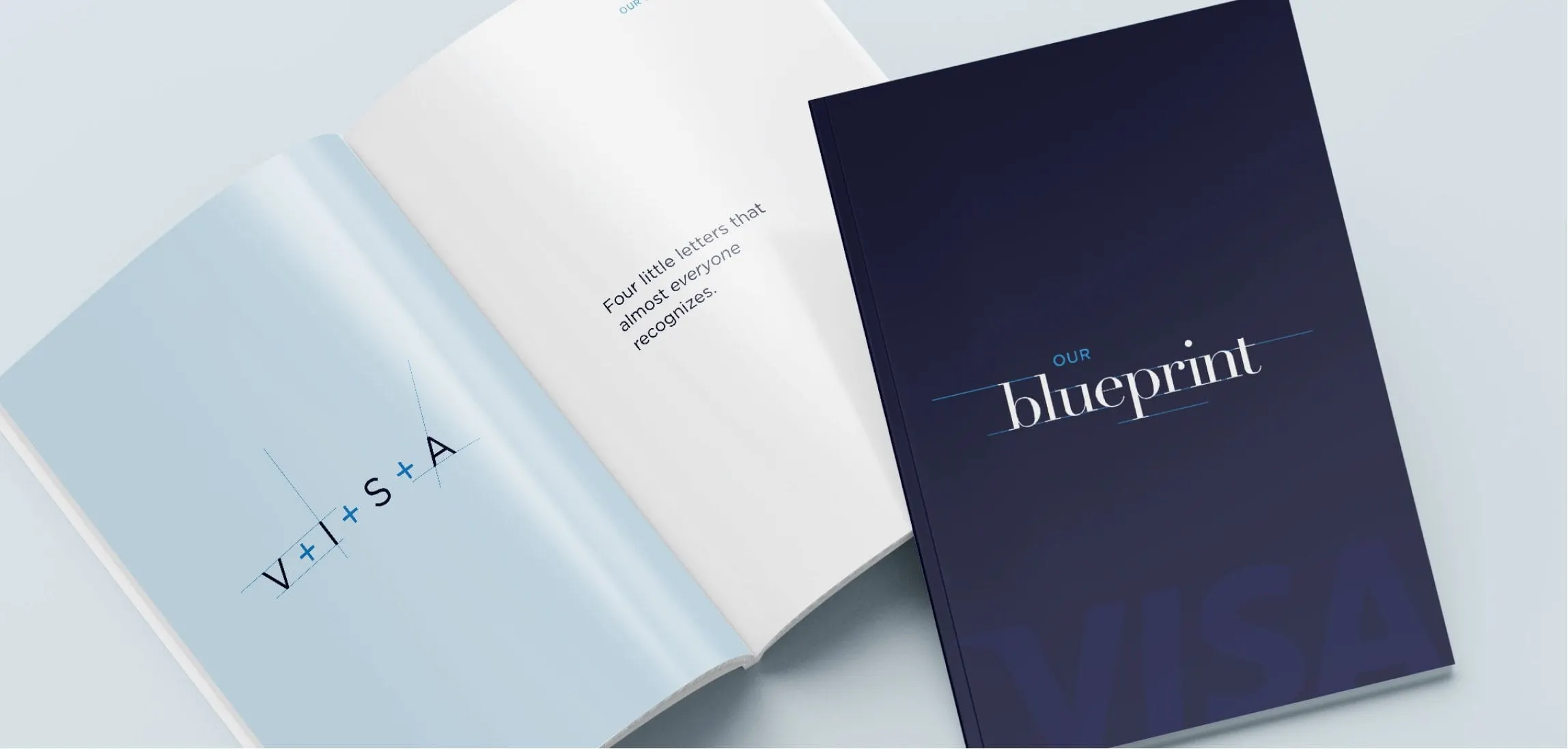
A repositioning document can easily feel like a policy manual. We treated the Blueprint as an editorial piece instead. The cover is deep navy with the word blueprint set in a fine, high-contrast serif, a thin rule running through it and the Visa letters ghosted large at the foot.
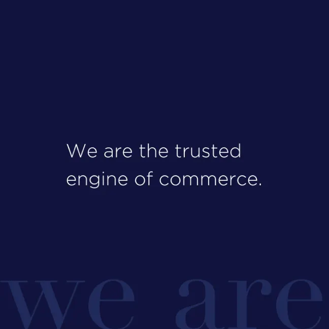
Inside, the pacing is slow on purpose. An early spread spells out V+I+S+A across a pale blue page, opposite a single line: Four little letters that almost everyone recognizes. Statement pages such as We are the trusted engine of commerce sit alone on navy, with oversized serif words like we are fading into the background behind them. Warm, candid photography of people at work, like a small restaurant team laughing at the bar, reminds the reader who the commerce network actually serves.
This mix of whitespace, big serif type and clean sans serif body copy is classic publication design: let one idea land before introducing the next.

03 — Poster and slides
One blueprint, on paper and on screen
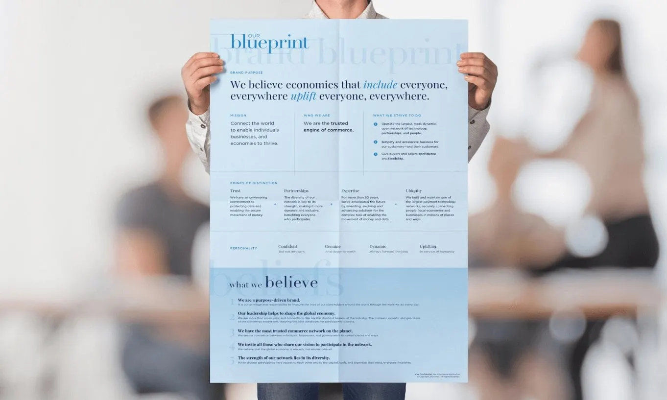
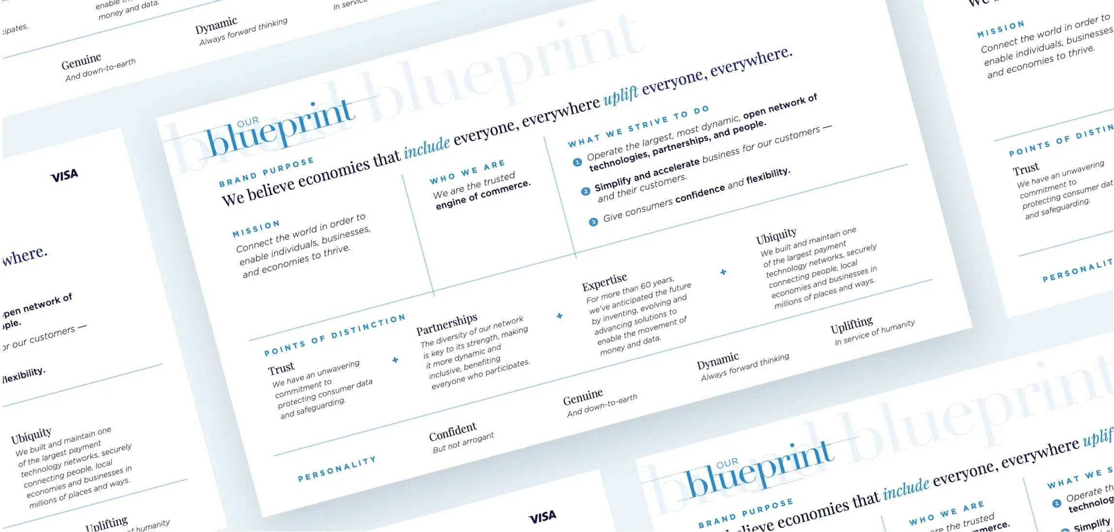
Unfolded, the cover becomes a single-page summary of the whole repositioning. The poster opens with the brand purpose, We believe economies that include everyone, everywhere uplift everyone, everywhere, with the words include and uplift set in blue italics. Below it, columns lay out the mission, who Visa is and what it strives to do, followed by four points of distinction, Trust, Partnerships, Expertise and Ubiquity, and four personality traits. A final section lists five numbered beliefs under the heading what we believe.
Getting that much content onto one sheet without crowding it took a strict grid, consistent small caps labels and fine dividing rules. We then supported the print production so the fold and finish worked as intended.
The same layouts were rebuilt as PowerPoint slides, so the team could walk through the Blueprint in the meeting and the executives could take the printed version away. It is the kind of corporate communication design we also brought to our Marriott M+E manifesto and to Johnson & Johnson's Project Ruby presentation.
What we delivered
Materials supporting Visa's new mission, vision and values.