Case study · Oceanic Wellness
Oceanic Wellness
A family of wave-inspired logos, a coastal colour palette and business cards for Oceanic Wellness, a provider of mental health support in corporate settings.
01 — Context
Mental health support, at work
Oceanic Wellness provides mental health support in corporate settings. Its clients are employers, and its users are their people: staff who may be dealing with stress, burnout or bigger challenges, often without much time or privacy to seek help.
That puts the brand in a delicate spot. It has to reassure HR leaders and executives that the service is professional and dependable, and it has to feel safe and human to the employees who actually use it. Oceanic Wellness asked us for a branding strategy and a complete brand identity that could do both. Our Oceanic Wellness brand identity work produced a family of logos, a full colour palette and business cards.
02 — The wave
Change and strength in one image
Our branding and identity design centred on a single motif: a curling wave inspired by the iconic Japanese Great Wave. We chose it for what it holds at once. A wave is a force of profound change, and it's also a symbol of steady, renewable strength, which is a fair description of what good mental health support helps people find.
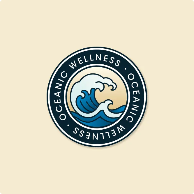
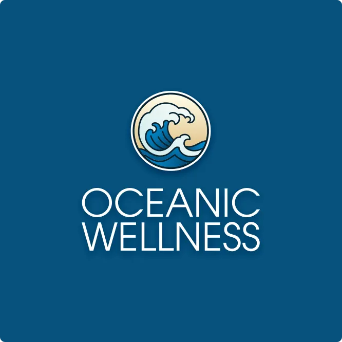
We drew the wave in a woodblock-print spirit, with clawed white crests over layered blues, set against a soft gold sky inside a circle. That circle became the anchor of a whole logo family. The badge version wraps OCEANIC WELLNESS around a navy ring, a format that feels established and trustworthy, almost like a seal. The stacked and horizontal lock-ups pair the round icon with the name in clean, light capitals, for places where the badge would feel too formal. A single-colour line version translates the wave into white strokes for embossing, one-colour printing or use on photography.
Having several versions isn't decoration. A brand that serves both boardrooms and break rooms needs to scale down to an email signature and up to a presentation slide without losing its character. It's the kind of thinking we cover in why branding without strategy is just expensive art.
03 — Colour and print
A palette chosen for warmth and trust
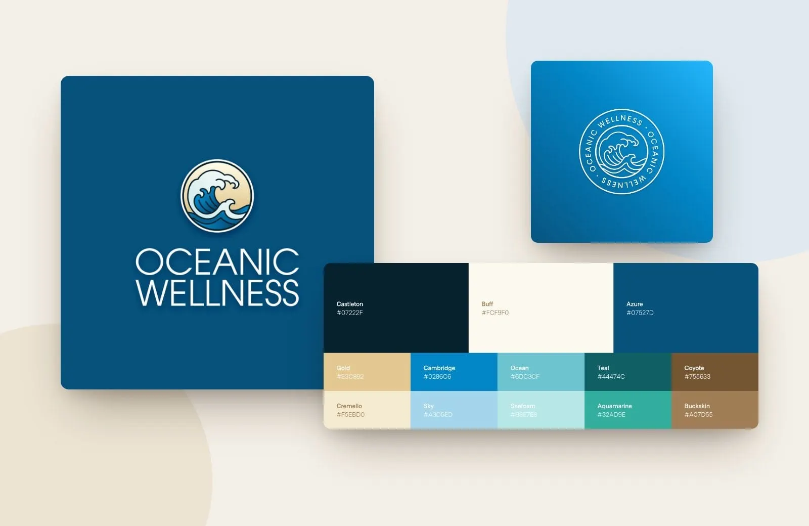
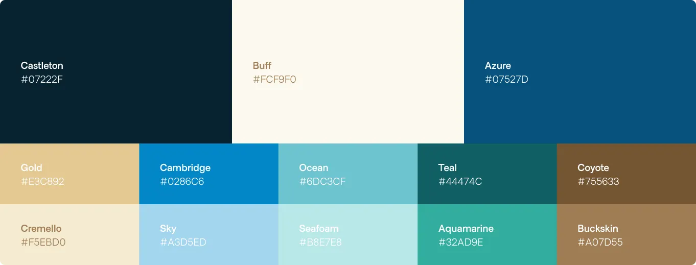
Blues alone can feel cold and corporate, so we balanced the ocean with the shore. The core colours are Castleton, a deep navy-black; Azure, a rich mid blue; and Buff, a soft off-white. Around them sit Cambridge, Sky, Ocean, Seafoam, Teal and Aquamarine on the water side, and Gold, Cremello, Coyote and Buckskin on the sand side. The warm tones bring compassion and approachability; the blues bring calm and dependability.
For print, the business cards put that balance in people's hands. One side is deep blue with the white line badge and a large, faint wave pattern bleeding off the edge. The other is cream, with contact details in a friendly lowercase sans, a sky blue title and a gold band carrying the web address along the bottom.
Every element was designed to help Oceanic Wellness establish a strong, supportive presence in the healthcare and workplace wellness space. For another mental health and recovery brand we built with the same care, see Steadfast Health.
What we delivered
A complete visual identity for a workplace mental health provider.