Case study · Kauri Chiropractic
Kauri Chiropractic
A complete brand overhaul for Kauri Chiropractic in Chilliwack, BC: new logo, colour palette, stationery, appointment cards and a custom website.
01 — Context
Chiropractic branding for a Chilliwack family practice
Kauri Chiropractic is a family practice in Chilliwack, British Columbia, offering neurologically based chiropractic care to everyone from newborns and expectant mothers to aging adults. Dr. Aaron Whitaker trained at the New Zealand College of Chiropractic, and the practice takes its name from the kauri, one of New Zealand's best-known native trees.
They came to us for a complete brand overhaul. They wanted a new mark that honoured their journey and breathed new life into the practice's design, with chiropractic branding that would carry through everything a patient touches: the logo, the business cards and appointment cards, the letterhead and, finally, a new website.
Our goal was a brand that honoured the practice's story while feeling calm, warm and trustworthy — the opposite of a cold clinic. For a family deciding where to bring an infant, that first impression matters.

02 — Identity
A growing leaf and a forest-green palette
We built the new mark from the name itself: a single leafy sprig rising inside an upright oval, like a young kauri. The upward growth speaks to healing and development — central to a practice that sees so many children — and the oval gives it a soft, contained shape that works as a stamp on letterhead, an icon on an envelope flap or a favicon. Paired with spaced capitals for KAURI and a fine CHIROPRACTIC line beneath, it reads as established without feeling stiff. A KC monogram version covers smaller spaces.
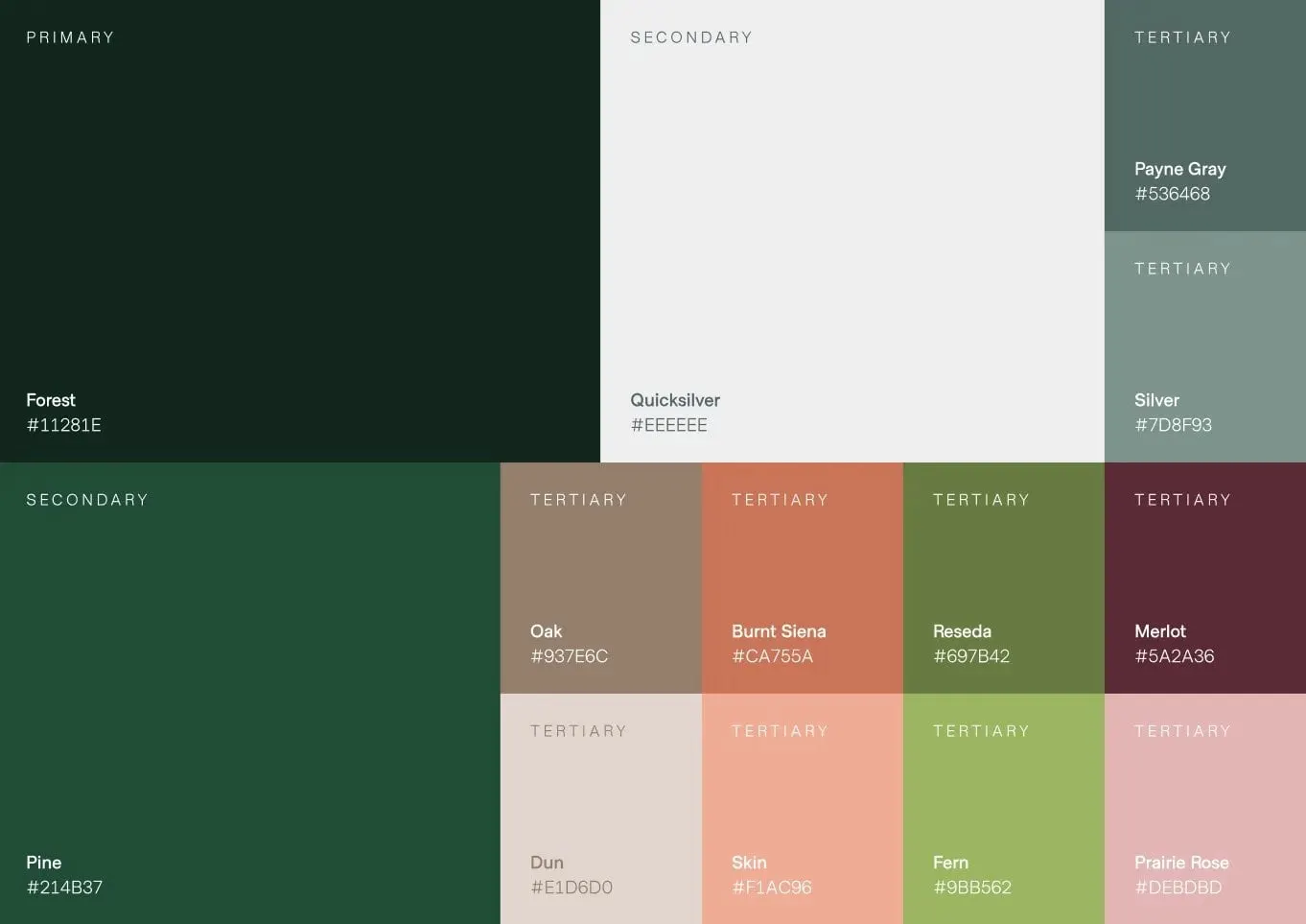
The palette is rooted in that same forest. Forest (#11281E) is the primary colour and Pine (#214B37) the secondary green, balanced by a light Quicksilver neutral. A set of tertiary tones — Payne Gray, Silver, Oak, Burnt Siena, Reseda, Merlot, Dun, Skin, Fern and Prairie Rose — gives the practice room for warmth in photography, highlights and future materials without straying from the brand.
For type, we paired an elegant serif, often set with an italic accent word, with a clean sans-serif for body text. The serif brings a personal, caring tone; the sans keeps clinical information easy to read.
03 — Print
Stationery patients keep in their wallet
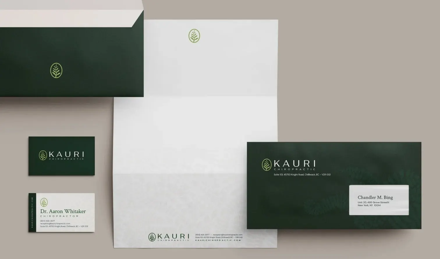
With the identity in place, we applied it across the practice's day-to-day print design. The stationery set includes business cards with a forest-green front and a white back carrying Dr. Whitaker's details, a white letterhead with the leaf mark at the top and the full logo and contact line at the foot, and deep green envelopes with the logo reversed out in light green.
The appointment card got special attention because it is the piece patients actually carry. A green spine on the left holds the KAURI name set vertically, while the white face has clear fields for name, date and time and a row of rounded weekday tabs from Monday to Saturday, so the front desk can mark the next visit quickly. A faint oversized leaf in the corner ties it back to the logo.
04 — Website
A website that answers new patients' questions
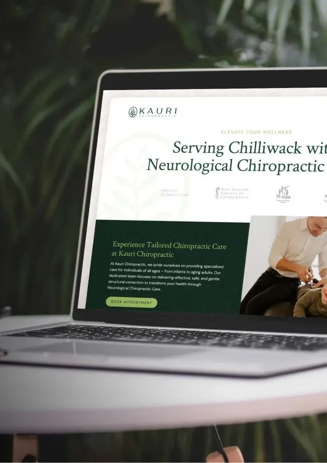
Finally, we took every asset we had created and used it to design and develop a bespoke website. Our website design opens with "Serving Chilliwack with Neurological Chiropractic," followed by the practice's accreditations and a forest-green panel introducing tailored care with a clear Book Appointment button — the action that matters most, as we explain in our guide to healthcare website CTAs.
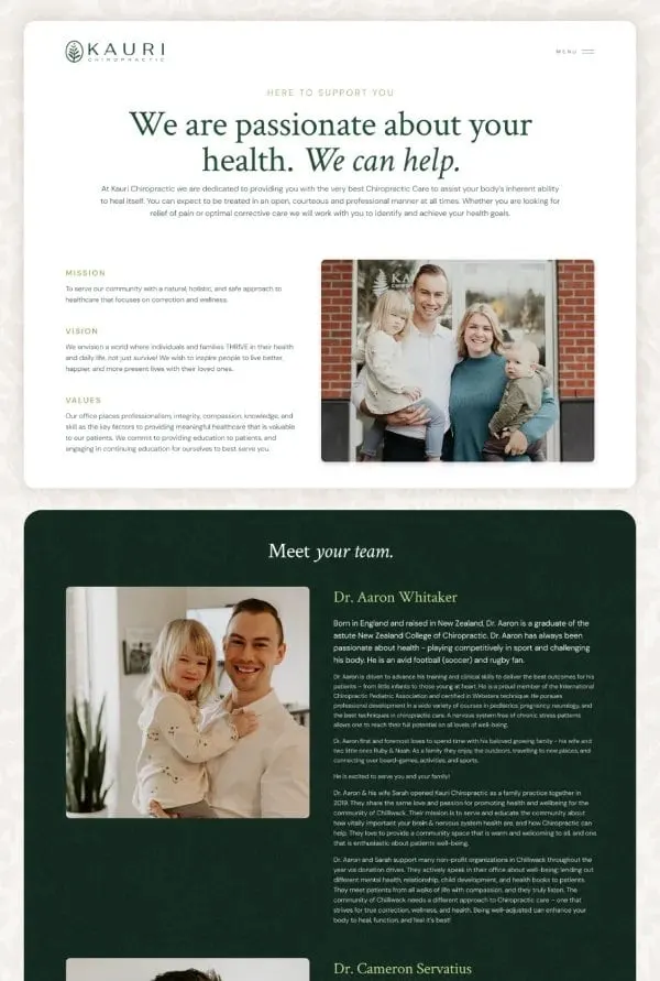
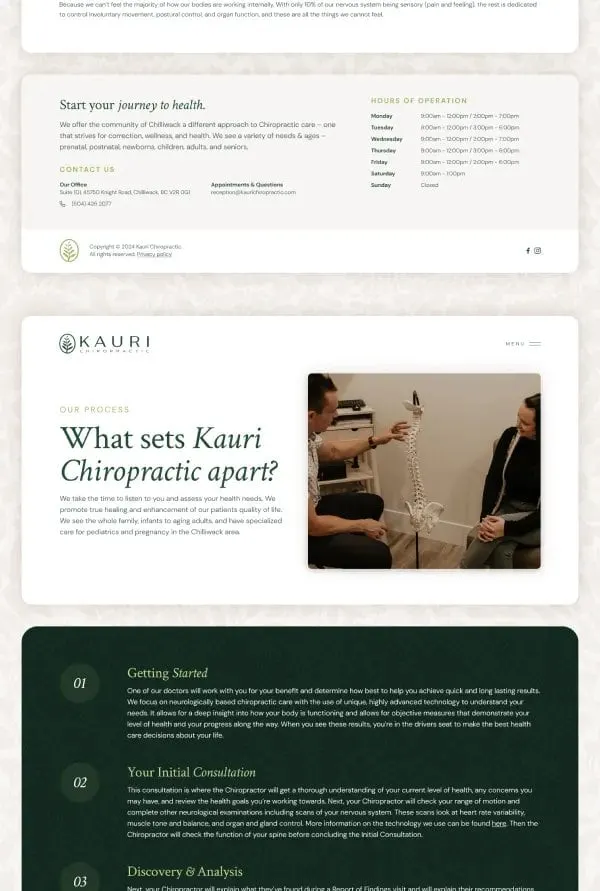
The About page sets out the mission, vision and values beside a family photograph, then moves into a dark green Meet your team section with full biographies for each chiropractor. A "What sets Kauri Chiropractic apart?" page walks new patients through the process in numbered steps — Getting Started, Your Initial Consultation, Discovery & Analysis — so nobody arrives unsure of what will happen. Hours of operation and contact details sit together in the footer.
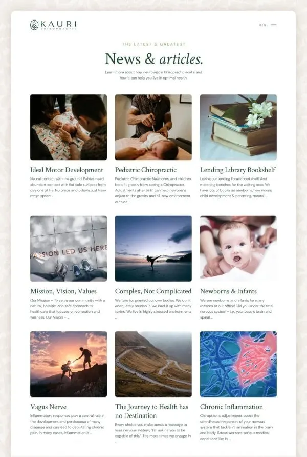
A News & articles section gives the practice a home for helpful content on topics like pediatric chiropractic, newborns and infants, and the vagus nerve, laid out in a photo-led three-column grid that is simple to keep growing.
05 — The result
One calm, consistent patient experience
Kauri Chiropractic now presents the same face everywhere: the leaf on the envelope matches the leaf in the browser tab, and the greens on the appointment card match the website panels. For a family practice, that consistency builds the kind of quiet confidence that helps a new patient pick up the phone.
If you run a clinic in the healthcare space, you may also like our work with Guidelight Health.
What we delivered
A complete brand overhaul for Kauri Chiropractic.