Case study · Marriott M+E
Marriott M+E
A brand refresh for Marriott's internal Meetings + Events team: discovery workshop materials, a typographic manifesto poster, office decals, apparel and a brand guide.
01 — Context
Brand manifesto design for an internal team
Inside Marriott, the Meetings + Events team, known as M+E, plans and delivers meetings and events for the hospitality company. In 2022 the team was going through a refresh and repositioning of its own internal brand, and it wanted a clear statement of who it is and what it stands for.
The core of the project was brand manifesto design: a poster that sets out the team's beliefs in its own words, and that could then travel through the office, onto t-shirts, decals and more. We supported the wider brand refresh with workshop materials, the manifesto poster, its applications and an internal brand guide. To be clear, this was a team-level identity that sits within Marriott; the Marriott brand itself was not part of our scope.
The interesting challenge was that the manifesto did not exist yet. Before we could design it, the team needed to write it. That shaped the whole project into two phases: first help the team discover its own voice, then give that voice a visual form strong enough to live on an office wall.
02 — Discovery
Designing the workshop that wrote the manifesto
A manifesto only works if the people it describes recognize themselves in it. So rather than drafting copy for the team, we designed materials that helped M+E's own discovery group find the words.
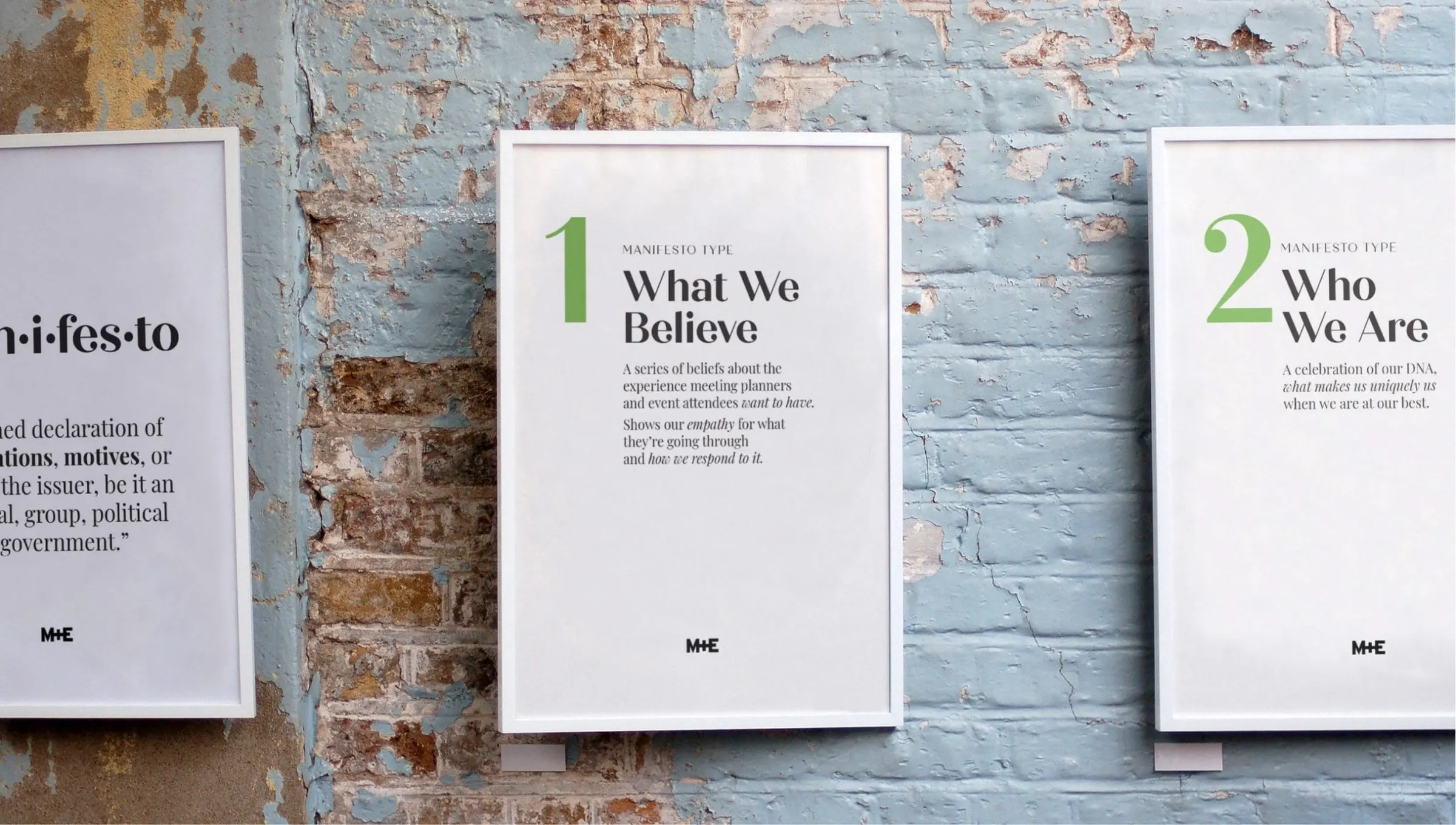
The workshop posters walk participants through the idea step by step. One defines the word manifesto: a public declaration of intentions, motives or views. Others introduce different manifesto types, numbered in green, such as What We Believe, a series of beliefs about the experience meeting planners and attendees want to have, and Who We Are, a celebration of the team's DNA when it is at its best.
Each poster pairs a large numeral with a serif headline and a short explanation, framed in white with the M+E mark at the foot. They were designed to be pinned up around a room so a group could move between them, react and write. This kind of facilitation material is a quiet but valuable part of print design: it shapes the conversation before any final artwork exists, and it keeps strategy ahead of styling.
03 — The poster
A manifesto set in many voices
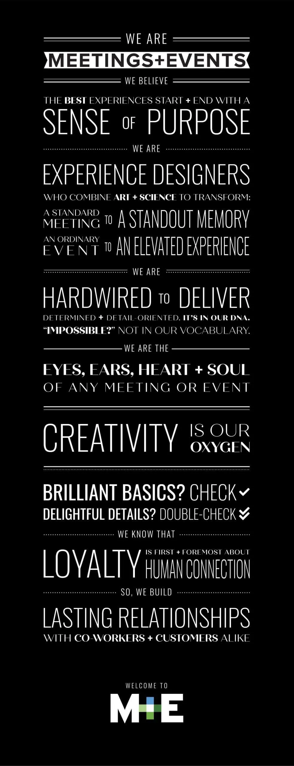
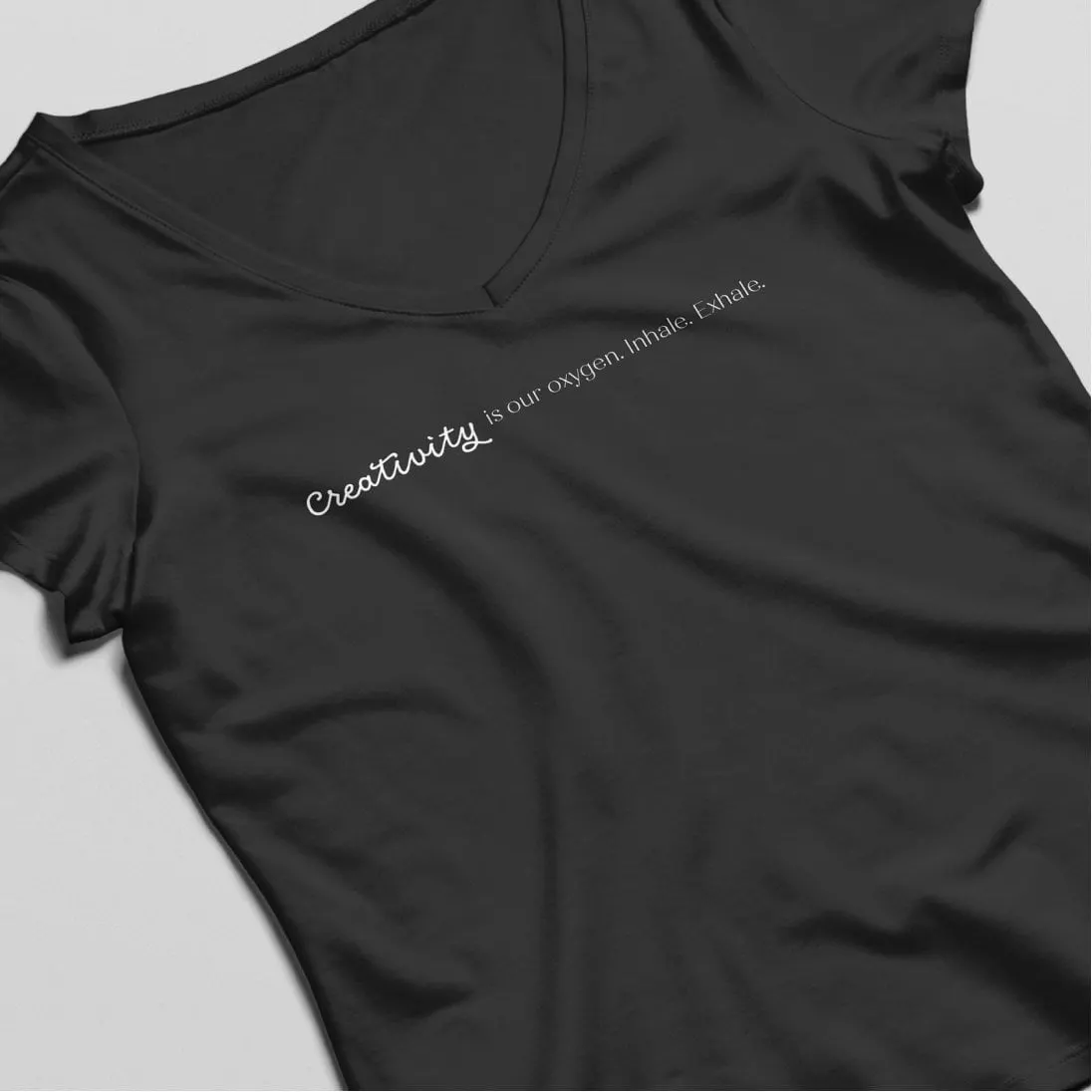
The team's finished manifesto is a series of short declarations: We believe the best experiences start and end with a sense of purpose. We are experience designers who combine art and science. We are hardwired to deliver. We are the eyes, ears, heart and soul of any meeting or event. Creativity is our oxygen. Brilliant basics, check; delightful details, double-check.
We set it as a tall, black typographic poster with white type. Each line mixes condensed capitals, wide display letters, a refined serif and small spaced labels like WE ARE and WE BELIEVE, separated by fine rules and dotted lines. The changes in typeface mirror the changes in tone, so a line about being determined and detail-oriented looks different from a line about heart and soul.
The poster is built in modules on purpose. Because every statement stands on its own, single lines can be lifted out and used elsewhere, which is exactly what happened with Creativity is our oxygen on a black t-shirt.
04 — System
A brand guide the whole team can use
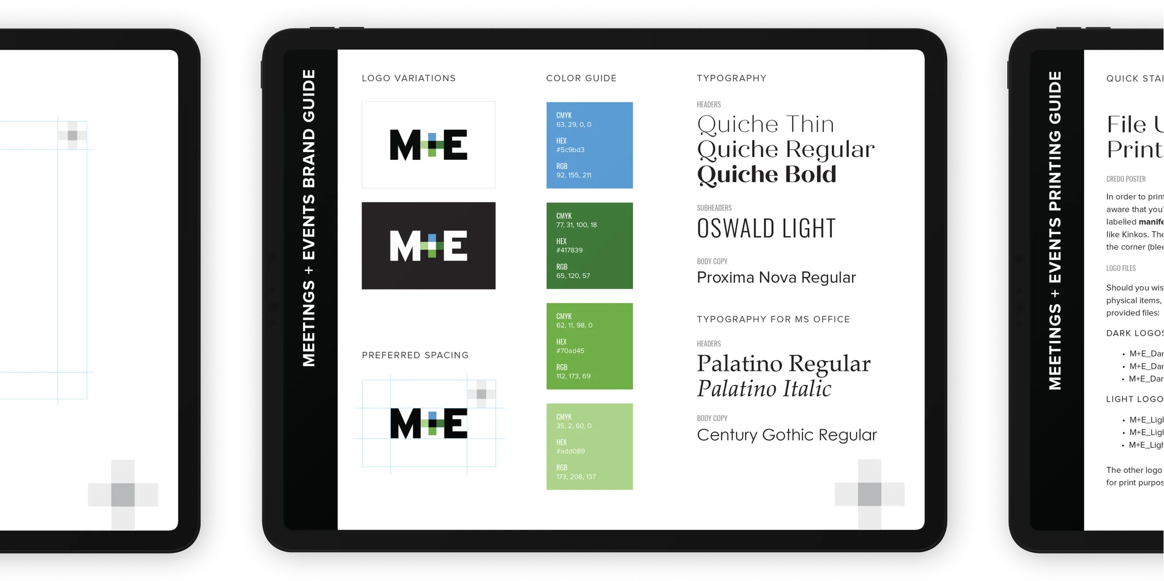
The M+E mark pairs bold black letters with a plus sign built from blue and green squares, a nod to the way meetings and events come together. The refresh needed rules so that the team could use it consistently without a designer in the room.
We put those rules into a Meetings + Events brand guide covering logo variations on light and dark backgrounds, preferred spacing, and a four-colour guide of blue and greens with CMYK, HEX and RGB values. The typography section sets Quiche for headers, Oswald Light for subheaders and Proxima Nova for body copy, along with Palatino and Century Gothic as stand-ins for everyday Microsoft Office documents. A companion printing guide explains file use and which logo files to send to a printer.
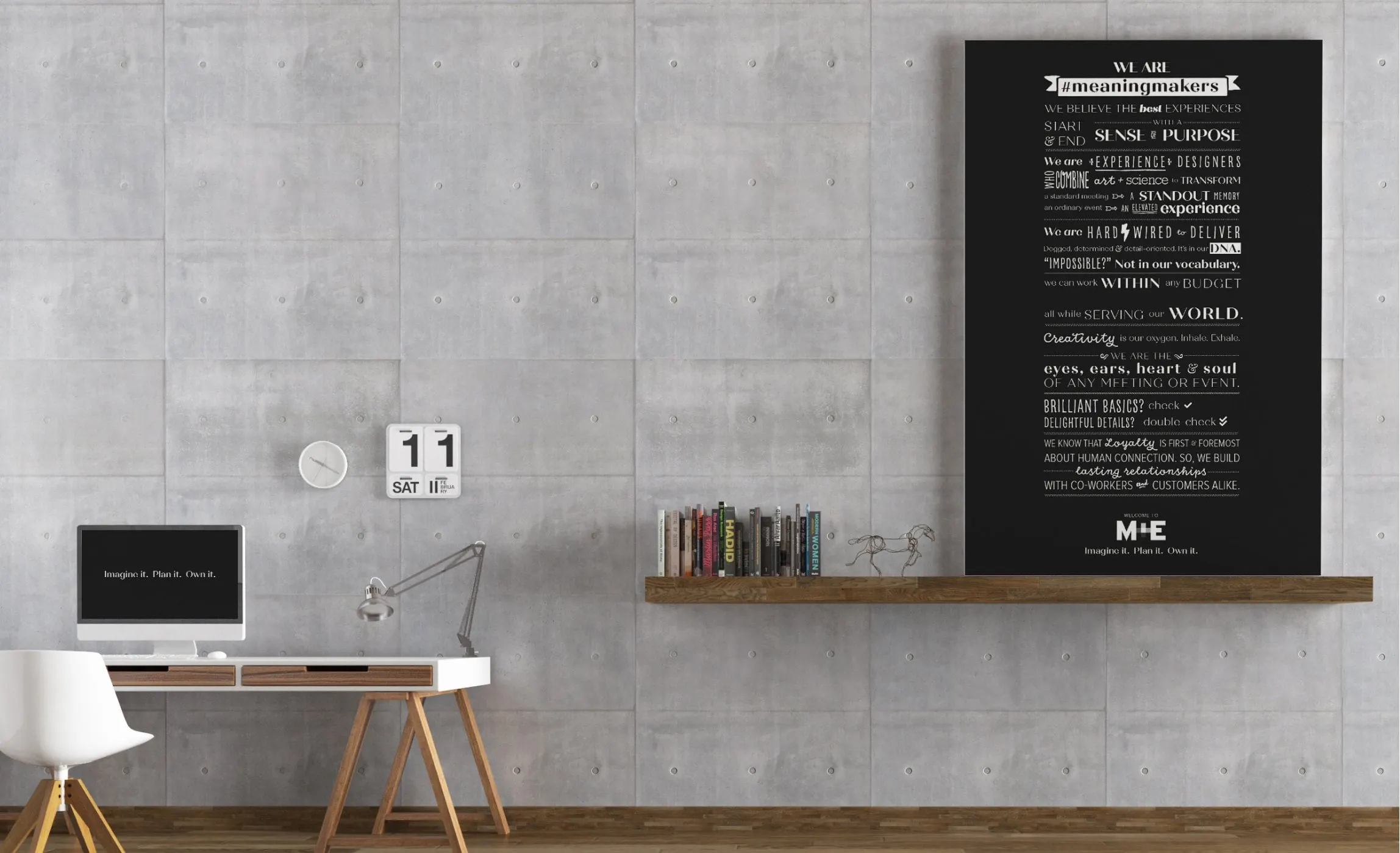
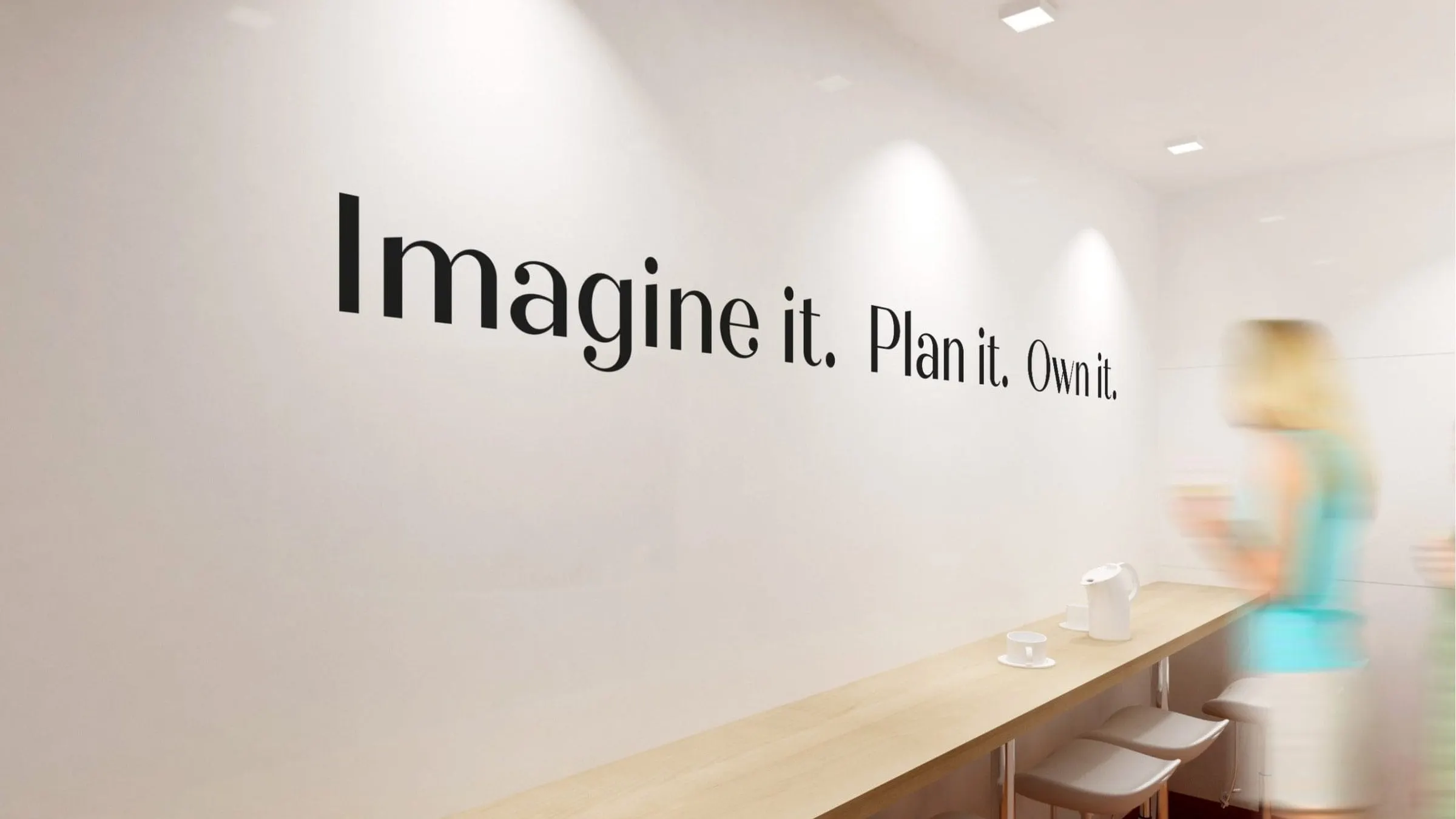
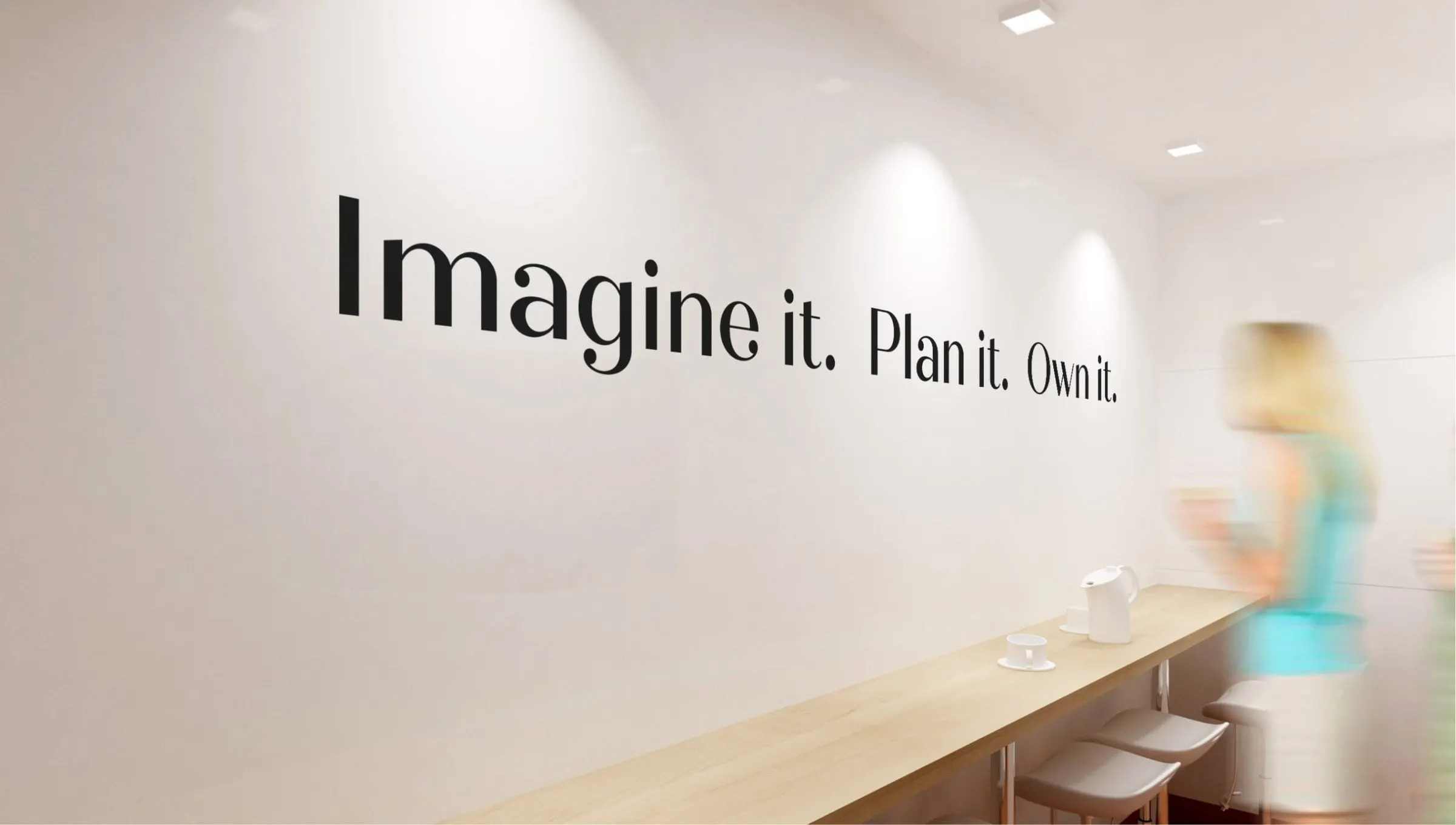
Applied to the office, the system turns into environmental graphics such as the tagline Imagine it. Plan it. Own it. along a wall and a Welcome to M+E decal. For a similar repositioning project with a large brand, see our Visa Blueprint booklet and poster.
What we delivered
Design support for the M+E team's internal brand refresh and manifesto.
- 01Brand refresh supportVisual direction for the refreshed M+E internal identity.
- 02Workshop posters and manifesto posterDiscovery materials and the final typographic manifesto.
- 03Brand and printing guidesLogo, colour and typography rules, plus file guidance for print.
- 04Office decals and apparelWall and window graphics and t-shirt artwork drawn from the manifesto.