Case study · Wandler Probiotics
Wandler Probiotics
A logo refresh and new website for Wandler Probiotics, a family-driven biotechnology company, built around a leaf-shaped W and the line a catalyst for harmony.
01 — Context
Probiotics website design for a science-led family company
Wandler Probiotics is a family-driven biotechnology company rooted in research and development, with a history in probiotics going back to 1998. It produces probiotic fermentations for animal and human health and for soil and compost, and offers contract manufacturing to brand owners, retailers and distributors.
The company came to us to refresh its logo and build a completely new web presence. The challenge was balance. Wandler needed to look credible to wholesale and manufacturing partners who care about process and quality, while still feeling natural and approachable. Our probiotics website design and identity work had to say both serious science and living things at once.
02 — Logo refresh
A W that grows
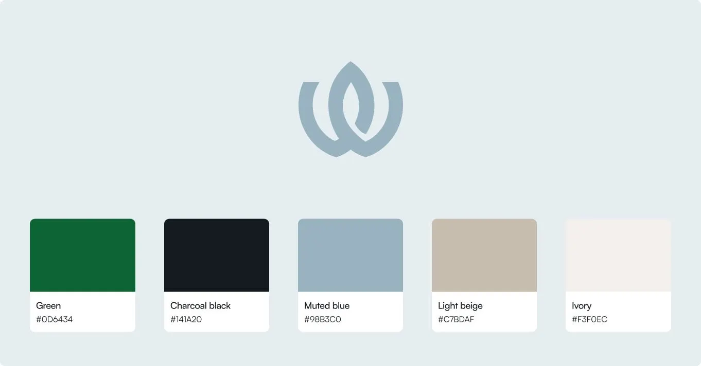
The refreshed mark draws a W from two overlapping leaf shapes, set in a deep green. It reads as a letter, as a sprouting plant and, if you look a little longer, as two forms working together, which ties neatly to Wandler's own tagline, a catalyst for harmony. Beside it, the WANDLER wordmark is set in wide, open capitals with PROBIOTICS INC. tracked out underneath, and the tagline runs in a loose handwritten script.
We also created a circular seal with a scalloped edge that carries the W, the company name and the year 1998. It gives Wandler a heritage stamp for packaging, documents and social posts where the full horizontal logo would be too wide.
The palette is deliberately small: a strong green, charcoal black, a muted blue, light beige and ivory. The green and black do the brand's heavy lifting; the blue and neutrals bring the calm, lab-clean feel the website needed.
03 — Website
Editorial calm for a technical business
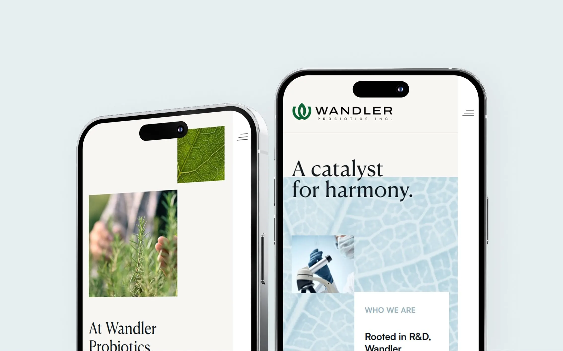
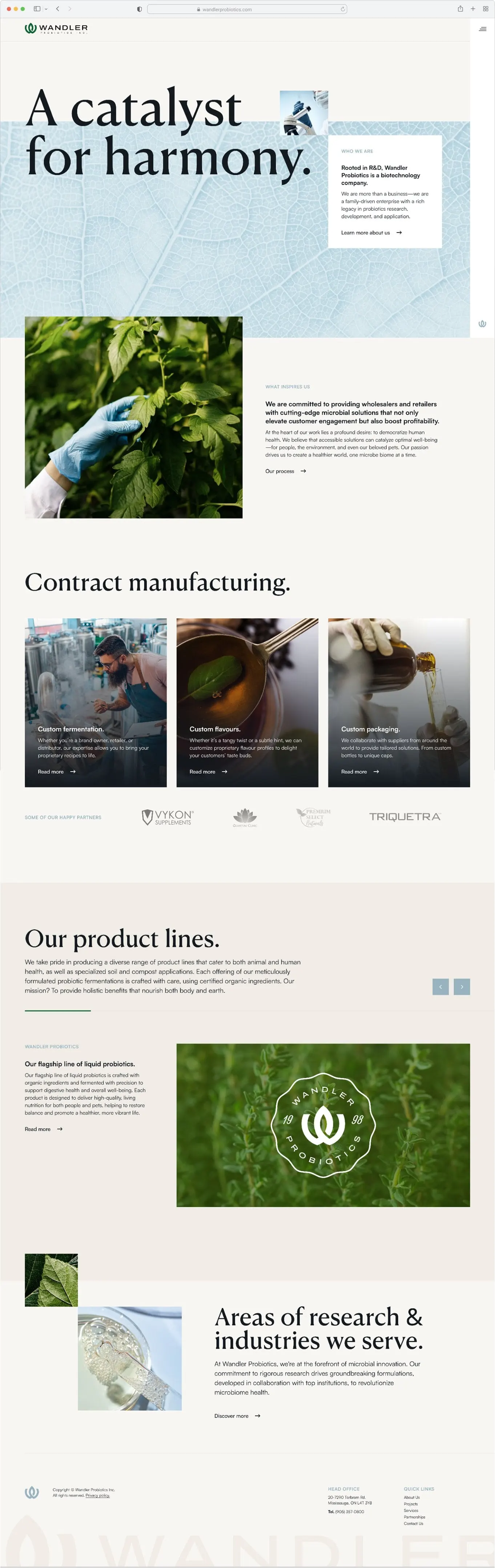
The homepage opens on a large serif headline, A catalyst for harmony., set over a pale blue macro photograph of leaf veins. A small lab image and a Who we are card sit on top of it, introducing Wandler as a biotechnology company in its own words. Science and nature share the first screen.
From there the page moves from purpose to business. A What inspires us section sets out the company's mission for wholesalers and retailers. A Contract manufacturing section breaks the offer into three image cards: custom fermentation, custom flavours and custom packaging. A row of partner logos adds proof, and an Our product lines carousel introduces products for animal health, human health and soil.
Generous ivory space, short paragraphs and a consistent arrow link style keep a technical subject easy to read. On phones, the same leaf texture, serif headline and overlapping image crops carry through, so the site feels just as considered on a small screen.
04 — Outcome
One identity, from seal to screen
Wandler now has a refreshed brand identity and a website design that speak the same language: the same green, the same leaf forms, the same calm tone. Partners can understand the contract manufacturing offer in a single scroll, and the brand has the pieces it needs to roll out across packaging and sales materials.
Doing both at once is the point. We explain why in why branding and web design should happen together. For a similar identity-and-website project, see our work for Conceive Health.