Case study · Zillow
Zillow
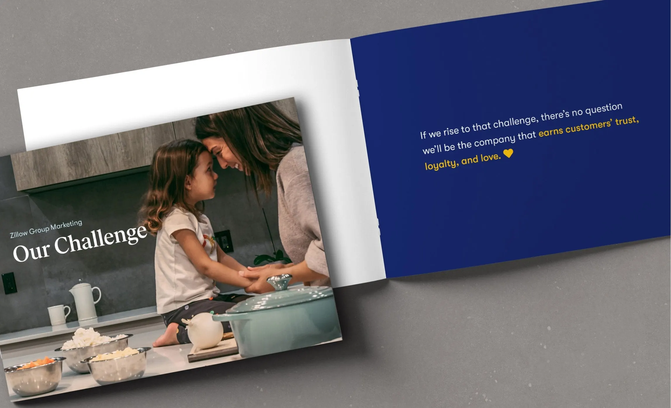
A pocket-sized, saddle-stitched booklet for Zillow's internal team: curated photography and short lines of copy that carry the company's refreshed messaging.
01 — Context
Internal booklet design for Zillow's team
Zillow is one of the best-known names in real estate. Its internal team had a story to tell its own people: a refreshed narrative about what the company is for and the challenge ahead. It wanted a printed leave-behind to carry that message, something every employee could hold, keep and be proud of.
We were brought in for that single piece. Working within Zillow's established brand, our job was internal booklet design: curating photography, pacing the story, and producing a pocket-sized, saddle-stitched booklet that supports the internal directive. It is a focused example of our publication design work for large organizations.
02 — Design
One idea per page, paced like a story
A leave-behind is not read like a report. People flip through it in a few minutes, so every spread has one job. We alternated two kinds of pages. Photographs carry short headlines set in a warm serif, such as "Our Challenge" and "Now we're challenging the status quo with Zillow Offers." Solid navy pages carry a single sentence in a clean sans-serif, with the key words picked out in yellow or underlined in italics.
Those navy pages do the heavy lifting. "Real estate isn't really about buildings or leases or listings…" sets up the idea and leaves the reader to turn the page. On another spread, the line "we'll be the company that earns customers' trust, loyalty, and love" ends with a small yellow heart, a quiet nod to the brand.
We curated the photography to match the message: everyday, lived-in moments rather than houses. A mother and daughter in a kitchen. A dog asleep on a blanket in front of a sofa. Hands signing paperwork at a wooden table. Real estate, shown as people's lives. Every image was chosen to feel candid and warm, so the booklet reminds employees who their work is ultimately for.


03 — Why print
A message people can keep in a pocket
Internal messaging usually lives in slide decks and emails, where it is easy to skim and forget. A small, well-made booklet does something different: it sits on a desk, travels in a bag and gets passed around. The pocket format and saddle-stitched binding keep it light and personal.
Working inside a brand as established as Zillow's also shaped the job. We were not reinventing anything; we were choosing. The palette stays to Zillow navy, white and a single yellow accent. Type is limited to one serif and one sans-serif. Margins are generous, and text never competes with the photographs. That restraint lets the words land, and it means the booklet sits comfortably beside everything else the company produces.
That is the value of corporate communication design done in print. For other booklets with a clear story to tell, see our LinkedIn booklet for Deloitte and the Outreach strategic plan.
What we delivered
A printed leave-behind for Zillow's internal team, designed within the Zillow brand.