Case study · Outreach
Outreach
A printed 2020–2025 strategic plan for Timiskaming First Nation, designed for Outreach as an elegant takeaway that sets out vision, analysis and goals.
01 — Context
Strategic plan design for Timiskaming First Nation
Outreach is a consultancy. In 2019 it was preparing a five-year strategic plan, covering 2020 to 2025, to present to the Timiskaming First Nation, an Algonquin community. It asked us for the strategic plan design: a refined printed piece that would set out the community's objectives, record past achievements and goals met, and serve as a takeaway long after the presentation ended.
A plan like this is read by community members and leadership alike. It has to be readable by everyone, it has to feel like it belongs to the community rather than to a consultant, and it has to hold a lot of dense planning content without becoming a report nobody opens. Our publication design approach was to make it feel like a book.
02 — Structure
A landscape book with a clear path through it
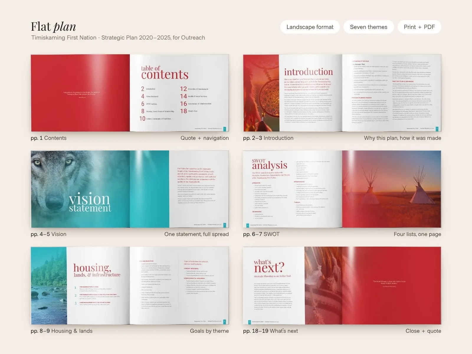
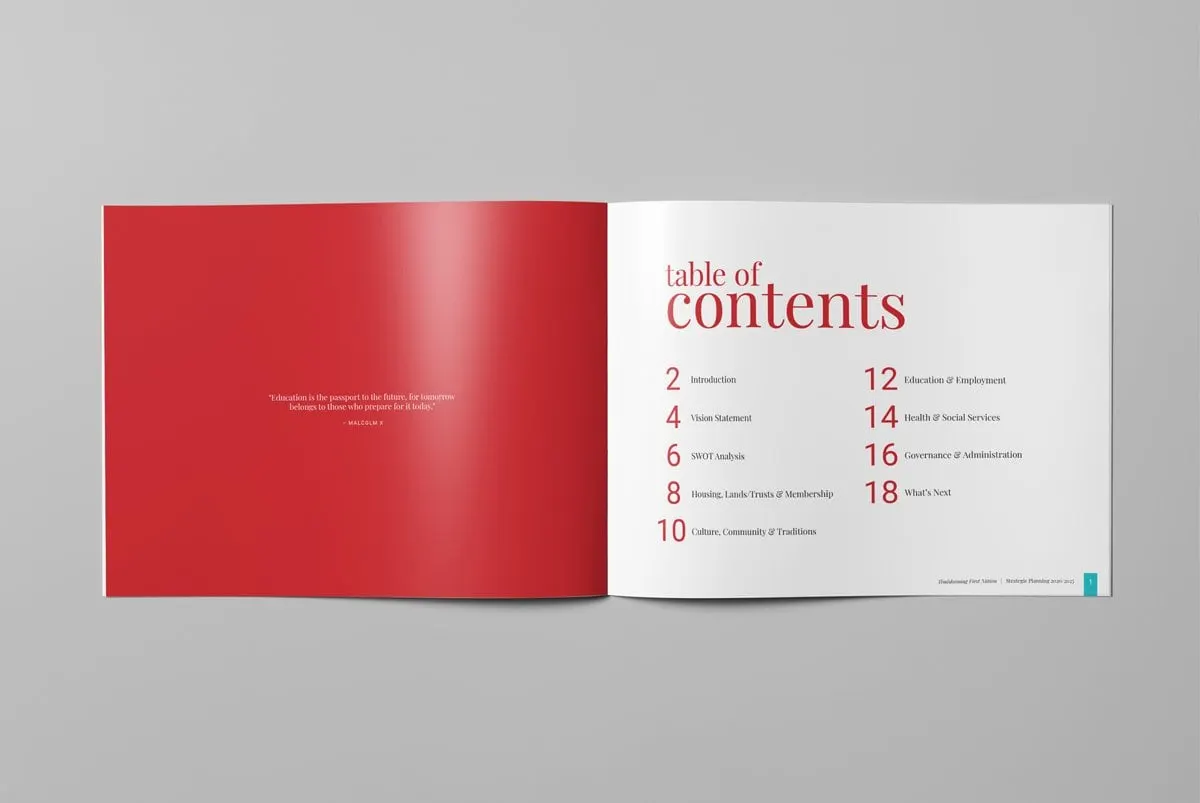
We chose a landscape format so each topic could open as a full spread: a photograph on one side, the content on the other. The table of contents sets out the journey plainly: Introduction, Vision Statement, SWOT Analysis, then one section for each area of community life, including Housing, Lands, Trusts and Membership; Culture, Community and Traditions; Education and Employment; Health and Social Services; and Governance and Administration, before closing with What's Next.
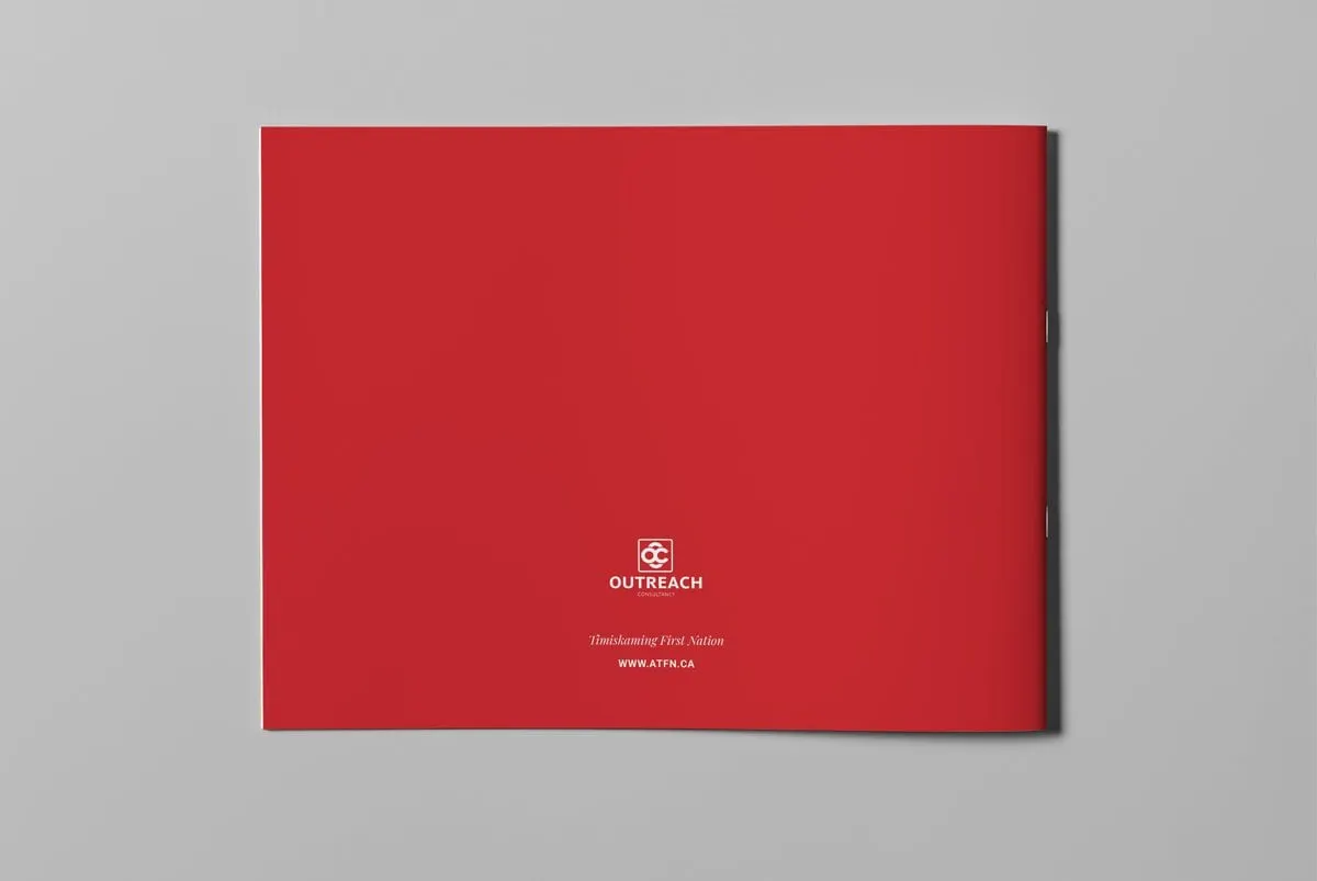
The cover sets the tone. A close-up of traditional beadwork and wrapped feathers fills the page in a red wash, with "strategic planning" in a large white serif and the years stacked in a teal block: 2020 over 2025. The back cover is plain red with the Outreach mark and the community's name, so the book reads as the community's document first.
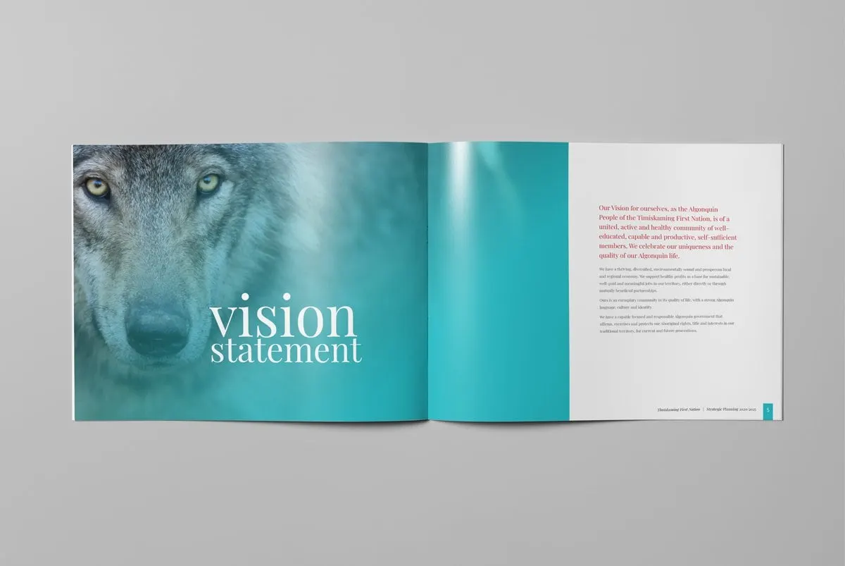
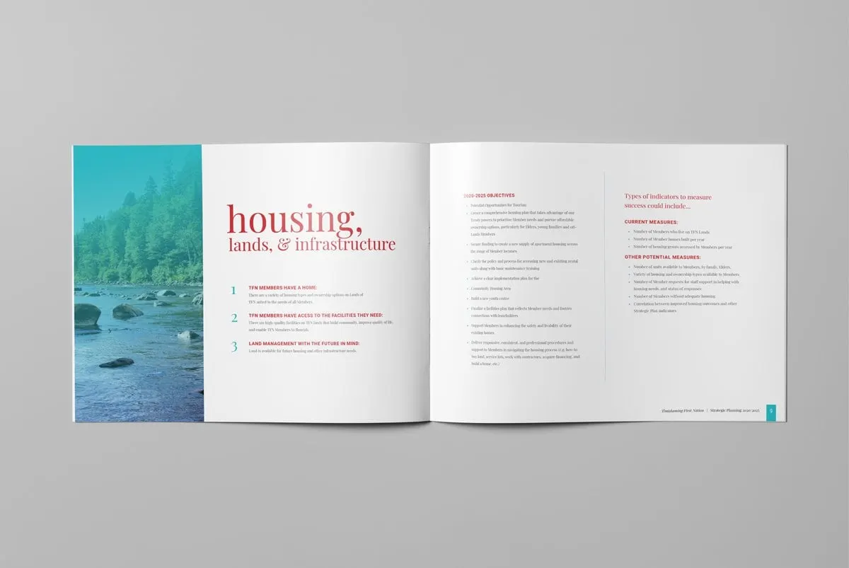
Two colours carry the whole document. A deep red is used for headings, quote pages and covers; a bright teal marks page numbers and the date block on the cover. Section titles are set in a large lowercase serif, which gives the book a warm, personal voice instead of the stiff tone of a government report. Photography of beadwork, a dreamcatcher, tipis at sunset, a river shoreline and a wolf is tinted in the same red and teal, so every spread feels part of one piece. It is careful print design doing what a style guide would normally do.
03 — Content
Making dense planning readable
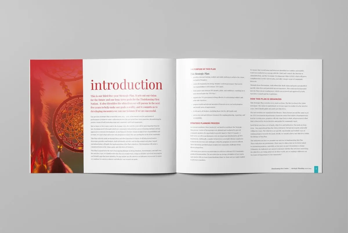
The introduction explains the plan's purpose, the strategic planning process and how the document is organized, in a two-column layout with red subheads so readers can find their place quickly.
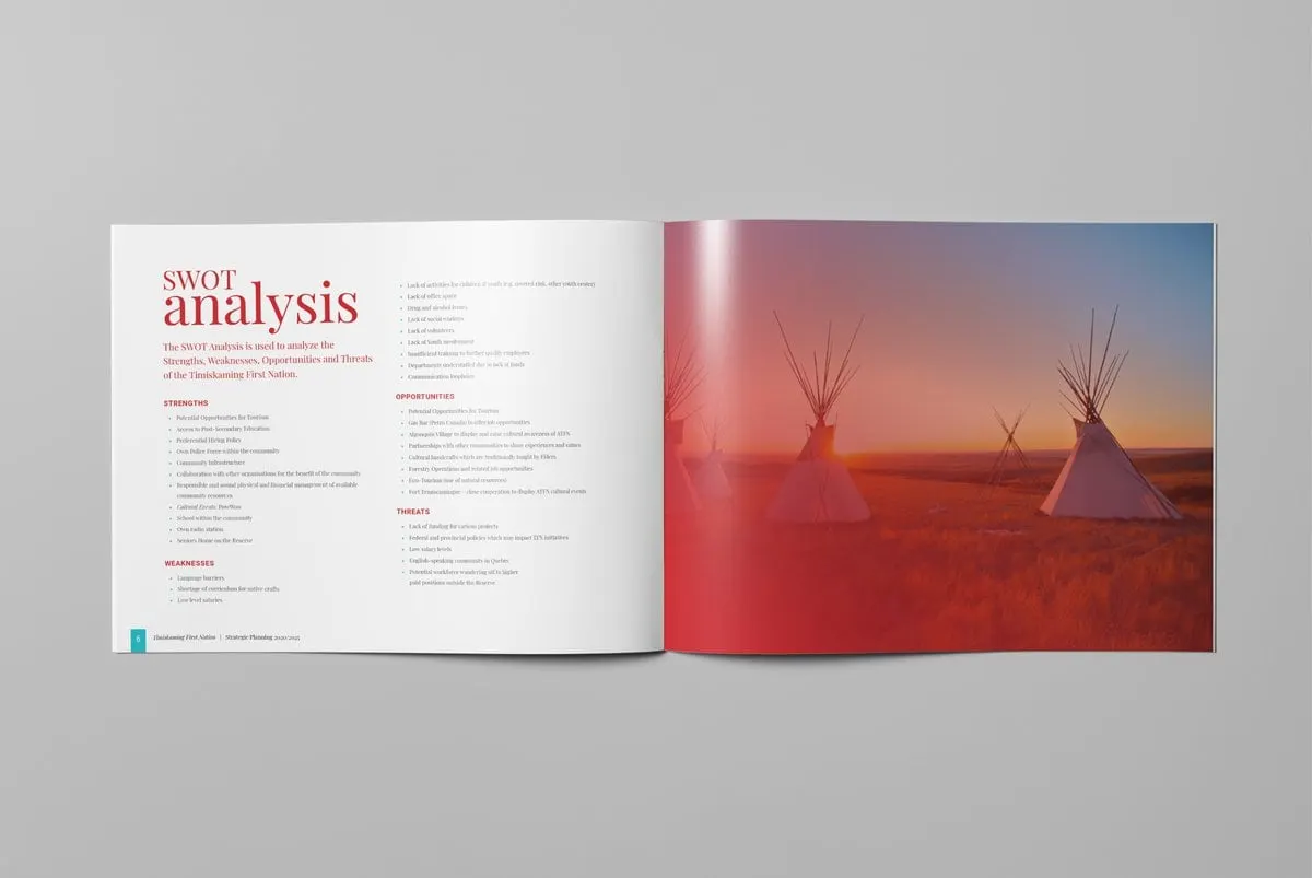
The SWOT analysis lists Strengths, Weaknesses, Opportunities and Threats under consistent red labels, set against a full-page image of tipis at sunset to keep a heavy page from feeling clinical.
Each community section follows the same template, which is what makes a long plan usable. The housing, lands and infrastructure spread opens with three numbered goals in teal, then lists objectives for 2020 to 2025, then a separate panel on the types of indicators that could measure success. Members can see what is planned and how progress will be judged, all on one spread.
The community and non-profit clients we work with often have this exact challenge: a lot to say, and a broad audience who all need to understand it.
04 — Closing
Quotes as pauses between chapters
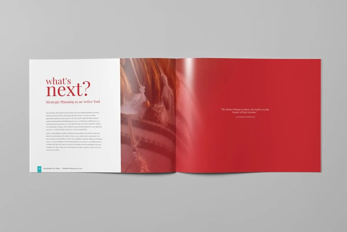
We used solid red pages carrying single quotations as resting points. One opens the book, opposite the table of contents: "Education is the passport to the future, for tomorrow belongs to those who prepare for it today." Another closes it, opposite What's Next, which presents the plan as an active tool, a document to return to rather than file away.
The result is an elegant takeaway that communicates the organization's purpose and progress to the people it serves. Designing for the reader first is the theme of our article on designing for your audience, not yourself. For another printed booklet, see our pocket booklet for Zillow.
What we delivered
A printed strategic plan for Outreach to present to Timiskaming First Nation.