Case study · Visa Proposal
Visa Proposal
A concept website and short video that helped Visa's discovery team picture its repositioning goals, and the groundwork for our later Visa Blueprint project.
01 — Context
Helping a discovery team see the idea
Visa's discovery team was exploring how the company might reposition itself in the marketplace. Strategy documents can describe a new direction, but they rarely make people feel it. The team needed a way to show what that repositioning could look like in practice, so that conversations about it would start from something concrete.
We were brought in to create a Visa repositioning website concept and a short video. To be clear about scope: this was a proposal piece for an internal discovery process, not a redesign of Visa's brand or its live website. Our job was to turn early strategic thinking into something people could click through and watch.
02 — The concept site
From card network to something bigger
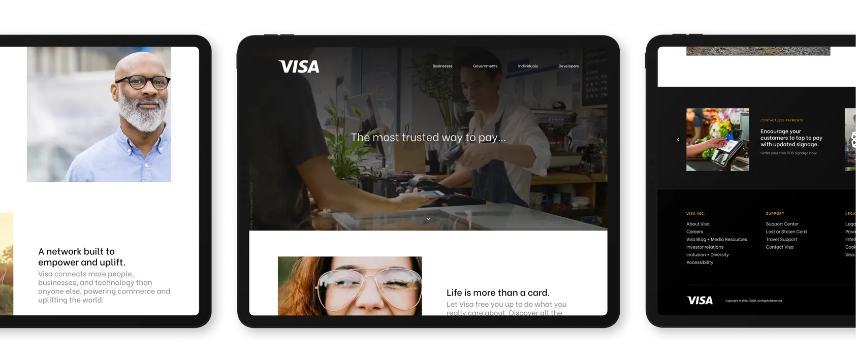
The idea at the centre of the concept was that Visa is more than a card. Our website design expressed that through the structure of the site as much as the words. The navigation speaks to four audiences (Businesses, Governments, Individuals and Developers), signalling a company that serves whole economies, not just shoppers at a till.
The homepage opens on a full-width photo of a tap-to-pay moment at a small shop counter, with the line "The most trusted way to pay..." trailing off to invite the reader in. Below, large portraits of people sit beside short statements: "Life is more than a card" and "A network built to empower and uplift," describing Visa as connecting people, businesses and technology. A dark footer carries promotional cards and a full set of links, so the concept feels like a working site rather than a mood board.
The UX and UI design stays deliberately quiet: white space, a clean sans-serif, the familiar wordmark and photography doing the emotional work. That restraint kept attention on the message the team wanted to test.

03 — Messaging and video
Messages that widen the frame
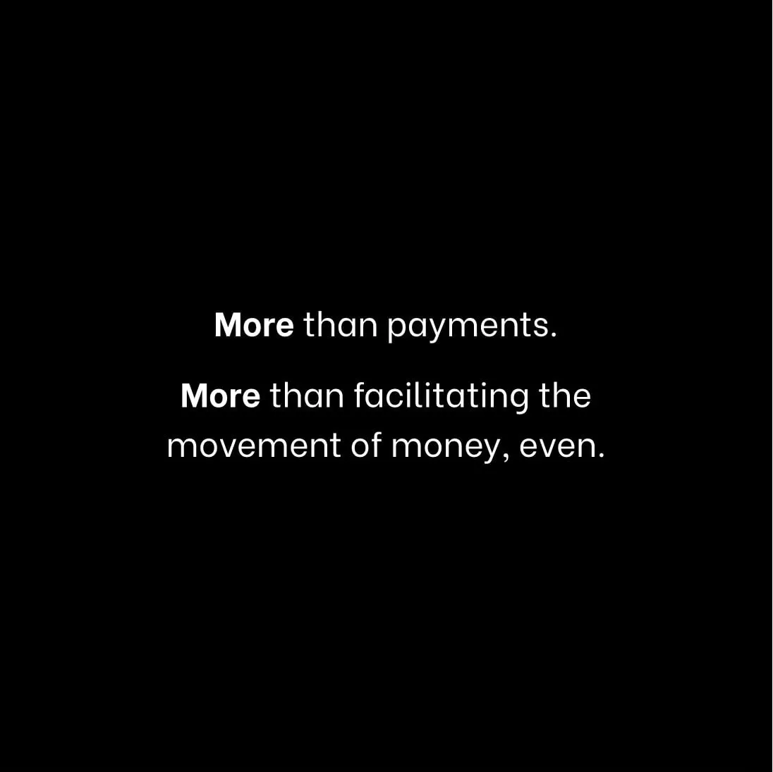
The concept carried a set of bold statements set in white on black, such as "More than payments. More than facilitating the movement of money, even." Paired with photography that looks well beyond the point of sale, like women carrying stacked bowls of produce through a busy market street, those lines move the viewer from a single transaction to a much wider picture of commerce and the people it supports.
We also produced a short video for the discovery team, so the direction could be shared and discussed in a format that's easy to play in a meeting or pass along. Motion and pacing add something static pages can't: the sense of a story unfolding.
That emotional pull matters in early strategy work. People remember how an idea made them feel long after they've forgotten the slide it was on, which is why we believe a website should make people feel something.
This proposal became the starting point for our Visa Blueprint project, where we took the thinking further and produced pieces presented to Visa's executive team to illustrate their goals in the marketplace. It sits alongside our other finance and insurance work.
What we delivered
Proposal materials to help an internal team visualize a strategic direction.
- 01Concept websiteHomepage, content and footer designs for a repositioning concept.
- 02Interface designNavigation and page layouts shown on tablet screens.
- 03Short videoA brief film for the discovery team to share the direction.