Case study · Corios
Corios
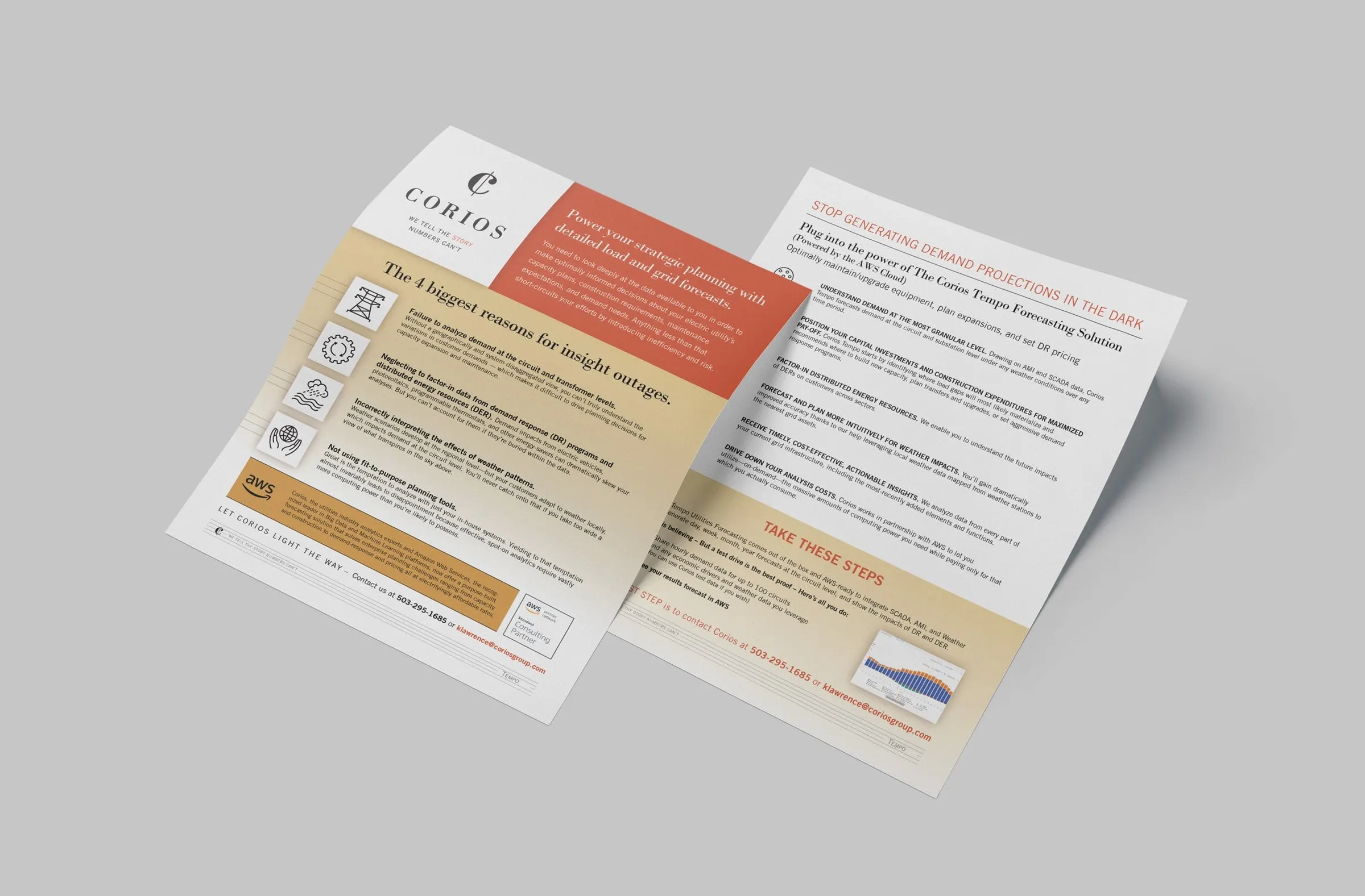
A series of B2B sell sheets for Corios, a Portland analytics firm, explaining complex utility forecasting and AWS migration offers in a clear, warm, on-brand format.
01 — Context
B2B sell sheet design for data-heavy services
Corios is a business performance and analytics firm based in Portland, Oregon. Its services are powerful and technical: forecasting electricity demand for utilities, moving SAS Institute AI/ML workloads into the AWS cloud, and turning large data sets into decisions. Its own line says it best: We tell the story numbers can't.
Corios asked us for a series of flyers and promotional pieces to support its marketing. The audience was senior buyers at utilities and enterprise clients, people who are short on time and skeptical of vague promises. Good B2B sell sheet design for that audience has to do two jobs at once: show expertise through detail, and stay readable enough that a busy executive gets the point in a minute. We designed the series as a family of marketing collateral that the sales team could put in front of prospects with confidence.
02 — Structure
Problem first, product second, next step last
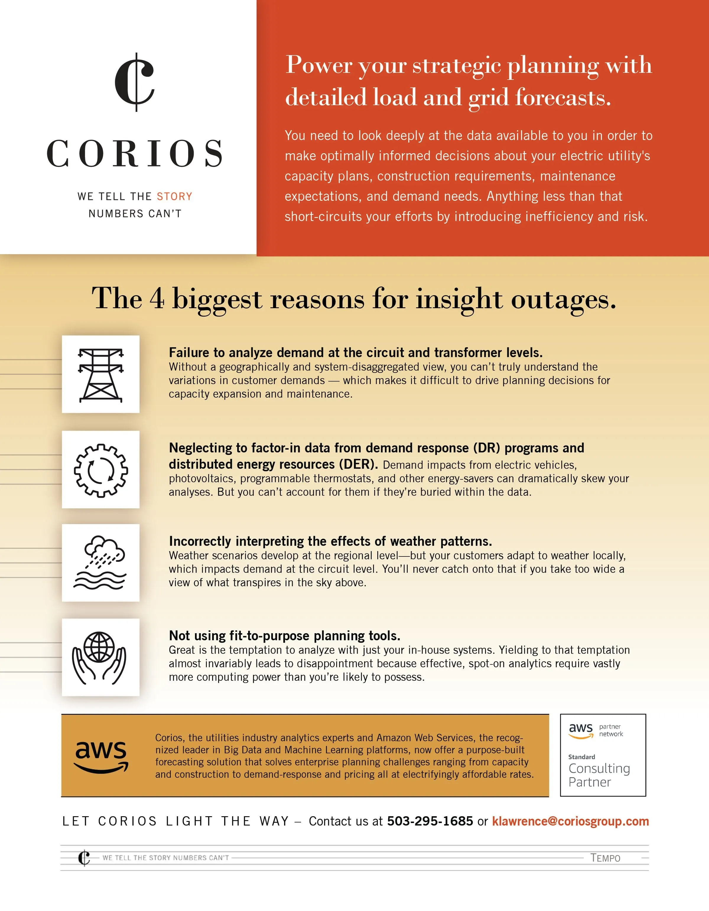
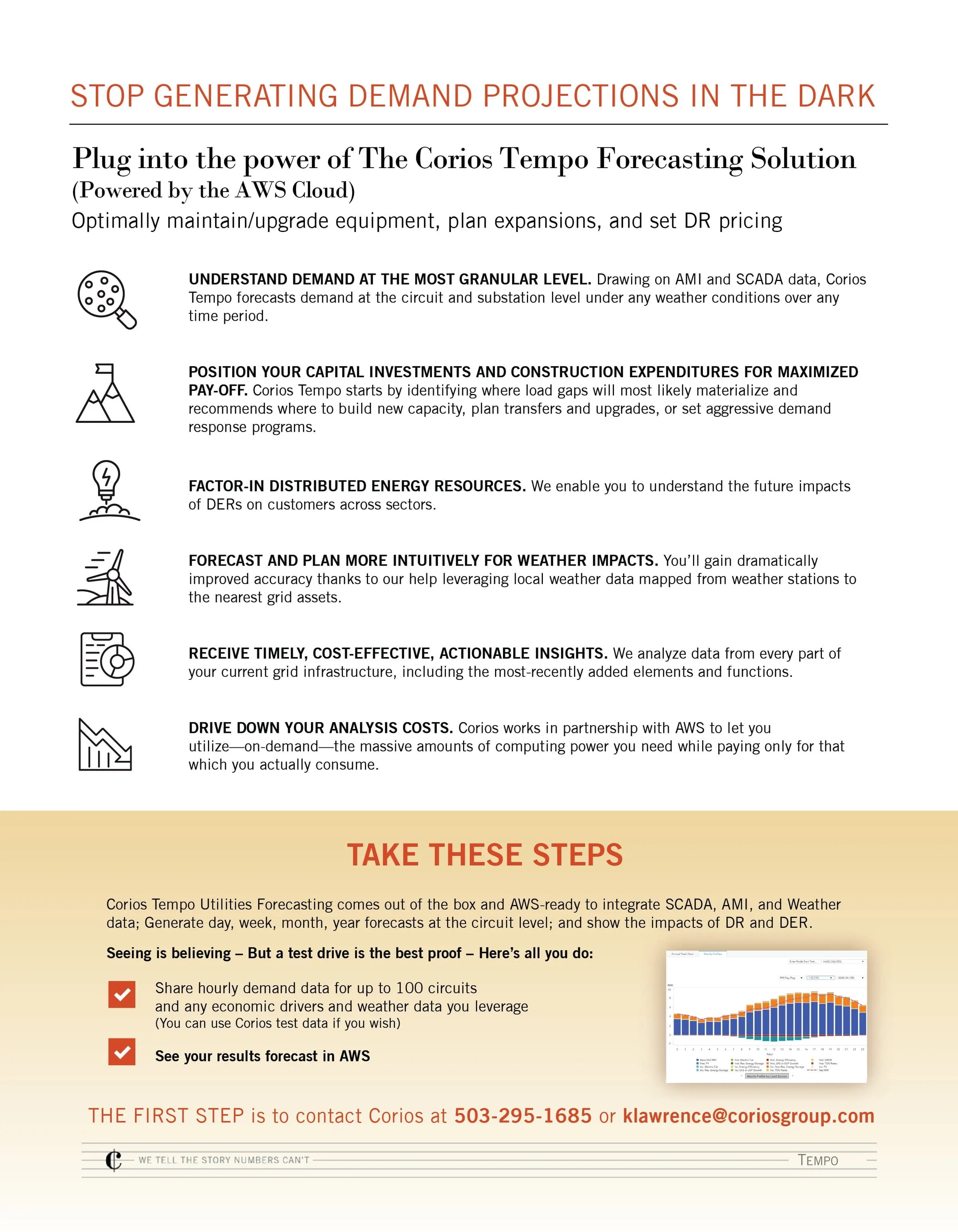
Each sheet follows the same persuasive order. The Tempo flyer for utility forecasting opens on the reader's problem with a bold serif headline, The 4 biggest reasons for insight outages, and four icon-led points: missing circuit-level demand, ignoring distributed energy resources, misreading weather and relying on in-house tools. Only after that does the back introduce the Corios Tempo Forecasting Solution, powered by the AWS Cloud, with six benefits and a Take These Steps panel that explains how to start a test drive.
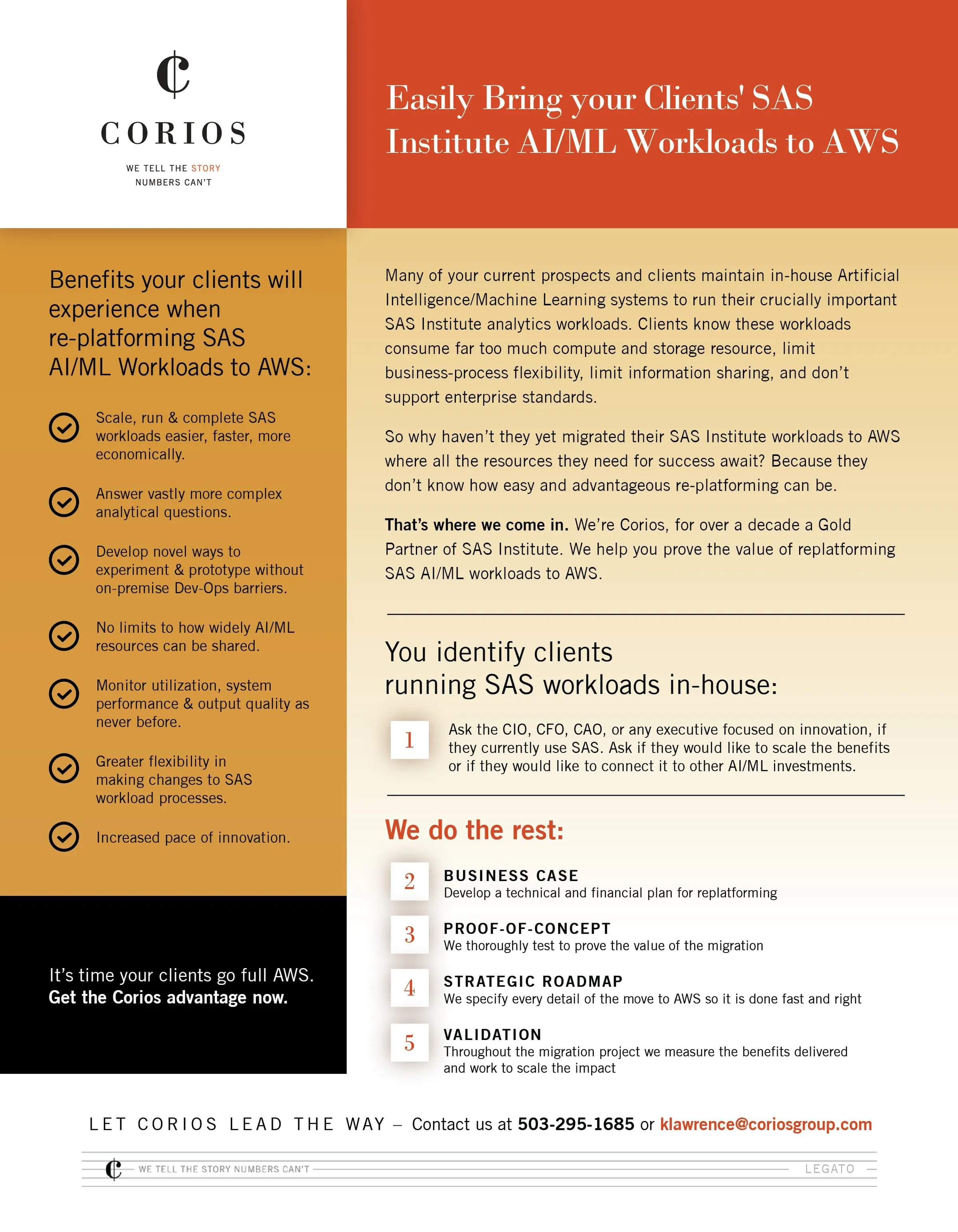
The second flyer speaks to partners whose clients run SAS workloads in-house. A gold sidebar lists the benefits of re-platforming to AWS, while the main column explains the opportunity and then breaks the Corios process into five numbered stages: identify clients, business case, proof-of-concept, strategic roadmap and validation.
Every sheet ends with the same call to action, Let Corios light the way or Let Corios lead the way, with phone and email in bold orange. A slim footer repeats the tagline and names the offer, Tempo or Legato, so each sheet is easy to file and find.
03 — Craft
Warm colour for a technical brand
Analytics firms often default to cold blues and grey charts. Corios has a warmer identity, a cent-sign style monogram with a classic serif wordmark, and we leaned into it. The sheets pair a vivid orange-red header block with a gold-to-cream gradient behind the body copy, and black and white panels for contrast. Headlines use a high-contrast serif that echoes the wordmark, while body copy is set in a clean sans serif with bold lead-ins.
Thin line icons, a power pylon, a gear, a weather cloud and a globe in hands, give each point a quick visual anchor without turning the page into a cartoon. Faint horizontal rules extend from the icons like lines on a chart, a quiet nod to the data behind every claim. This is print design that respects the reader's time, using visual hierarchy to guide the eye from problem to proof to contact. For similar single-page sales tools, see our HDCS sell sheet and the Quadrillion Partners flyer. Firms in professional services often need exactly this blend of credibility and clarity.
What we delivered
A series of flyers and promotional materials for Corios.